
Caroline Scharf
Vice President of Operations
In fields where relationships shape outcomes, such as cybersecurity, finance, logistics, and bioinformatics, understanding how everything connects is key to gaining meaningful insights. While dashboards and KPIs offer summaries, they often miss the underlying structure.
Graph visualization changes that. By revealing how entities interact and influence one another, it empowers analysts and decision-makers to detect hidden patterns, understand system dynamics, and move beyond surface-level metrics.
In this article, we’ll explore the core benefits of graph visualization, show where it delivers the most value across industries, and demonstrate how Tom Sawyer Software helps organizations uncover insights and scale discovery with confidence.

A graph visualization produced with Tom Sawyer Perspectives showing the underlying structural relationships between entities.
Understanding the Power Behind Graph-Based Thinking
Graph-based thinking shifts the focus from isolated data points to the dynamic relationships that define systems. Instead of treating data as flat tables or independent records, this approach models entities as nodes and their interactions as edges—unlocking new ways to observe structure, flow, and influence.
While traditional visualizations highlight quantities and comparisons, graph-based models excel in contexts where relationships matter most: from mapping user journeys to uncovering risk exposure, or tracing network dependencies. This perspective lays the foundation for deeper insights—and powers the core benefits explored in this article.
Graphs vs. Traditional Visualizations: What's the Difference?
Traditional charts like bar graphs or line plots are effective for summarizing data across a few dimensions, especially when the goal is to compare values or observe trends. However, their linear nature limits their ability to represent systems with feedback loops, nested relationships, or overlapping structures.
Graph visualizations offer a fundamentally different approach—emphasizing how elements are interconnected. Instead of focusing solely on quantities, they reveal structure: how entities relate, where clusters form, which nodes serve as bridges, and how information or influence flows across a system. This relational view enables a deeper level of insight, particularly in environments where understanding how things connect is more important than how many there are.
From Data Points to Insightful Networks
Traditional data analysis focuses on individual records, rows in spreadsheets, entries in logs, or isolated events in dashboards. But in many cases, the true value of data doesn’t lie in the points themselves, but in the connections between them.
Graph-based thinking reframes this perspective. It asks not just what happened, but how entities relate, who influences whom, and where dependencies or hidden clusters exist. By linking data elements into structured networks, we move from flat lists to living systems—systems that reveal flow, hierarchy, feedback, and opportunity.
This structural view isn’t just technically interesting—it’s a strategic advantage. It allows analysts and decision-makers to see patterns emerge, trace influence across systems, and act with greater confidence.
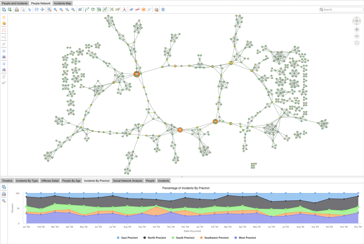
A graph visualization showing the key players in a criminal network produced with Tom Sawyer Perspectives.
When to Use Graph Visualization: Ideal Scenarios
Graph visualization excels in situations where relationships are central to understanding. If you're working with networked systems—such as IT infrastructures, social media interactions, or semantic data models—graphs provide a natural way to represent the flow and structure of those connections.
It's also the method of choice when you're less interested in absolute values and more focused on tracing influence, cause-and-effect, or shared behaviors across entities. Complex workflows, cascading dependencies, and hierarchical systems benefit immensely from being modeled as graphs, as do systems where multiple types of interactions coexist.
Top Benefits of Graph Visualization
Reveal Hidden Patterns and Relationships
Traditional analytics often rely on summarizing or aggregating data, which can obscure the nuanced relationships that exist within a system. Graph visualization takes a different approach: it prioritizes connections. When entities are mapped as nodes and relationships as edges, patterns emerge naturally—clusters of related activity, isolated outliers, or multi-step influence chains that are nearly impossible to detect in raw datasets.
For example, in a fraud detection scenario, individual transactions might seem legitimate when viewed independently. But when visualized as part of a network, a circular pattern or shared endpoint may suggest collusion. Graphs allow these subtle structures to surface visually, helping analysts move from isolated facts to broader insight.
Visualize Complex, Interconnected Systems
Modern systems are rarely linear. They involve feedback loops, conditional dependencies, parallel processes, and shifting hierarchies. Graph visualization excels in capturing and communicating this complexity. It represents interconnected systems without forcing them into rigid models, offering a more accurate depiction of how real-world systems behave.
For organizations managing infrastructure, software dependencies, or knowledge bases, graph visualization reveals not just components, but how those components interact. It shows flows, bottlenecks, and the paths that connect seemingly unrelated parts. This enables both high-level understanding and deep, node-level investigation within the same visual interface.
Reduce Analytical Complexity and Mental Overhead
When working with complex datasets, analysts often expend significant cognitive effort piecing together how data points relate. Graph visualization simplifies this task by making structure explicit. Instead of translating spreadsheet columns or JSON trees into mental models, users can see those models directly.
By visualizing relationships, the need to mentally reconstruct data connections is reduced or eliminated. This frees up attention for higher-order tasks: interpretation, comparison, and strategic planning. Especially in environments with time-sensitive demands, this clarity can make the difference between acting reactively and thinking proactively.
Support Real-Time and Interactive Data Exploration
Static dashboards offer snapshots; graphs offer living systems. Graph visualization tools—especially those powered by platforms like Tom Sawyer Perspectives—support interactive exploration where users can click into a node, expand surrounding relationships, and dynamically filter data by type, weight, or direction.
This level of interactivity transforms how users engage with data. They’re no longer consuming information passively; they’re manipulating, questioning, and discovering. In environments like cybersecurity operations or supply chain monitoring, the ability to follow a lead in real time can drastically reduce response times and increase analytical depth.
Decision-Making Benefits of Graph Visualization
Better decisions come from better context. Graphs not only show the state of individual elements, but how those elements fit within a larger structure. When decision-makers understand the role of a node within its broader network—whether it’s a critical connector, a peripheral entity, or a bridge between clusters—they can act with precision.
This structural context is especially powerful in domains like enterprise architecture or network design, where the consequences of small changes ripple across multiple systems. Graph visualization helps stakeholders anticipate impact, simulate outcomes, and design with system-wide awareness.
Enhance Communication and Stakeholder Alignment
One of the most underestimated benefits of graph visualization is its ability to unify perspectives. Complex data often lives in silos—technical teams speak in logs, analysts in metrics, and executives in outcomes. Graphs act as a shared visual language, making it easier for all stakeholders to see what matters.
Well-structured graph visuals can turn abstract relationships into compelling narratives. They support faster alignment, shorter feedback loops, and more productive discussions. Whether presenting to a boardroom or debugging with a development team, the ability to show not just what is happening, but how and why, builds trust and clarity.
Real-World Applications of Graph Visualization
Graph visualization becomes exponentially more valuable when applied to real-world domains where relationships drive outcomes. Below are key industries where this approach is not just useful, but essential—providing both strategic clarity and operational advantage.
Cybersecurity – Uncover Threat Vectors and Anomaly Chains
Modern cyber threats rarely occur in isolation. Instead, they manifest as a series of seemingly benign actions distributed across users, systems, and time. Graph visualization empowers security analysts to trace these actions through interconnected events, uncovering hidden patterns that signal coordinated attacks or policy breaches.
For example, what may appear as a failed login followed by data access and then a log deletion—scattered across logs—can be connected visually into a threat vector when modeled as a graph. Nodes might represent devices, user sessions, or event types, and edges show relationships like sequence, ownership, or timing. With this approach, it becomes possible to see the entire anomaly chain, not just isolated incidents.
Visualization also supports real-time monitoring. Security operations centers can configure live dashboards where new nodes appear as activity unfolds, allowing teams to intervene before threats escalate. With platforms like Tom Sawyer Perspectives, this interactivity is coupled with the scalability to handle vast streams of data without sacrificing performance.
Bioinformatics – Map Genetic and Molecular Relationships
In the life sciences, the complexity of biological systems demands a model that can reflect intricate interdependencies. Graph visualization provides a natural fit for mapping relationships between genes, proteins, symptoms, and treatments—especially when these relationships are not strictly linear.
By modeling molecular pathways as graphs, researchers can identify regulatory loops, shared nodes across different biological processes, or previously unknown associations between genes and diseases. Visualization makes it easier to hypothesize mechanisms, detect redundancies, or prioritize targets for further study.
Additionally, graph-based models support integration across data types—gene expression profiles, clinical records, ontologies—into a single network. This holistic view enables researchers to approach discovery from a systems biology perspective, with visual tools that adapt dynamically as hypotheses evolve.
UX and Web Analytics – Analyze User Behavior Flows
User experience is rarely a linear journey. Visitors enter from multiple channels, explore different paths, repeat actions, or abandon midway. Traditional funnel visualizations fail to capture this complexity. Graph visualization, however, models each user interaction as a node, and each transition as an edge—revealing actual navigation behavior.
These visual maps show where users loop, drop off, or branch into unexpected flows. For design and product teams, this insight is invaluable: it clarifies which paths lead to engagement and which introduce friction. A high-exit node might indicate a confusing interface, while a tightly connected subgraph may suggest a natural cluster of content or features.
In practice, graph-based UX analysis supports data-informed design. It enables teams to iterate more intelligently by visualizing how changes affect flow patterns over time. It also facilitates stakeholder conversations by transforming clickstreams into a visual journey that aligns with product goals.
Financial Services – Monitor Transactions and Detect Risk
In financial networks, risk is often hidden in the connections—not the individual transactions. Graph visualization allows institutions to track how funds, clients, and intermediaries are linked, enabling more effective detection of fraud, compliance violations, or concentration risks.
A customer who appears legitimate in isolation may be part of a highly connected risk cluster when visualized within the broader network of transactions. Edges can represent transfers, shared addresses, or common vendors, while attributes like transaction volume or timing provide context. By modeling these structures as graphs, analysts can see how risk propagates—not just where it ends up.
Graph visualization also supports regulatory reporting and audit workflows. Rather than compiling complex spreadsheets or filtered reports, compliance officers can show relational models directly, providing clarity on exposure and rationale for decisions. This increases transparency and streamlines communication with oversight bodies.
IT & Enterprise Architecture – Visualize Systems and Dependencies
Modern IT environments are deeply interconnected, with services depending on APIs, microservices, cloud components, and legacy systems. A change in one area can cascade through many others. Graph visualization enables teams to see these dependencies clearly, reducing the risk of unintended consequences.
By visualizing enterprise architecture as a graph, stakeholders can understand which components interact, how data flows between them, and where potential bottlenecks or single points of failure exist. During digital transformation initiatives or system migrations, this visibility is critical for planning and risk assessment.
Furthermore, graph models support change impact analysis. Teams can simulate what happens if a node (system or service) is modified, retired, or overloaded. Visualization helps prioritize resilience and efficiency, enabling organizations to evolve their IT infrastructure with greater confidence.

An example microwave antenna network produced with Tom Sawyer Perspectives showing relationships between devices, system load, and capacity bottlenecks.
Choosing the Right Tool: Why Tom Sawyer Perspectives?
When working with graph data at scale, not all tools are created equal. While many platforms offer basic visualization capabilities, few are designed to handle the complexity, volume, and performance demands of enterprise environments. This is where Tom Sawyer Perspectives stands out—as a robust, flexible, and enterprise-ready solution for serious graph visualization needs.
Built for Performance – Handle Large, Complex Graphs at Scale
Graph datasets can quickly grow into the tens or hundreds of thousands of nodes and edges, especially in domains like cybersecurity, network management, or financial transactions. Tom Sawyer Software is engineered to manage this complexity without compromising on performance or responsiveness.
Its architecture supports efficient rendering and graph computation, allowing users to explore high-density networks in real time. Whether you're monitoring dynamic telemetry data or modeling entire IT ecosystems, the platform maintains clarity and speed, even as graph size increases.
This scalability isn’t just about volume—it’s about maintaining interactivity and insight even when the system is under pressure.
Advanced Layout Algorithms and Visual Styling
One of the defining strengths of Tom Sawyer Software is its suite of advanced layout algorithms. These include force-directed, orthogonal, radial, hierarchical, and custom layout styles that reveal structural patterns with clarity and precision.
Beyond layout, the platform supports rich visual styling options—color coding, shape customization, edge styling, and conditional formatting—all of which help translate raw relationships into understandable visual cues. This is critical when presenting complex systems to diverse audiences who need intuitive visuals to guide interpretation.
These features aren’t superficial—they’re functional, ensuring that the structure of the data drives the visual outcome, rather than the other way around.
Seamless Integration with Enterprise Data and Systems
Graph visualization doesn't operate in isolation. To be useful in real-world workflows, it must integrate cleanly with existing data infrastructure. Tom Sawyer Software offers connectors and APIs that make integration with relational databases, graph databases, RESTful services, and enterprise systems straightforward.
This makes it possible to pull live data into visual interfaces, apply transformation rules, and reflect updates instantly—without disrupting existing pipelines or rebuilding infrastructure. For organizations managing sensitive or evolving datasets, this level of flexibility and interoperability is a major advantage.
Whether deployed on-premise or in the cloud, the platform adapts to enterprise IT environments while meeting strict security and governance standards.
Visual Querying, Filtering, and Real-Time Updates
Analytical value increases when users can ask better questions—and get instant, visual answers. Tom Sawyer Perspectives enables this through visual querying tools, dynamic filtering, and real-time data interaction. Users can drill into nodes, trace paths, isolate subgraphs, and update views based on context—all within a visual interface.
This supports both structured and exploratory analysis. You can start with a hypothesis, build a query visually, and follow emerging relationships without writing complex code. For analysts, architects, and decision-makers, this means faster iteration and greater control over insight generation.
Real-time updates ensure that visualizations remain accurate and relevant, even as the underlying data changes—making the platform suitable for operational dashboards as well as deep analysis.

Tom Sawyer Perspectives visual query builder enables exploratory analysis without the need to understand database query languages.
Trusted by Leading Industries and Organizations
Tom Sawyer Perspectives isn’t an experimental tool—it’s a production-grade platform trusted by organizations with some of the most demanding graph requirements in the world. Its clients span government agencies, defense systems integrators, telecommunications firms, and large enterprises in engineering, finance, and healthcare.
These use cases include network planning, intelligence analysis, fraud detection, system architecture mapping, and more. The platform’s adoption across such diverse and mission-critical domains is a testament to its stability, performance, and flexibility.
Organizations turn to Tom Sawyer Software not just to visualize graphs, but to turn complexity into clarity, and analysis into action.
Visualization Techniques Powered by Tom Sawyer Perspectives
Graph visualization isn't just about placing nodes and drawing lines—it’s about choosing the right visual logic to express the structure and meaning of data. Tom Sawyer Software supports a wide range of visualization techniques that help users extract insight from even the most complex graphs. Each method serves a unique purpose, and selecting the right one can make the difference between confusion and clarity.
Force-Directed vs. Hierarchical Layouts
Force-directed layouts simulate physical forces—nodes repel one another while edges act like springs—to produce an organic spatial arrangement. This approach is ideal for exploring natural clusters, communities, and relational density. It helps users see where connectivity is high and how elements self-organize into groups.
Hierarchical layouts, by contrast, arrange nodes in layered tiers. This is especially effective for workflow diagrams, organizational charts, and process trees, where directionality and sequence matter more than proximity. Tom Sawyer Software supports both models, allowing users to switch between them depending on the question at hand—relational complexity vs. procedural clarity.

A hierarchical graph layout produced with Tom Sawyer Perspectives showing the sequential flow of commodities between locations.
Mapping Graphs to Geographic Contexts
Not all graphs exist in abstract space—many have physical coordinates or geographic meaning. In transportation, urban planning, or telecom infrastructure, nodes represent physical entities like facilities, intersections, or endpoints. Mapping these graphs onto geographic overlays adds contextual awareness that pure topology can’t provide.
Tom Sawyer Perspectives supports hybrid visualization modes where graph structure and spatial data coexist. You can view a network both as a topological system and as a geo-referenced structure—switching seamlessly between abstract and map-based views. This dual perspective enhances planning, monitoring, and optimization efforts.
Weighted and Directed Edge Interpretation
Graphs become more expressive when relationships carry weight or direction. Whether it's the volume of financial transactions, the strength of signal between devices, or the frequency of user actions, weighted edges reveal much more than mere existence.
Tom Sawyer Perspectives enables users to style edges based on magnitude, type, or flow—using color gradients, thickness, and directional arrows. This allows analysts to see influence, understand hierarchy, or track dynamic propagation through systems. In domains like supply chain management or social media analysis, these features are essential for answering the questions not just of what connects, but how strongly and in which direction.
Managing Visual Clutter in Dense Graphs
As graph size and complexity grow, visual overload becomes a serious challenge. Tom Sawyer Perspectives addresses this through intelligent layout tuning, interaction design, and performance optimization. Users can collapse subgraphs in nested drawings, apply visual filtering, highlight paths, and group nodes into abstracted clusters—all with minimal effort.
Techniques like nested drawings, swimlanes, and contextual zoom help preserve readability without sacrificing detail. More importantly, these features scale with the data—ensuring that even large enterprise graphs remain navigable, insightful, and performant.
Through these tools, Tom Sawyer Perspectives transforms dense networks from visual noise into strategic assets.

Tom Sawyer Perspectives intelligent layout and nested drawings reduce noise and ensure graphs remain readable and navigable.
Solving Industry-Specific Problems with Graph Visualization
The real strength of a graph visualization platform is measured by how well it translates complexity into action. Tom Sawyer Software has proven its capabilities across a wide range of industries and scenarios—from network visualization in telecom to fraud detection in finance. Below are examples of how the platform performs in practice and how organizations leverage it to solve critical problems with clarity and confidence.
Telecom Network Visualization
In large telecommunications networks, understanding service paths, equipment dependencies, and fault propagation is essential for uptime and efficiency. Tom Sawyer Software has been deployed by leading telecom providers to visualize entire network topologies, including switches, routers, signal paths, and customer endpoints.
By mapping the infrastructure as a graph, engineers can instantly locate failure points, identify redundant paths, and simulate the impact of maintenance or outages. The platform’s ability to scale with data volume ensures that even national-level systems remain visually manageable. Interactive filters and pathfinding tools allow operations teams to trace disruptions and reroute traffic in real time—reducing resolution time and improving service continuity.
Fraud Detection in Banking Networks
Financial institutions use Tom Sawyer Perspectives to detect and prevent fraudulent activity across transactional networks. While individual transactions may seem legitimate, patterns often emerge when viewed as part of a larger, interconnected graph.
In one use case, analysts visualized relationships between accounts, merchants, and transactions—using edge weights to represent transaction frequency and direction to track fund flows. The result revealed anomalous clusters and cyclical behaviors typical of laundering or collusive fraud. By integrating these visual insights into their monitoring systems, compliance teams were able to isolate suspicious activity more rapidly and justify deeper investigations with clear visual evidence.
Final Thoughts
As data becomes more interconnected and systems more complex, traditional tools often fall short. Making sense of that complexity requires more than rows and columns—it requires a clear view of how everything relates.
Graph visualization delivers that clarity. It turns fragmented data into dynamic, interactive networks that expose hidden patterns, relationships, and dependencies. Whether you're tracking security threats, analyzing user journeys, or mapping critical infrastructure, this approach helps you see what truly matters.
Tom Sawyer Software takes this even further. With powerful layout engines, real-time exploration, seamless integrations, and proven reliability across industries, it empowers teams to go from data to insight—faster and more confidently.
If clarity, agility, and system-wide understanding are essential to your organization, it’s time to explore the advantages of graph visualization at scale.
About the Author
Caroline Scharf, VP of Operations at Tom Sawyer Software, has 15 years experience with Tom Sawyer Software in the graph visualization and analysis space, and more than 25 years leadership experience at large and small software companies. She has a passion for process and policy in streamlining operations, a solution-oriented approach to problem solving, and is a strong advocate of continuous evaluation and improvement.
FAQ
What Makes Graph Visualization Different from Charts?
While traditional charts focus on values, such as sums, averages, or distributions, graph visualization focuses on relationships. A bar chart may show how many times an event occurred, but a graph reveals how events are connected, which entities are central, and how influence or flow spreads through a system.
Graph visualization uncovers structure and topology, making it possible to detect loops, communities, or hidden dependencies that are virtually invisible in tabular or aggregated data. It shifts the analytical focus from what to how and why—a crucial difference when investigating complex, dynamic systems.
Can I Use Graph Visualization with My Existing Data?
Yes. Most datasets already contain implicit relationships—they're just not always modeled that way. With the right transformation, data from relational databases, logs, JSON files, or CSVs can be restructured into graphs. Entities become nodes, and relationships (such as shared IDs, interactions, or sequences) become edges.
Tom Sawyer Software supports a wide range of data sources and includes tools for data modeling and transformation, making it easy to build graph-ready inputs from what you already have. Whether you're working with customer records, network logs, or supply chain data, the shift to graph form is often easier than expected.
How Scalable Is Tom Sawyer Perspectives?
Tom Sawyer Perspectives is designed for enterprise-grade scalability. It handles graphs with tens of thousands of nodes and edges, without sacrificing interactivity or clarity. The platform uses optimized rendering engines and intelligent layout algorithms to ensure performance, even when dealing with dense, real-time datasets.
In production environments—such as telecom networks or financial fraud monitoring—the software continues to perform under pressure, supporting fast load times, smooth navigation, and real-time updates. Whether you’re visualizing a microservice architecture or a global asset map, scale is never a limitation.
Do I Need a Graph Database to Get Started?
No, a graph database is not required—though it can enhance your workflow. Tom Sawyer Perspectives works with both graph-native and non-graph data sources, including relational databases, flat files, and APIs. This makes it accessible for teams that haven’t yet adopted graph databases but want to explore graph visualization.
That said, when combined with graph databases like Kuzu, Neo4j, or Amazon Neptune, the platform can leverage advanced querying capabilities (e.g., Cypher or Gremlin) and real-time traversal features for even deeper analysis.
How Can I Avoid Visual Clutter in Large Graphs?
Managing complexity is one of the core strengths of Tom Sawyer Software. The platform includes multiple strategies to reduce visual clutter:
- Clustering algorithms to group related nodes
- Edge bundling to minimize overlap
- Contextual expansion so users can explore only the areas of interest
- Incremental loading for large datasets
Together, these features ensure that even very large graphs remain readable, navigable, and insightful, regardless of size or density.
Submit a Comment