
Caroline Scharf
Vice President of Operations
What is Python Graph Visualization?
Python graph visualization is the process of representing graph data structures, which consist of nodes (vertices) and edges (links), in a visual format. This technique is instrumental in making complex relationships and patterns within data more understandable. Python, known for its simplicity and vast ecosystem of libraries, offers numerous tools for effective visualization.
Graphs play a key role in various domains, such as social network analysis, bioinformatics, recommendation systems, and logistics. By visualizing these graphs, data scientists and analysts can uncover hidden insights, detect anomalies, and make informed decisions. Graph visualization Python helps to bring clarity to data, revealing the intricate connections and dependencies that may otherwise be obscured.

An undirected graph drawing of a crime network.
Types of Graphs:
- Directed Graphs: In directed graphs, edges have a direction, indicating a one-way relationship. This type of graph is useful in scenarios like the World Wide Web, where web pages (nodes) are connected by hyperlinks (edges) that have a direction. Graph visualization Python tools can help illustrate these directional relationships clearly.
- Undirected Graphs: In undirected graphs, edges do not have a direction, indicating a two-way relationship. This type of graph is often used in social networks, where friendships are mutual. Effective Python visualization graphs can make these mutual connections easy to understand.
- Weighted Graphs: In weighted graphs, edges have weights that represent the cost, length, or capacity of the connection. This type of graph is commonly used in transportation networks to represent distances between cities. Visualize graph Python techniques can be used to display these weights, providing insight into the relative strengths of connections.
- Unweighted Graphs: In unweighted graphs, edges do not have weights. This type of graph is simpler and is used when all connections are considered equal. Even with simple structures, it can effectively highlight the overall connectivity and structure of the network.
Libraries and Tools for Graph Visualization in Python
Python's ecosystem includes several libraries specifically designed for graph visualization Python. Each library has unique features and is suited to different use cases, making it important to choose the right one for your specific needs. Here, we will explore some of the most popular and powerful libraries for Python graph data structure visualization: NetworkX, Matplotlib, Plotly, Graph-tool, and Pyvis.
NetworkX
NetworkX is a comprehensive library for the creation, manipulation, and study of complex networks. It provides tools to work with various types of graphs, including directed, undirected, weighted, and unweighted graphs. NetworkX is highly versatile and includes a wide range of graph algorithms, such as those for shortest paths, clustering, and centrality measures. This makes it an excellent choice for analyzing the structure and dynamics of complex networks. Additionally, NetworkX can be combined with other libraries like Matplotlib to create static visualizations, making it a powerful tool for both analysis and Python graph visualization.
Matplotlib
Although Matplotlib is primarily known as a general-purpose plotting library, it can be used effectively for graph visualization when paired with NetworkX. Matplotlib offers extensive customization options, allowing you to control every aspect of your plots, including colors, labels, and layouts. This flexibility is particularly useful for creating high-quality static visualizations suitable for inclusion in reports, publications, and presentations. While Matplotlib may not be as interactive as other libraries like Plotly, its ability to produce detailed and precise static images makes it indispensable for certain types of visualizations, enhancing the overall quality of Python graph visualization Matplotlib.
Plotly
Plotly is renowned for its ability to create interactive and dynamic visualizations. It supports a wide range of plot types, including scatter plots, line charts, bar charts, and complex graph visualizations. Plotly's interactivity features, such as tooltips, zooming, and panning, make it an ideal choice for exploratory data analysis. Users can interact with the graph to uncover hidden patterns and insights, making it highly engaging. Plotly also integrates well with web applications and dashboards, providing a seamless experience for users who need to interact with their visualizations online. This makes Plotly particularly useful for applications in business intelligence, where interactive dashboards are essential for Python graph visualization interactive features.
Graph-tool
Graph-tool is designed for performance optimization, making it suitable for handling large graphs that require high-performance processing. Unlike pure Python libraries, Graph-tool is implemented in C++ and provides a Python interface, significantly improving its speed and efficiency. This makes it an excellent choice for applications that involve large-scale data and require fast computation, such as biological network analysis and large-scale social network analysis. Graph-tool also includes advanced features for statistical analysis and visualization, allowing users to perform complex operations on their graphs efficiently and enhancing the performance of Python graph theory visualization.
Pyvis
Pyvis is a library specifically designed to create interactive network graphs that can be easily integrated into web applications. It simplifies the process of making graphs interactive by providing built-in features such as node dragging, zooming, and tooltips. This out-of-the-box interactivity makes Pyvis an excellent choice for users who want to create engaging and user-friendly visualizations without extensive coding. Pyvis graphs can be embedded directly into HTML files, making it straightforward to share and display visualizations online. Pyvis is particularly suitable for educational purposes, interactive reports, and web-based applications, making it a valuable tool for the best Python graph visualization.
How to Choose the Right Tool for Python Graph Visualization
Selecting the appropriate tool to visualize a graph in Python depends on several factors, including the complexity of your data, the type of visualization required, the level of interactivity needed, and your performance requirements. Here are some key considerations to help you choose the right tool for Python graph visualization:
- Understand Your Data and Objectives
- Data Complexity: Assess the complexity of your graph data. Simple graphs with few nodes and edges may require different tools compared to large, complex networks.
- Objective: Determine what you aim to achieve with the visualization. Are you looking to analyze network structures, present findings in a report, or create an interactive dashboard?
- Determine the Type of Visualization
- Static Visualizations: If you need high-quality static images for reports, publications, or presentations, choose tools that specialize in detailed static plots.
- Interactive Visualizations: If you require user interaction, such as zooming, panning, or clicking on nodes, opt for tools that support interactivity and can be embedded in web applications. Plotly and Pyvis are excellent choices for interactive Python graph visualization.
- Evaluate Tool Capabilities
- NetworkX: Ideal for creating and analyzing complex networks with extensive built-in algorithms. Best for projects focusing on network analysis and manipulation.
- Matplotlib: Excellent for high-quality static visualizations with extensive customization options. Suitable for creating polished, professional-looking static graphs.
- Plotly: Renowned for interactive and dynamic visualizations. Perfect for exploratory data analysis and integrating visualizations into interactive dashboards.
- Graph-tool: Designed for performance and efficiency, making it suitable for large and complex graphs requiring fast computation. Ideal for applications involving large-scale data analysis.
- Pyvis: Best for creating interactive network graphs with minimal coding. Suitable for educational purposes, interactive reports, and web-based applications.
- Consider Performance and Efficiency
- Large-scale Data: To handle large graphs efficiently, consider tools optimized for performance, such as the Graph tool.
- Real-time Data: If your project involves real-time data updates, choose tools that support dynamic and real-time visualizations, such as Plotly.
- Integration and Ease of Use
- Integration with Other Libraries: Some tools integrate well with others, providing additional functionality. For example, NetworkX pairs well with Matplotlib for enhanced visualizations.
- Ease of Use: Consider the learning curve and ease of use. Some tools, like Pyvis, are designed to simplify the creation of interactive graphs with minimal coding.
- Community and Support
- Documentation and Tutorials: Check the availability of documentation, tutorials, and community support. Tools with strong community support and extensive resources can help you troubleshoot issues and learn new techniques.
- Active Development: Prefer tools that are actively maintained and updated, ensuring you have access to the latest features and improvements.
Advanced Graph Visualization Techniques
Handling large and complex datasets efficiently requires advanced Python graph visualization techniques. These techniques include clustering algorithms, hierarchical layouts, dynamic and real-time visualizations, and customizing interactive features to enhance user experience and understanding.
Visualizing Large Graphs Efficiently
- Clustering Algorithms: Clustering algorithms simplify large graphs by grouping nodes into clusters, making the overall structure more comprehensible. This is particularly useful in social network analysis, where large networks can be overwhelming. By clustering nodes based on certain criteria (e.g., community detection or node similarity), you can reduce visual clutter and highlight important patterns and relationships within the graph. Effective Python graph visualization with clustering algorithms helps identify these patterns clearly.
- Hierarchical Layouts: Hierarchical layouts help in visualizing large graphs by representing the graph's structure at different levels of granularity. This technique organizes nodes into layers or hierarchies, providing a clear view of the overall structure and the relationships between different parts of the graph. It is especially effective for visualizing organizational charts, taxonomies, and network topologies, where understanding the hierarchical relationships is crucial. Implementing hierarchical layouts in Python graph visualization makes it easier to manage and interpret large datasets.

A graph drawing with clustering algorithm applied.
Dynamic and Real-Time Graph Visualizations
- Streaming Data Sources: Integrating with streaming data sources allows graphs to update in real time, reflecting changes in the underlying data instantly. This capability is essential for applications such as network monitoring, where real-time updates are crucial for identifying and responding to issues promptly. By connecting to data streams, you can visualize live data and track changes as they occur, providing up-to-the-minute insights. Real-time Python graph visualization ensures your data representations are always current.
- Dashboards: Libraries like Dash, combined with Plotly, enable the creation of real-time interactive dashboards. These dashboards can display live data and allow users to interact with the graph, providing a dynamic and engaging way to explore the data. Real-time dashboards are valuable in various domains, including finance, operations, and IT, where continuous monitoring and rapid decision-making are required. Dashboards can incorporate multiple visualizations, filters, and interactive elements to provide a comprehensive view of the data. Utilizing these tools in Python graph visualization can significantly enhance data interaction and analysis.
Customizing Interactive Features
- Tooltips: Adding tooltips to nodes and edges enhances the visualization by providing additional information on hover. Tooltips can display metadata, statistical summaries, or contextual information, making the visualization more informative and engaging. This feature helps users quickly access relevant details without cluttering the main view. Customizing tooltips in Python graph visualization makes data exploration intuitive and user-friendly.
- Clickable Nodes: Making nodes clickable allows users to drill down into the details of specific nodes, providing a deeper understanding of the data. This interactivity enables users to explore subgraphs, view node properties, or trigger additional actions (e.g., opening related documents or displaying detailed statistics), enhancing the exploratory capabilities of the visualization. Clickable nodes are a powerful feature in Python graph visualization that enhances user engagement and data insight.
- Zooming and Panning: Interactive controls such as zooming and panning significantly enhance the user experience by allowing users to explore different parts of the graph in detail. Zooming helps users focus on specific areas of the graph, while panning enables them to navigate through large graphs seamlessly. These controls are essential for managing the complexity of large-scale visualizations and ensuring that users can examine both the overall structure and the finer details. Incorporating zooming and panning in Python graph visualization provides a comprehensive and user-friendly way to interact with large datasets.
Graph Theory and Data Structure Visualizations
Python graph visualization forms the backbone of many visualization techniques. Understanding and visualizing graph algorithms can provide valuable insights into their behavior and performance, helping to solve complex problems across various domains.
- Shortest Path Algorithms: These algorithms determine the shortest path between two nodes in a graph, which is useful in applications like GPS navigation and network routing. Visualizing the shortest path helps in understanding the algorithm's efficiency and the overall structure of the graph. By highlighting the path, one can easily see the most efficient route through the network. Utilizing Python graph visualization to display these paths makes it easier to interpret and optimize routing and navigation solutions.
- Minimum Spanning Tree Algorithms: These algorithms identify a subset of edges that connect all nodes in a graph with the minimum possible total edge weight, which is essential in network design and optimization. Visualizing the minimum spanning tree (MST) provides insights into the most efficient way to connect all nodes, ensuring minimal cost and maximum efficiency. Implementing these visualizations with Python graph visualization tools allows for clear and effective analysis of network designs.
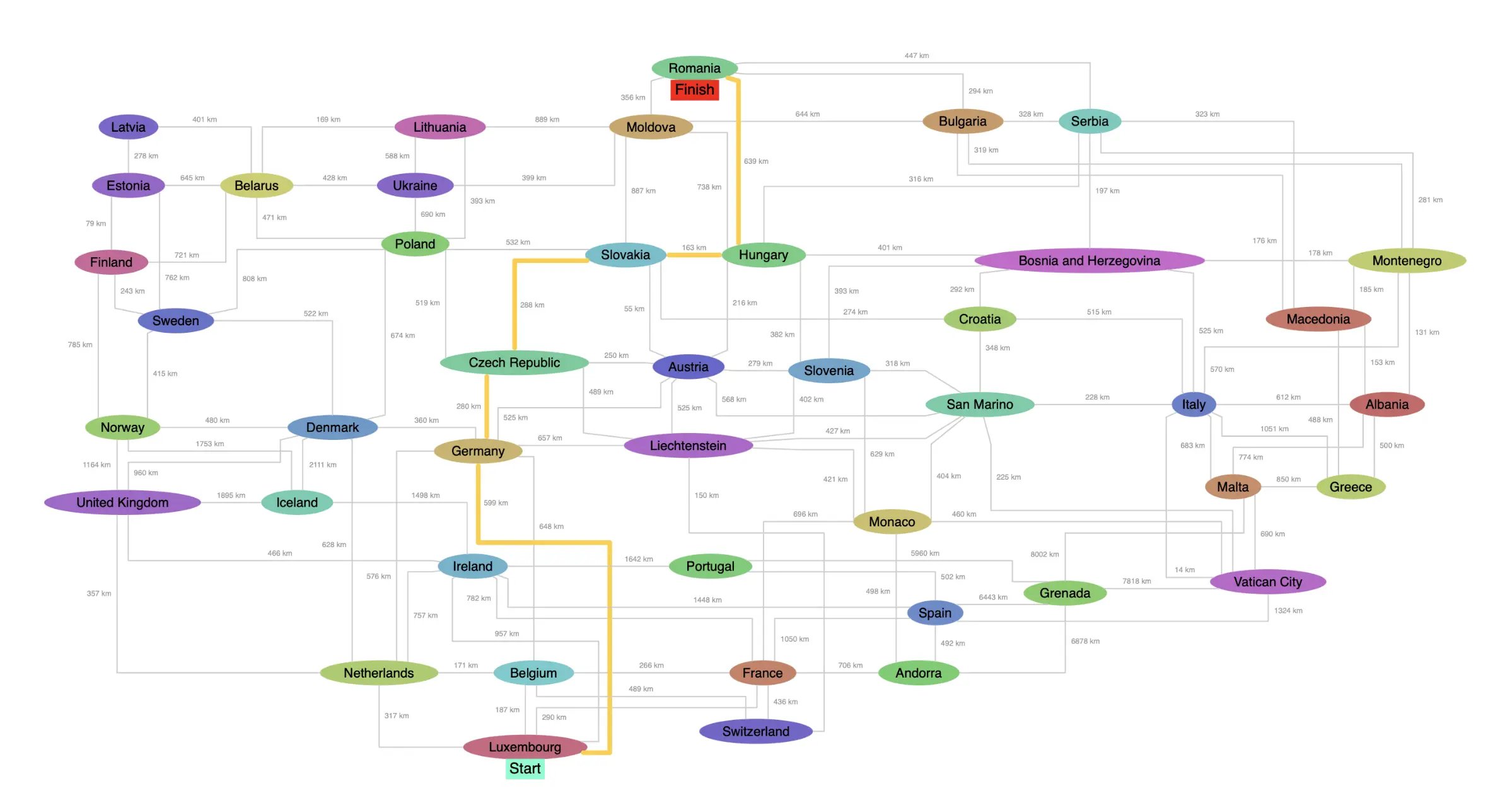
A graph of locations with the shortest path algorithm applied.
Visualizing these algorithms not only aids in understanding their operation and verifying their correctness but also offers insights into the graph's structure and properties, such as the presence of cycles and the distribution of edge weights. This can be particularly useful for educational purposes and for developing new algorithms. Python graph visualization makes it possible to explore these properties interactively, enhancing both learning and innovation.
Graph Database Visualization
Graph databases store data in graph structures, enabling efficient querying of relationships. Visualizing data from these databases can provide deep insights into the connections and interactions within the data, making complex relationships easier to understand and analyze.
- Neo4j: Neo4j is one of the most popular graph databases, offering robust tools for visualizing graph data directly from the database. This capability is particularly useful for understanding complex relationships and patterns within the data. Neo4j's visualization tools allow users to explore the data interactively, providing a more intuitive understanding of the graph structure. Using Python graph visualization tools in conjunction with Neo4j can enhance the analytical capabilities and clarity of the visualizations.
- AWS Neptune: Amazon's graph database service, AWS Neptune, supports both property graphs and RDF graphs. Visualization tools integrated with Neptune help explore the data stored, providing clear and intuitive representations of relationships. This is especially useful in applications like knowledge graphs, where understanding the connections between different entities is crucial. Combining AWS Neptune with Python graph database visualization can significantly improve the interpretability and usability of graph data.
Use-Cases for Python Graph Visualization
Python graph visualization is applicable across various domains, providing valuable insights into complex data structures. Here are some key use cases:
Knowledge Graphs: Visualizing knowledge graphs helps in understanding the relationships between different entities, providing insights into the structure of the knowledge base. This is crucial for applications in research, where visualizing the interconnections between concepts can lead to new discoveries and deeper understanding. Implementing Python graph visualization techniques in knowledge graphs makes it easier to manage and explore vast amounts of interconnected data.
Network Analysis: Visualizing network data stored in graph databases can help analyze the structure and interactions within the network. It allows for identifying key nodes and understanding overall connectivity, which is vital in fields like telecommunications, social network analysis, and transportation planning. Effective Python graph visualization of network data can reveal crucial insights and enhance decision-making processes.
Fraud Detection: Visualizing transaction data in graph databases can help detect patterns of fraudulent activity. By examining the connections and interactions between different entities, anomalies can be spotted, providing insights that can lead to the prevention of fraud. This is particularly valuable in financial services and e-commerce. Utilizing Python graph visualization for fraud detection allows for the clear identification of suspicious patterns and connections, aiding in timely and effective intervention.
Best Practices for Python Graph Visualization
Creating effective graph visualizations requires careful consideration of several factors. Here are some best practices:
- Clarity: Ensure that the visualization clearly communicates the intended message. Avoid clutter and use labels, colors, and shapes effectively to differentiate between different elements of the graph. Clear and concise labels, as well as appropriate use of color, can enhance the visualization's readability and interpretability.
- Scalability: Design visualizations that can handle large datasets efficiently. Use techniques like clustering and hierarchical layouts to simplify complex graphs. This ensures that the visualization remains comprehensible and informative, even as the size and complexity of the graph increase.
- Interactivity: Enhance user engagement by adding interactive features. This allows users to explore the graph in detail and uncover additional insights. Interactive features such as tooltips, zooming, and panning can make the visualization more engaging and informative.
- Performance: Optimize the performance of your visualizations, especially when dealing with large graphs or real-time data. Choose the right tools and techniques to ensure smooth and responsive visualizations. This includes using performance-optimized libraries like Graph-tool for large graphs and employing efficient algorithms for graph manipulation and analysis.
Conclusion
Python offers a rich ecosystem of libraries and tools for graph visualization, each with its unique strengths and use cases. From NetworkX and Matplotlib for static visualizations to Plotly and Pyvis for interactive graphs, there is a solution for every need. Understanding the fundamentals of graph theory and leveraging advanced techniques can significantly enhance the quality and effectiveness of your visualizations. By following best practices and exploring different tools, you can create insightful and engaging graph visualizations that make complex data more accessible and understandable.
Whether you are analyzing social networks, optimizing transportation routes, understanding molecular structures, or exploring business relationships, graph visualization can help you make sense of complex data and reveal the underlying patterns and connections. So, dive into the world of Python graph visualization and discover the endless possibilities it offers for exploring and understanding your data.
About the Author
Caroline Scharf, VP of Operations at Tom Sawyer Software, has 15 years experience with Tom Sawyer Software in the graph visualization and analysis space, and more than 25 years leadership experience at large and small software companies. She has a passion for process and policy in streamlining operations, a solution-oriented approach to problem solving, and is a strong advocate of continuous evaluation and improvement.
FAQ
1. Which Python libraries support hierarchical graph layouts, and when should I use them?
Libraries like NetworkX, Graph-tool, Pyvis, and Plotly support hierarchical graph layouts, though NetworkX requires integration with Graphviz for native hierarchical layouts. Hierarchical layouts are useful for data with clear parent-child relationships, such as organizational charts, taxonomies, or tree structures. For performance, use Graph-tool for large datasets, and for interactive visuals, opt for Pyvis or Plotly. Use these layouts when visualizing relationships that require layered, structured displays, like system topologies or workflows.
2. What are the most efficient ways to handle real-time data in Python graph visualizations?
For real-time data handling, use libraries like Plotly with Dash, which allow dynamic updates to your visualizations based on live data streams. Tools like Bokeh and Pyvis also support real-time interaction with data. These libraries allow you to connect to streaming data sources (e.g., WebSockets, APIs) to keep graphs updated in real-time. This is especially useful for applications like network monitoring or live dashboard analytics.
3. How can I visualize 3D graphs in Python, and when is it beneficial?
3D graph visualizations can be implemented using libraries like Plotly or PyThreeJS, which allow you to explore data in three dimensions. 3D graphs are beneficial when dealing with highly connected or spatial data, such as geographic networks, molecular structures, or complex social graphs. They allow users to rotate, zoom, and explore relationships in ways that 2D graphs may obscure, especially when handling dense or overlapping networks.
4. How do Python graph visualization libraries handle graph algorithms like shortest path and minimum spanning tree?
Libraries like NetworkX, Graph-tool, and Igraph provide built-in algorithms to compute shortest paths (using Dijkstra’s or Bellman-Ford algorithms) and minimum spanning trees (using Prim’s or Kruskal’s algorithm). Once calculated, these algorithms can be visualized to highlight important paths or minimal connections within a network. NetworkX can visualize these results with Matplotlib for static images or Pyvis for interactive exploration. These visualizations are useful for understanding network efficiency, such as in routing or infrastructure planning.
5. How can you create Python graph visualizations with Tom Sawyer Software?
To create Python graph visualizations with Tom Sawyer Software, you can first use Python libraries like NetworkX or Graph-tool to analyze and manipulate your graph data. After performing computations (such as shortest paths or community detection), export the data in a format like JSON or CSV. Then, import this data into Tom Sawyer Perspectives to take advantage of its advanced visualization and interaction features, which provide sophisticated layouts, customization, and real-time data integration capabilities. This integration allows you to harness Python’s analytical power while utilizing Tom Sawyer for enhanced visualization.
Submit a Comment