
Max Chagoya
What is Graph Network Visualization?
Graph network visualization is a method for representing the relationships and interactions within a network visually. This technique is crucial for understanding complex structures, as it allows users to see patterns, anomalies, and trends that may not be immediately apparent through raw data alone. The primary purpose of visualizing network graphs is to simplify the interpretation of complex network data, enabling better decision-making and insights.
Imagine trying to understand a massive spreadsheet filled with thousands of rows of interconnected data. This data might represent social media interactions, transport routes, or biological processes. Without a visual representation, discerning meaningful patterns or insights from such data would be incredibly challenging. It transforms this data into a visual format, creating a map of connections that is much easier to interpret.
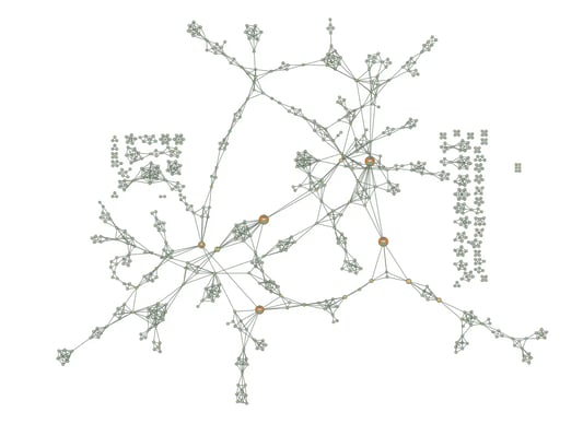
A graph visualization of the complex structure of an extensive crime network.
Understanding Graph Networks
A graph network consists of two fundamental components: nodes (also known as vertices) and edges (or links). Nodes represent entities, such as people, computers, or molecules, while edges represent the connections or relationships between these entities. Graph networks can be categorized in various ways:
Directed vs. Undirected Graphs
- Directed Graphs: In directed graphs, edges have a direction, indicating a one-way relationship.
- Undirected Graphs: In undirected graphs, edges signify bidirectional relationships.
Weighted vs. Unweighted Graphs
- Weighted Graphs: Weighted graphs have edges with assigned weights, representing the strength or capacity of the connection.
- Unweighted Graphs: Unweighted graphs treat all connections equally, with no additional information about the strength or importance of the edges.
Types of Graph Network Visualizations
Visualizing network graphs can take many forms depending on the data's nature and the analysis's goals. Here are some common types:
Adjacency Matrix
An adjacency matrix is a square grid used to represent a graph. Each cell in the matrix indicates whether an edge connects a pair of nodes. This method is particularly useful for dense graphs but can become cumbersome for sparse graphs due to the large number of zeros.
Node-Link Diagram
This is the most common form of graph network visualization. Nodes are displayed as points and edges as lines connecting these points. Node-link diagrams are intuitive and effective for small to medium-sized networks but can become cluttered as the network size increases.
Edge Bundling
Edge bundling is a technique for reducing visual clutter in dense node-link diagrams. It groups similar edges together, which helps to reveal patterns and reduces the overall number of visible lines. This method is particularly useful for networks with many connections.

A graph network visualization illustrating edge bundling.
Hive Plot
Hive plots are a method for drawing networks in a way that makes their structure more interpretable. Nodes are placed on radially distributed axes based on their network properties, and edges are drawn as curves connecting the nodes. This can help in highlighting the relationships and interactions between different groups of nodes.
The Importance of Graph Network Visualization
Why Visualize Graph Networks?
Graph network visualization acts as a bridge between raw data and actionable insights. Visualizing graph networks is essential for several reasons:
- Enhancing Data Understanding: Graph network visualization transforms complex data into a more understandable and interpretable form, making it easier to grasp the underlying relationships. By converting numerical and textual data into visual elements, it allows users to quickly comprehend the structure and dynamics of the network.
- Identifying Patterns and Relationships: Visualization helps in spotting patterns, clusters, and outliers, providing insights into the structure and behavior of the network. For instance, in social network analysis it can reveal influential individuals, tightly knit communities, and isolated groups.
- Applications in Various Fields: From social networks to biological systems, graph network visualization is used across numerous disciplines to analyze connections and interactions. In cybersecurity, it helps identify and visualize network vulnerabilities. In biology, it aids in understanding complex biochemical processes.
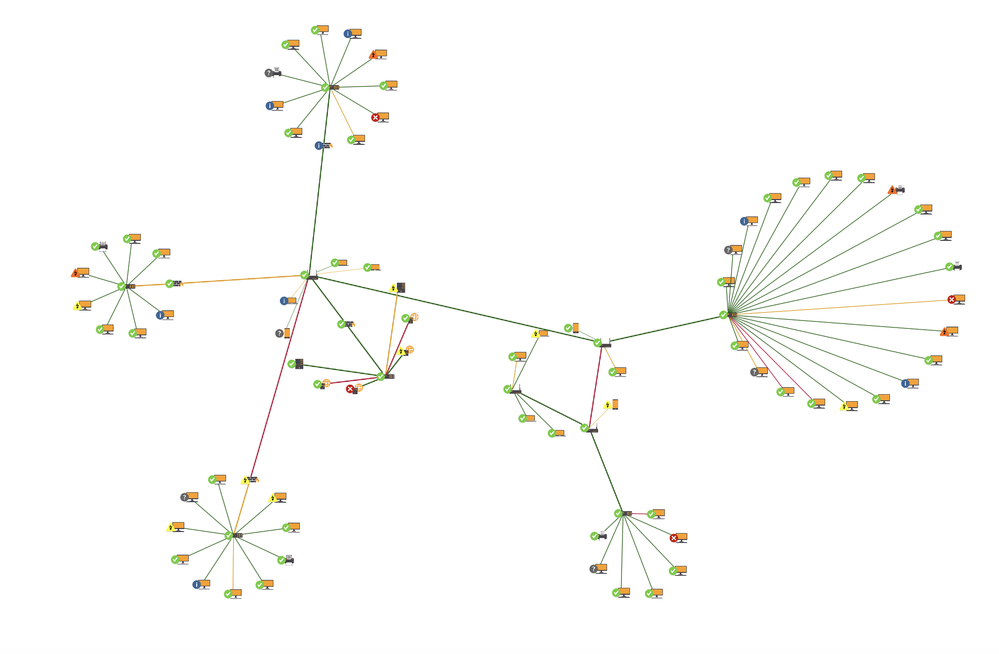
A graph visualization of a computer network helps to spot patterns, clusters, and outliers, providing insights into the structure and behavior of the network.
Real-World Benefits
Graph network visualization has a significant impact on various sectors. Here are some real-world benefits:
Improved Decision-Making
Visualizing relationships between different entities (such as customers, products, and transactions) can lead to better strategic decisions in business. For example, a retail company might visualize network graphs to understand customer purchase behavior, identify popular product bundles, and optimize inventory management.
Enhanced Security
In cybersecurity, graph network visualization helps in mapping network traffic, identifying unusual patterns, and detecting potential threats. By visualizing the connections between network nodes, security professionals can quickly spot anomalies and take proactive measures to protect the system.
Advanced Research
In academic and scientific research, graph network visualization enables the exploration of complex datasets, such as gene interactions, social networks, and ecological systems. Researchers can use these visualizations to generate hypotheses, discover new patterns, and communicate their findings effectively.
Tools and Techniques for Graph Network Visualization
Tools for Graph Network Visualization
Gephi
Gephi is an open-source network analysis and visualization software that has gained popularity for its dynamic and hierarchical graph analysis capabilities. It allows users to explore network data interactively, offering a range of layout algorithms and customization options. Gephi is particularly useful for exploratory data analysis in fields like social network analysis, biological network analysis, and beyond. Its ability to handle large networks and perform real-time visualization makes it a favorite among researchers and data scientists.
Cytoscape
Cytoscape, initially developed for biological research, has evolved into a versatile platform for visualizing complex networks. It supports integration with various tools and data sources, and its extensive library of plugins allows users to perform customized analyses. Cytoscape's strengths lie in its applicability to systems biology, genomics, and other biomedical research areas. The platform's ability to manage and visualize large-scale networks, combined with its robust plugin ecosystem, makes it an indispensable tool for researchers in these fields.
NodeXL
NodeXL is a network analysis and visualization tool that integrates seamlessly with Microsoft Excel. This makes it accessible to users who are already familiar with Excel's interface and functionality. NodeXL provides a straightforward way to manipulate and visualize network data within a spreadsheet environment. It is particularly useful for those who need basic network analysis capabilities without the steep learning curve associated with more complex software. NodeXL is ideal for business analysts, marketers, and educators who need to visualize social networks, organizational structures, or other relational data.
Graphviz
Graphviz is open-source graph visualization software that defines graphs using the DOT language. It supports a variety of layout algorithms, making it suitable for different types of network visualizations. Graphviz is widely used in software engineering to visualize data structures, algorithms, and network protocols. Its ability to produce high-quality diagrams programmatically makes it a valuable tool for technical documentation and academic research. Graphviz's flexibility and scriptability allow users to automate the generation of complex diagrams, saving time and ensuring consistency.
D3.js
D3.js is a powerful JavaScript library for creating dynamic, interactive data visualizations in web browsers. While it has a steep learning curve, D3.js offers unparalleled customization and flexibility, enabling developers to create bespoke visualizations that can be integrated into web applications. It is widely used in data journalism, interactive dashboards, and any application requiring real-time data visualization. The ability to bind data to a Document Object Model (DOM) and apply data-driven transformations to the document makes D3.js a go-to choice for sophisticated, interactive visualizations.
Tom Sawyer Perspectives
Tom Sawyer Perspectives is an advanced software platform designed for the visualization and analysis of graph and data relationships. It provides a comprehensive environment for designing and deploying sophisticated graph visualizations and diagramming applications. Tom Sawyer Perspectives supports a wide range of data sources and integrates seamlessly with enterprise systems, making it suitable for large-scale and complex data environments. Its features include powerful layout algorithms, extensive customization options, and interactive capabilities that allow users to explore and manipulate data intuitively. This tool is particularly valuable for industries such as telecommunications, financial services, and cybersecurity, where understanding complex relationships and dependencies is crucial.

An example computer network generated with Perspectives showcasing orthogonal graph layout.
Techniques and Methods
Different techniques can be used to visualize graph networks, each suited for specific types of data and analysis:
Force-directed Layouts
Force-directed layouts position nodes in such a way that all the edges are of more or less equal length and there are as few crossing edges as possible. This method uses a physical simulation to achieve a balanced layout, making it easier to see clusters and relationships within the network. Force-directed layouts are commonly used because they produce aesthetically pleasing and informative visualizations.
Hierarchical Layouts
Hierarchical layouts arrange nodes in a hierarchy, making it easier to see parent-child relationships. This method is particularly useful for organizational charts, tree structures, and other hierarchical data. By positioning nodes according to their level in the hierarchy, it becomes easier to understand the overall structure and the relationships between different levels.
Circular Layouts
Circular layouts place nodes in a circle, which can be useful for highlighting symmetrical relationships. This method is often used for visualizing cyclic relationships and for comparing the connections between nodes in a balanced way. Circular layouts can make it easier to identify central nodes and the overall connectivity of the network.
Advanced Techniques
For more complex networks, advanced techniques may be required:
Heatmaps and Node Coloring
Heatmaps and node coloring can be used to add an additional layer of information to the graph network visualization. For instance, nodes can be colored based on their centrality, degree, or other properties, providing immediate visual cues about the importance or role of each node within the network.
Dynamic and Temporal Visualization
For networks that change over time, dynamic and temporal visualization techniques are essential. These techniques allow users to see how the network evolves, track changes, and understand temporal patterns. This is particularly useful in social networks, financial transactions, and other time-dependent datasets.
3D Visualization
Three-dimensional graph network visualization can provide a more immersive and comprehensive view of complex networks. By adding the third dimension, dense networks can be visualized more easily and relationships that might be obscured in a two-dimensional layout understood.
Applications of Graph Network Visualization
Graph network visualization has numerous applications across various fields:
Social Network Analysis
Graph network visualization is used to study relationships and interactions within social networks, helping to identify influential individuals and communities. By visualizing social media interactions, companies can better understand their audience, track the spread of information, and identify key influencers. This insight is valuable for marketing, public relations, and sociological research. Common tasks in social network analysis include identifying central nodes (influencers), detecting communities, and analyzing the spread of information. Visualization helps make these tasks easier and more intuitive.
Biological Network Analysis
Graph network visualization is essential for understanding complex biological systems, such as protein-protein interactions and gene regulatory networks. In bioinformatics, visualizing these networks helps researchers identify important proteins, understand disease mechanisms, and discover potential drug targets. It provides a visual framework for exploring the complex interplay between different biological entities, aiding in the identification of key genes involved in diseases and revealing how different proteins interact within a cell.
Transportation and Logistics
In transportation and logistics, graph network visualization helps optimize routes, manage traffic flows, and analyze transportation networks. By visualizing transportation data, planners can identify bottlenecks, optimize delivery routes, and improve overall efficiency. This application is critical for urban planning, logistics management, and transportation engineering, enabling the design of better traffic flow patterns and the optimization of supply chain routes for improved performance.
Cybersecurity and Fraud Detection
Graph network visualization is used to identify and analyze network vulnerabilities, detect fraud, and prevent cyber-attacks. By visualizing network traffic, cybersecurity professionals can spot unusual patterns, trace the source of attacks, and understand the spread of malware. This visualization is crucial for maintaining the security and integrity of information systems.
In fraud detection, visualizing transaction networks can help identify suspicious patterns and connections, making it easier to detect fraudulent activities. Similarly, visualizing network traffic can help identify unusual behavior indicative of a cyber attack.
Additional Applications
Graph network visualization has many other applications beyond the ones mentioned above. Here are a few more examples:
Healthcare
In healthcare, graph network visualization can be used to visualize patient data, track disease outbreaks, and understand patient relationships.
Finance
In finance, graph network visualization can help in understanding financial transactions, analyzing market networks, and detecting fraud.
Telecommunications
In telecommunications, graph network visualization can help in managing network infrastructure, analyzing call data records, and optimizing network performance.
Challenges in Graph Network Visualization
Despite its benefits, graph network visualization also presents several challenges:
- Scalability Issues: As the size of the network grows, visualizing it becomes increasingly difficult due to computational and rendering limitations. Large networks can overwhelm standard visualization tools, making it hard to maintain performance and clarity. This can be addressed by using more powerful hardware, optimizing algorithms, or employing techniques such as clustering to reduce the complexity of the visualization.
- Visual Clutter: In large and dense networks, the visualization can become cluttered, making it hard to discern meaningful patterns. Too many nodes and edges can lead to a tangled and confusing visual representation, reducing the effectiveness of the visualization. Techniques like edge bundling, filtering, and zooming can help manage visual clutter.
- Interpretation Complexity: Complex visualizations can be difficult to interpret, especially for users without a background in network analysis. Understanding the nuances of a detailed graph network visualization requires expertise and experience, which can be a barrier to broader accessibility. Providing interactive features, tooltips, and explanatory notes can help users better understand the visualization.
Technical Challenges
Apart from the general challenges, there are several technical challenges associated with graph network visualization:
Data Integration
Integrating data from different sources to create a comprehensive graph network can be challenging. Different data sources may have different formats, structures, and qualities, making it difficult to combine them into a single network. This requires careful preprocessing and data cleaning to ensure consistency and accuracy.
Performance Optimization
Optimizing the performance of graph network visualization tools is crucial, especially for large networks. This involves developing efficient algorithms for layout computation, rendering, and interaction. Performance optimization can be achieved through techniques such as parallel processing, hardware acceleration, and algorithmic improvements.
User Experience
Designing an effective user interface for graph network visualization tools is essential for ensuring usability and accessibility. This involves creating intuitive controls, interactive features, and responsive layouts. A good user experience can make it easier for users to explore and analyze the network, leading to better insights and decision-making.
Best Practices for Effective Graph Network Visualization
To effectively visualize network graph, consider the following best practices:
- Choosing the Right Layout: Select a layout that best represents the data and highlights the key relationships and patterns. Different layouts can emphasize different aspects of the network, so choose one that aligns with your analysis goals. For example, use a force-directed layout for general exploration, a hierarchical layout for hierarchical data, and a circular layout for data with natural clusters.
- Simplifying the Graph: Reduce the number of nodes and edges where possible to minimize clutter and enhance readability. Focus on the most important connections and entities to create a clearer and more informative visualization. Techniques such as filtering, aggregation, and clustering can help simplify the graph without losing important information.
- Using Color and Size Effectively: Utilize color and size to encode additional information and make important elements stand out. For example, different colors can be used to represent different types of nodes or edges and the size of nodes can be adjusted based on their importance or degree of connectivity. This can help users quickly identify key elements and understand the overall structure of the network.
- Interactive Features: Incorporate interactive features such as zooming, panning, filtering, and tooltips to enhance user experience and exploration. Interactive features can help users explore the network in more detail, focus on specific areas, and access additional information.
- Clarity and Consistency: Ensure that the visualization is clear and consistent, with well-labeled nodes and edges, a clean layout, and a coherent color scheme. Avoid unnecessary complexity and focus on creating a visualization that is easy to interpret and understand.
- Context and Explanation: Provide context and explanations to help users understand the visualization. This can include labels, legends, annotations, and explanatory notes. Providing context can help users understand the visualization's meaning and insights.
Final Thoughts
Graph network visualization is a powerful tool for understanding complex networks and relationships. By transforming raw data into visual representations it enhances data comprehension, identifies patterns, and supports decision-making across various fields. Despite the challenges involved, technological advancements and adherence to best practices continually improve the effectiveness of graph network visualizations. As these techniques evolve, they become even more valuable for researchers, analysts, and professionals looking to gain deeper insights from their data.
About the Author
Max Chagoya is Associate Product Manager at Tom Sawyer Software. He works closely with the Senior Product Manager performing competitive research and market analysis. He holds a PMP Certification and is highly experienced in leading teams, driving key organizational projects and tracking deliverables and milestones.
FAQ
1. How do I choose the right tool for graph network visualization based on my project needs?
Different tools have unique strengths. For instance, Gephi is excellent for exploratory analysis of large datasets, while D3.js is ideal for creating highly customized, interactive web-based visualizations. If your project involves large-scale, complex networks that require integration with enterprise systems, Tom Sawyer Perspectives is a powerful tool. It provides advanced layout algorithms, extensive customization, and interactive capabilities, making it ideal for industries like telecommunications, cybersecurity, and financial services. Understanding the nature of your data (static or dynamic) and the level of interactivity and complexity you need will help you select the right tool.
2. How can I integrate data from different sources into a unified graph network?
Integrating data from multiple sources into a unified graph network involves several steps. First, preprocess the data by normalizing formats (e.g., CSV, JSON) and removing duplicates. Then, map relationships between entities from different datasets, such as linking a "user" in one dataset to a "customer" in another. Tools like Tom Sawyer Perspectives, Neo4j, or Gephi can be used to combine datasets by importing node and edge lists and linking common identifiers. Finally, you can use these tools to visualize the unified network, clearly showing relationships from multiple data sources.
3. How can graph network visualization help in predictive analysis or forecasting?
You can use graph network visualizations to identify predictive patterns or behaviors by integrating machine learning algorithms with network analysis. For example, in social networks, you can predict the spread of information, or in transportation networks, forecast traffic patterns.
4. How do I handle overlapping nodes and edges in dense graphs?
In dense graphs, overlapping nodes and edges can make the visualization difficult to interpret. To declutter the view, you can use edge bundling, clustering, or hierarchical layouts. Additionally, interactive features like zooming and panning can help users explore dense networks more effectively.
5. How do you visualize temporal networks while maintaining the contextual history of node and edge changes?
Temporal graphs require visualizing how the structure and relationships within a network evolve over time. What are the optimal approaches for visualizing temporal changes while preserving historical context, such as using time sliders, animated transitions, or dynamic graphs?
6. How can graph embeddings be used to improve the visualization of high-dimensional graph data?
Graph embeddings reduce the dimensionality of graph data while preserving its structural properties. What are the most effective embedding techniques (e.g., node2vec, DeepWalk), and how can you use these embeddings to enhance visualizations, particularly in detecting patterns or anomalies in large networks?
7. What are the trade-offs between real-time and batch-mode visualizations for monitoring network data?
Real-time graph visualizations provide immediate insights into dynamic networks but may introduce performance issues. How can you balance real-time responsiveness with the need for accuracy and performance, and when should you consider using batch-mode updates instead?
Submit a Comment