
Max Chagoya
Understanding Neo4j Graph Visualization
Neo4j graph visualization is a method of representing graph data in a visual format, making it easier to understand the relationships and interactions between different data points. This visualization is crucial for several reasons:
- Enhanced Data Insights: By visualizing data, users can quickly identify patterns, trends, and anomalies that are not immediately apparent in raw data.
- Improved Data Relationships Understanding: Visualizing data relationships helps in comprehending how different entities are interconnected, providing a clearer picture of the data structure.
- Better Decision-Making: With clear visual insights, organizations can make more informed decisions based on the underlying data relationships and patterns.
Graph visualization in Neo4j goes beyond simple charts and graphs. It involves sophisticated tools and techniques to represent complex data structures dynamically. These visualizations are interactive, allowing users to explore the data by zooming, panning, and clicking on nodes and edges to reveal deeper insights.
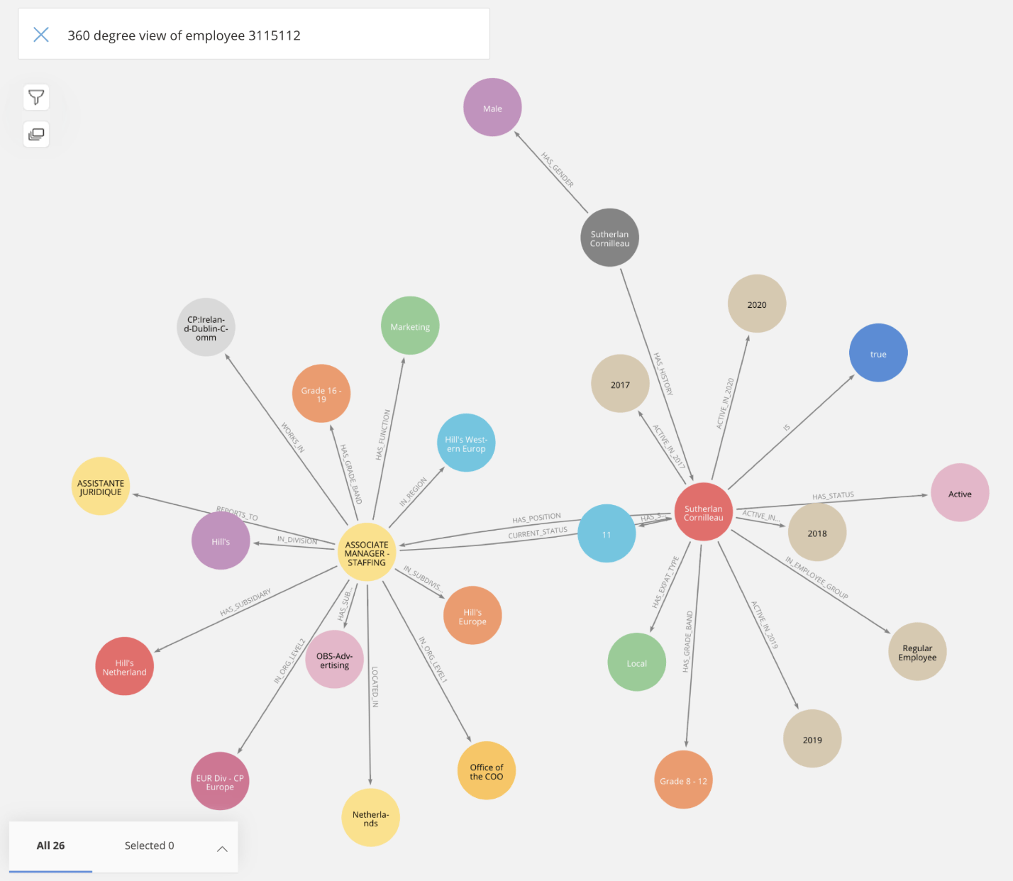
A Neo4j graph visualization.
One of the key advantages of graph visualization in Neo4j is its ability to handle large and complex datasets efficiently. Unlike traditional relational databases, Neo4j is designed to manage highly connected data, making it ideal for applications that require understanding intricate relationships. Whether it's social networks, supply chains, or knowledge graphs, integrating Neo4j in social graph analysis provides a powerful way to analyze and interpret data.
In addition to simplifying data interpretation, Neo4j graph visualization also enhances collaboration within teams. Visual representations make it easier for team members to discuss and analyze data, fostering a more collaborative environment. By visualizing data, teams can align their understanding and make collective decisions based on shared insights.
Moreover, Neo4j graph visualization aids in storytelling. Data visualization transforms raw data into narratives that can be easily understood and communicated to various stakeholders. Whether presenting to executives, clients, or team members, a well-designed graph visualization can effectively convey complex information in a digestible format.
The importance of Neo4j graph visualization extends to various industries. In healthcare, for example, visualizing patient data and treatment outcomes can help identify trends and improve patient care. In finance, graph visualization can reveal hidden patterns in transaction data, aiding in fraud detection and risk management. Neo4j for network graph visualization is also significant in cybersecurity, network management, and other fields where understanding intricate networks is crucial. The applications are vast and diverse, underscoring the significance of mastering Neo4j graph visualization.
Tools for Neo4j Visualization
A wide range of tools are available for Neo4j visualization, each with its unique features and use cases. These tools help in transforming complex graph data into understandable visual formats, making it easier for users to interact with and analyze the data. Here are some of the most popular Neo4j visualization tools:
- Neo4j Bloom: Neo4j Bloom is a visualization tool specifically designed for Neo4j databases. It offers an intuitive, codeless interface that allows users to explore and visualize graph data easily. Bloom's visual narrative approach makes it suitable for business users and analysts who need to derive insights without writing complex queries. Neo4j Bloom provides a powerful way to explore and share graph data insights. Users can create custom perspectives, which are tailored views of the graph data, allowing them to focus on specific aspects relevant to their analysis. This customization makes Bloom adaptable to various use cases, from data discovery to operational analysis.
- Linkurious: Linkurious is a powerful graph visualization and analysis platform that integrates seamlessly with Neo4j. It provides advanced features such as pattern detection, customizable dashboards, and real-time collaboration. Linkurious is widely used in fields like cybersecurity, fraud detection, and network analysis. One of Linkurious's standout features is its ability to handle large-scale graph data. It offers advanced filtering and search capabilities, making it easier to navigate and analyze complex networks. Linkurious also supports collaborative analysis, allowing multiple users to work together in real time, which is particularly useful for investigative and analytical tasks.
- KeyLines: KeyLines is a JavaScript-based visualization toolkit that offers highly customizable and interactive graph visualizations. It supports various data sources, including Neo4j, and is known for its performance and flexibility. KeyLines is ideal for developers who need to build bespoke visualization solutions. KeyLines provides a range of visualization options, including network diagrams, geospatial maps, and timelines. This versatility makes it suitable for various applications, from social network analysis to supply chain management. KeyLines' API allows developers to create highly tailored visualizations, ensuring that the tool can meet specific project requirements.
- GraphXR: GraphXR is a cloud-based graph visualization tool that combines 3D visualization with powerful analytics. It supports Neo4j and other graph databases, providing an immersive experience for exploring large and complex datasets. GraphXR is used in applications such as knowledge graph visualization and geospatial analysis. GraphXR's 3D visualization capabilities set it apart from other tools. By leveraging 3D space, GraphXR allows users to explore complex datasets more intuitively and engagingly. This is particularly beneficial for applications that require understanding multi-dimensional relationships and spatial data.
- Tom Sawyer Perspectives: Tom Sawyer Perspectives is a comprehensive software development platform for building advanced graph and data visualizations. It supports Neo4j and other graph databases, offering a range of features for designing, developing, and deploying interactive visualization applications. Tom Sawyer Perspectives excels at handling complex and large-scale graph data. It provides powerful layout algorithms, customizable styles, and interactive features that enhance the visualization experience. The Query Builder and Load Neighbors features add support for advanced graph pattern searches without the need for knowledge of the Gremlin or Cypher query languages. This functionality enables application users to search for graph patterns through an intuitive graph visualization. The tool is particularly useful for applications requiring detailed analysis and presentation of graph data, such as network management, intelligence analysis, and engineering design. One of Tom Sawyer Perspectives' key strengths is its ability to integrate with various data sources and provide a unified visualization platform. This makes it a versatile tool for organizations that need to visualize and analyze data from multiple sources coherently.

A swimlane graph visualization of federated data produced with Tom Sawyer Perspectives.
These Neo4j visualization tools offer different features and capabilities, catering to various user needs and technical requirements. Choosing the right tool depends on factors such as the complexity of the data, the specific use case, and the level of customization required. For instance, while Neo4j Bloom is ideal for business users seeking simplicity, KeyLines and GraphXR provide advanced customization and 3D visualization options for developers and analysts. Tom Sawyer Perspectives, on the other hand, offers a powerful platform for building sophisticated visualization applications that can handle complex and large-scale graph data.
Neo4j Graph Visualization in React
React, a popular JavaScript library for building user interfaces, offers a robust platform for creating dynamic and interactive graph visualizations. Using Neo4j graph visualization React has several advantages:
- Component-Based Architecture: React's component-based architecture allows developers to build reusable and maintainable visualization components.
- Rich Ecosystem: React has a rich ecosystem of libraries and tools that facilitate graph visualization, making it easier to integrate with Neo4j.
- Interactive UI: React's virtual DOM and efficient rendering mechanisms enable the creation of highly interactive and responsive visualizations.
Several libraries and frameworks can be used with React to create Neo4j graph visualizations. Some of the most notable ones include:
- Neovis.js: Neovis.js is a library specifically designed to integrate Neo4j with web applications using JavaScript. It leverages the power of Neo4j's Cypher query language and the visualization capabilities of the D3.js library to create interactive graph visualizations. Neovis.js simplifies the process of connecting to a Neo4j database and rendering graph data in a browser. Neovis.js is particularly useful for developers looking to quickly integrate Neo4j graph visualizations React into their web applications. It provides built-in support for rendering nodes and relationships, as well as features like node highlighting, layout algorithms, and interaction handling. This makes it a powerful tool for creating interactive graph visualizations with minimal setup.
- D3.js: D3.js is a powerful JavaScript library for creating data-driven visualizations. It provides extensive customization options and supports various types of visualizations, including graphs and networks. D3.js allows developers to create highly customized and interactive visualizations by binding data to the DOM and applying data-driven transformations. D3.js's flexibility makes it a favorite among developers who require fine-grained control over their visualizations. It supports a wide range of visualization types and can be integrated with other libraries and frameworks. While D3.js has a steeper learning curve than some other libraries, its versatility and power make it an invaluable tool for complex visualization projects.
- React-Graph-Vis: React-Graph-Vis is a React wrapper for the popular Vis.js library, which provides easy-to-use and highly interactive graph visualizations. Vis.js offers a range of visualization options, including network graphs, timelines, and 3D graphs. React-Graph-Vis simplifies the process of integrating Vis.js visualizations into React applications. Using React-Graph-Vis, developers can quickly create interactive Neo4j graph visualization React within their React applications. It provides an intuitive API for configuring and customizing visualizations, making it easy to create rich and responsive user interfaces. React-Graph-Vis also supports various interaction features, such as node dragging, zooming, and panning, enhancing the user experience.
- Tom Sawyer Perspectives: Tom Sawyer Perspectives includes a native React-based web client framework for data visualization views, toolbars, dialogs, context menus, as well as the Web Previewer. In addition, this framework includes modern styles for view components, tabs, toolbars, and dialogs, which bring a modern look and feel to Perspectives applications. The Generate Web Application Code feature supports the creation of React web applications using the new React-based view components.
By combining these libraries with React, developers can create sophisticated and interactive Neo4j graph visualizations that provide deep insights into the data. The choice of library depends on the specific requirements of the project, including the level of customization needed, the complexity of the data, and the desired user experience.
Neo4j Graph Visualization in Python
Python, known for its simplicity and versatility, is another excellent choice for Neo4j graph visualization. Python's extensive libraries and frameworks make it easy to connect to Neo4j and create compelling visualizations. Here are some of the key libraries used for Neo4j graph visualization in Python:
- Py2neo: Py2neo is a comprehensive toolkit for working with Neo4j from within Python applications. It provides a simple and intuitive API for connecting to Neo4j, executing queries, and handling graph data. Py2neo supports both synchronous and asynchronous operations, making it suitable for a wide range of applications.
Py2neo simplifies the process of integrating Neo4j with Python, allowing developers to focus on building their applications rather than dealing with complex database interactions. It supports various Neo4j features, including Cypher query execution, graph algorithms, and transaction management. Py2neo also integrates well with other Python libraries, making it a versatile tool for Neo4j development. - NetworkX: NetworkX is a powerful library for the creation, manipulation, and study of complex networks. It offers extensive functionality for analyzing graph structures and generating visualizations. NetworkX supports various graph types, including directed, undirected, and multi-graphs, making it suitable for a wide range of applications. NetworkX provides a comprehensive set of tools for network analysis, including algorithms for pathfinding, clustering, and centrality measures. It also supports graph visualization, allowing developers to create static and interactive visualizations of graph data. While NetworkX is primarily focused on analysis, it integrates well with other libraries for visualization, such as Matplotlib and Plotly. This makes NetworkX a valuable tool for Neo4j Python graph visualization projects.
- Plotly: Plotly is a popular library for creating interactive and publication-quality visualizations. It supports various types of visualizations, including graphs and networks, and integrates seamlessly with Neo4j. Plotly offers a user-friendly API for creating interactive visualizations, making it easy to generate complex graphs with minimal code. Plotly is particularly well-suited for creating interactive dashboards and web applications. It provides a wide range of chart types and customization options, allowing developers to create visually appealing and interactive visualizations. Plotly's integration with Dash, a web application framework, further enhances its capabilities, enabling the creation of full-fledged analytical applications.
- Dash: Dash is a framework for building analytical web applications using Python. It leverages Plotly for visualization and provides a user-friendly interface for creating interactive dashboards. Dash applications are highly customizable and can integrate with various data sources, including Neo4j. Dash simplifies the process of creating interactive web applications by providing a declarative approach to building user interfaces. Developers can define the layout and behavior of their applications using Python code, making it easy to create complex applications without needing extensive front-end development skills. Dash's integration with Plotly ensures that visualizations are interactive and high-quality, making it a robust framework for Neo4j Python graph visualization.
The choice of library depends on the specific requirements of the project, including the level of interactivity needed, the complexity of the data, and the desired user experience.
Advanced Techniques and Best Practices for Neo4j Graph Visualization
As data grows in size and complexity, advanced techniques and best practices become essential for effective Neo4j graph visualization. Here are some key techniques and practices to consider:
- Clustering: Clustering techniques help group related nodes together, making it easier to identify patterns and relationships within large graphs. Clustering algorithms, such as k-means, Louvain, and Girvan-Newman, can be used to identify communities and substructures within the graph. Visualizing clustered data helps in understanding the overall structure and identifying key groups within the data.
- Filtering: Filtering allows users to focus on specific subsets of the data, improving clarity and reducing visual clutter. Filters can be applied based on node and edge attributes, such as type, weight, and degree. Interactive filtering enables users to dynamically adjust the visualization based on their specific needs and preferences, enhancing the overall user experience.
- Interactive Visualizations: Interactive features such as zooming, panning, and node clicking enhance user engagement and provide deeper insights into the data. Interactive visualizations allow users to explore the graph data in a more intuitive and engaging way, making it easier to uncover hidden patterns and relationships. Features like tooltips, highlighting, and context menus further enrich the user experience.

An advanced graph visualization with clustering produced with Tom Sawyer Perspectives.
Performance optimization is also important for maintaining smooth and responsive visualizations. This includes efficient querying, caching strategies, and choosing the right visualization libraries based on the dataset's characteristics. Here are some best practices for optimizing performance:
- Efficient Querying: Use efficient Cypher queries to minimize the load on the Neo4j database. Indexing frequently queried properties and optimizing query patterns can significantly improve performance.
- Caching Strategies: Implement caching mechanisms to store frequently accessed data and reduce the load on the database. Caching can be done at various levels, including the application layer and the database layer.
- Appropriate Visualization Libraries: Choose visualization libraries that are optimized for performance and can handle large datasets efficiently. Libraries like D3.js and KeyLines are known for their performance and scalability.
Finally, adhering to best practices such as clear labeling, consistent color schemes, and intuitive layouts ensures that visualizations are easy to understand and interpret. Here are some additional best practices to consider:
- Clear Labeling: Ensure that nodes and edges are clearly labeled and that labels are readable at various zoom levels. Use tooltips and legends to provide additional context and information.
- Consistent Color Schemes: Use consistent color schemes to represent different node and edge types. Color coding helps quickly identify different elements and understand their relationships.
- Intuitive Layouts: Choose layout algorithms that enhance the clarity and readability of the visualization. Force-directed layouts, hierarchical layouts, and circular layouts are some common options. Experiment with different layouts to find the one that best represents the data.

A graph with edge and connector labels produced with Tom Sawyer Perspectives.
Conclusion
Neo4j graph visualization is a powerful tool for uncovering insights within complex data relationships. By leveraging the right tools and techniques, users can transform raw data into interactive and intuitive visual formats, enhancing data understanding and decision-making.
Whether using React or Python, the versatility and power of these platforms enable the creation of dynamic and insightful Neo4j graph visualizations. React's component-based architecture and rich ecosystem of libraries, combined with Python's simplicity and extensive data-handling capabilities, provide a robust foundation for building sophisticated visualizations.
By exploring and experimenting with different tools and techniques, users can unlock the full potential of their data and gain valuable insights that drive better decisions. Tools like Tom Sawyer Perspectives further enhance this process. Tom Sawyer Perspectives offers comprehensive support for Neo4j and other graph databases, providing advanced layout algorithms, customizable styles, query builder with pattern matching, and additional interactive features. This makes it particularly suitable for complex and large-scale graph visualizations in both React and Python environments. Developers can leverage Tom Sawyer Perspectives to create highly detailed and interactive visualization applications that handle complex data structures with ease.
With Neo4j graph visualization, the possibilities are endless. Whether you are analyzing social networks, investigating fraud, managing supply chains, or visualizing knowledge graphs, Neo4j graph visualization provides the tools and techniques needed to turn complex data into actionable insights.
About the Author
Max Chagoya is Associate Product Manager at Tom Sawyer Software. He works closely with the Senior Product Manager performing competitive research and market analysis. He holds a PMP Certification and is highly experienced in leading teams, driving key organizational projects and tracking deliverables and milestones.
FAQ
How can I optimize Neo4j graph visualization performance for large datasets?
Performance optimization is crucial when working with large datasets in Neo4j. Use efficient Cypher queries by indexing commonly queried properties and avoiding deeply nested queries. Implement caching strategies at the application level to store frequently accessed graph data, reducing database load. Choose tools and libraries optimized for large-scale graphs, such as Tom Sawyer Perspectives or KeyLines, which offer high-performance rendering and interactive features for handling large volumes of data.
What are the best techniques for handling dense and highly connected networks in Neo4j visualizations?
Dense networks can cause visual clutter, making it difficult to interpret relationships. To mitigate this, clustering algorithms like Louvain or k-means can be used to group related nodes and reduce complexity. Edge bundling can help manage overlapping edges by grouping similar connections, and interactive filtering allows users to hide less relevant nodes or edges dynamically. Additionally, employing force-directed or hierarchical layouts helps to organize dense networks better.
How do I visualize temporal graph data in Neo4j for time-based analysis?
Temporal graph visualization is useful when analyzing how relationships change over time. Tools like GraphXR and Neo4j Bloom can display dynamic visualizations where users can view snapshots or animations of the graph at different time intervals. Additionally, libraries such as Plotly with Dash enable the creation of interactive dashboards where users can manipulate time sliders to explore graph changes over time.
What strategies can I use for multi-dimensional graph visualization in Neo4j?
When dealing with multi-dimensional data, tools like GraphXR allow users to visualize graphs in 3D, making it easier to explore relationships in space or across different dimensions. For example, in geospatial analysis, 3D visualizations can map node positions in physical space while representing additional dimensions such as time or intensity through color or size. D3.js can also be customized using interactive visuals and layout adjustments to represent different dimensions.
How can I leverage Neo4j visualization for real-time data analysis?
To visualize real-time data from Neo4j, tools like Linkurious and KeyLines support live updates to graph visualizations. By connecting to streaming data sources, these platforms allow continuous updates to nodes and edges, reflecting real-time changes in the network. Real-time visualization is particularly useful in areas like fraud detection, where immediate insights are critical. WebSocket connections or stream processing platforms like Kafka can also be integrated to push real-time updates into graph visualizations.
Submit a Comment