
Caroline Scharf
Vice President of Operations
What is d3.js Graph Visualization?
d3.js graph visualization is an essential technique in the field of data analysis and presentation, leveraging the robust capabilities of the d3.js JavaScript library. This tool enables developers and data scientists to convert complex datasets into interactive and dynamic visual representations, making it easier to identify patterns, trends, and insights.
The power of d3.js graph visualization lies in its ability to marry data with graphics, allowing for a more intuitive understanding of complex information. By utilizing web standards like HTML, SVG, and CSS, d3.js empowers users to create visualizations that are not only informative but also highly interactive and adaptable to various data narratives.
d3.js graph visualization stands out for its flexibility and depth, and it caters to a wide range of visualization needs, from simple bar charts to intricate network diagrams, making it a versatile tool for anyone dealing with data visualization.
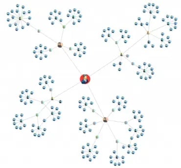
An informative network graph visualization of a criminal network.
Fundamental Concepts of d3.js Graph Visualization
d3.js graph visualization revolves around a few important concepts that form the basis of its powerful visualization capabilities.
Data-Driven Documents
- At its core, d3.js stands for Data-Driven Documents. This concept refers to the method of dynamically generating and manipulating web documents based on data. In d3.js graph visualization, this means binding data to the DOM (Document Object Model) elements and applying transformations to those elements based on the data values. This dynamic and interactive approach allows the visual elements of a webpage to change in response to user actions or data updates, making d3.js a potent tool for creating responsive, data-driven visualizations.
Scales and Axes
- Scales are fundamental in d3.js graph visualization as they translate data values into visual dimensions that can be rendered on the screen. For instance, a linear scale might map a set of numerical data points to a line chart's pixel range, determining how the data is displayed in terms of height or width. There are various types of scales in d3.js, including linear, time, ordinal, and logarithmic, each serving different visualization needs.
- Axes in d3.js provide a context for understanding the scales by visually representing the scale's range on the chart. They typically include ticks and labels to help users interpret the data represented on the graph. Creating axes involves defining their orientation (horizontal or vertical) and positioning them in the d3.js graph visualization layout.
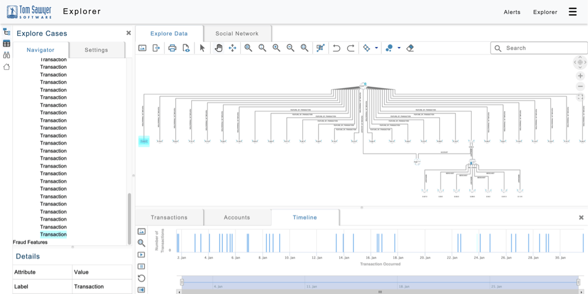
A bar chart with labeled axes.
SVG Elements
- SVG (Scalable Vector Graphics) is an XML-based format for describing two-dimensional graphics. In d3.js graph visualization, SVG is used to draw the graphical elements like lines, circles, rectangles, and paths that represent the data. SVG elements are scalable and can be easily styled and animated, making them ideal for complex visualizations that require detailed graphical representations.
Data Binding
- Data binding is a key feature in d3.js that connects the data to the SVG elements. Through data binding, d3.js selects DOM elements, binds them to the data, and then applies transformations to those elements to generate the visualization. This process is often described in three phases: enter, update, and exit. The enter phase introduces new data points and creates corresponding new elements. The update phase adjusts existing elements as the data changes. The exit phase removes elements that no longer have associated data points.
- Understanding these core concepts of d3.js graph visualization is crucial for effectively using the library to create interactive and dynamic visualizations that not only display data but also tell a story.
Advanced d3.js Graph Visualization Techniques
Advancing in d3.js graph visualization means exploring more sophisticated techniques that enhance the interactivity and analytical depth of the visualizations. These techniques can transform static charts into dynamic narratives that offer insights into complex data sets.
Interactive Legends and Dynamic Data Filtering
One of the key features of advanced d3.js graph visualization is the ability to make graphs interactive. Interactive legends, for example, allow users to highlight or filter the data points within the graph, making it easier to focus on specific aspects of the data. Dynamic data filtering goes a step further by enabling real-time adjustments to the visualization based on user inputs, allowing for a more explorative analysis of the data.
Custom Animation and Transitions
Animations and transitions in d3.js graph visualization can significantly enhance the user experience by providing a smooth flow of data changes over time. Custom animations can be used to draw attention to specific changes in the data, while transitions smoothly update the visualization when the underlying data changes, helping to tell a compelling story as the data evolves.
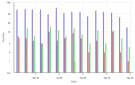
A graph visualization with controls to dynamically visualize changes over time.
Force-Directed Graphs
For representing complex network structures, force-directed graphs are an invaluable tool within d3.js graph visualization. These graphs use physical simulation to layout network nodes and links in a way that visually conveys the relational structures and hierarchies, making them ideal for visualizing social networks, organizational structures, and other interconnected data.
Applications of d3.js Graph Visualization
d3.js graph visualization is not just a tool for creating charts and graphs; it's a comprehensive framework that can be applied to a wide range of real-world scenarios. Here are some key applications that highlight its versatility and impact:
Data Analysis and Business Intelligence
In the realm of business intelligence and data analysis, d3.js graph visualization enables companies to transform their raw data into intuitive and actionable insights. Interactive dashboards, financial charts, and performance metrics are commonly developed using d3.js, helping analysts and executives make informed decisions based on the visualized data trends and patterns.
Scientific and Research Purposes
Researchers utilize d3.js graph visualization to present complex scientific data in a more accessible format. From plotting experimental results to mapping genomic sequences, d3.js facilitates the detailed and precise representation of scientific information, aiding in the exploration and communication of research findings.
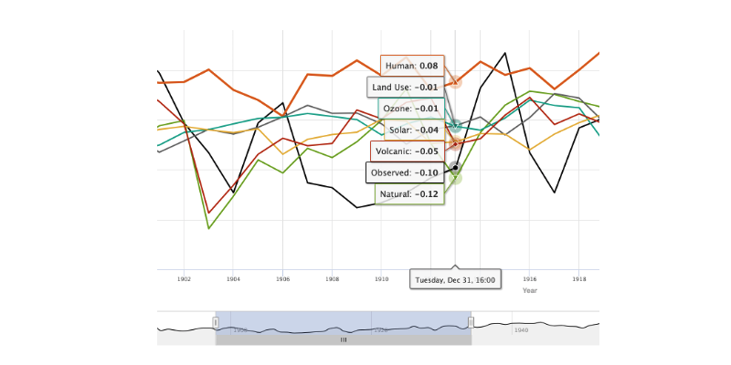
- Visualization of the various causes and their impact on climate change.
Social Network Analysis
d3.js graph visualization is particularly effective for visualizing social network structures, showcasing the relationships and interactions between individuals or groups. Force-directed graphs, which highlight the connections and clusters within networks, provide insights into the dynamics and hierarchies of social systems.
Geographic and Spatial Mapping
As seen in d3.js map visualization, d3.js is adept at creating interactive maps that represent geographic or spatial data. These maps are used for a variety of purposes, including urban planning, environmental monitoring, and location-based analytics, offering a dynamic way to explore and understand geographic information.
Real-time Data Visualization
For scenarios requiring real-time monitoring, such as network traffic, stock market fluctuations, or social media activity, d3.js graph visualization offers the ability to dynamically update and display data as it changes. This capability is crucial for applications where timely information is essential for rapid decision-making or immediate analysis.
Educational Tools
Educators and e-learning platforms leverage d3.js graph visualization to create interactive learning materials that illustrate complex concepts in mathematics, economics, science, and more. These tools enhance learning experiences by providing students with a hands-on approach to exploring data and concepts dynamically.
Interactive Storytelling and Journalism
In digital journalism and storytelling, d3.js graph visualization helps in crafting engaging narratives where readers can interact with the data. News organizations use d3.js to create data-driven stories, allowing readers to delve into the facts and figures that support journalistic reports, thereby fostering a deeper understanding of the news.
Integrating Map Visualization with d3.js
d3.js stands out for its ability to create both traditional graph visualizations and interactive, detailed maps. These maps effectively display diverse data points and geographic distributions, offering a visual platform for analyzing spatial data.
d3.js Map Visualization
Map visualizations in d3.js involve rendering geographic data to create detailed and interactive maps, which can illustrate a variety of data points and geographic distributions.
GeoJSON and TopoJSON
Utilizing formats like GeoJSON and TopoJSON, d3.js can render complex geographic layouts. GeoJSON defines simple geographical features along with their non-spatial attributes, while TopoJSON, an extension of GeoJSON, encodes topology, significantly reducing the size of the data files and enabling more efficient rendering of intricate maps.
Projection in d3.js
Projection is a core aspect of map visualization, converting the three-dimensional earth into a two-dimensional representation. d3.js offers a variety of projection functions to translate geographic coordinates into pixel coordinates on the screen, accommodating different styles of map visualizations, from traditional Mercator projections to more specialized ones like azimuthal or conic projections.
Drawing the Map
The final step in map visualization with d3.js is the actual rendering of the map. This is achieved by using SVG path elements to draw geographic features as defined in the GeoJSON or TopoJSON data. The d3.geoPath function generates the path data needed to render these features accurately, allowing for the creation of maps that are not only visually appealing but also highly interactive and informative.
Diving Deeper into d3js Graph Visualization
As we continue to explore the capabilities of d3.js, it becomes crucial to highlight the specialized segment of d3js graph visualization. This niche within the broader d3.js ecosystem offers an array of advanced techniques that cater to the nuanced needs of data-intensive applications. D3js graph visualization is not just about plotting data on a graph; it's about creating a narrative that can be dynamically explored and understood by users.
Working within the d3js graph visualization, developers have the opportunity to push the boundaries of conventional data display. Features like interactive legends, dynamic data filtering, and custom animation sequences allow users to interact with the data in more meaningful ways. For instance, implementing force-directed graphs in d3.js enables the visualization of complex networks, where nodes and links can be manipulated to represent various relationships and interactions dynamically.
Moreover, d3js graph visualization excels in creating real-time data displays, where live data feeds continuously update the graph, providing instantaneous insights into changing trends and patterns. This capability is essential for applications in financial markets, social media analytics, and IoT device monitoring, where understanding real-time data flow is crucial.
Incorporating these advanced d3js graph visualization techniques not only enriches the user experience but also provides a deeper analytical view of the data, enabling decision-makers to derive actionable insights more effectively. Through the lens of d3js graph visualization, data is not merely presented; it is experienced, offering a dynamic and interactive canvas that invites exploration and discovery.
Best Practices for Effective d3.js Graph Visualization
Achieving mastery in d3.js graph visualization entails more than just technical know-how; it requires a strategic approach to presenting data that is both informative and engaging. Here, we outline the best practices that should guide the development of d3.js visualizations to ensure they are not only visually appealing but also meaningful and accessible to all users.
Setting Up Your d3.js Graph Visualization Environment
With d3.js graph visualization, setting up a proper development environment is the first crucial step. This process involves integrating the d3.js library into your web projects, which can be done via linking to a Content Delivery Network (CDN) or downloading the library for local use.
- Once the library is included, the next step in setting up your d3.js graph visualization environment is to prepare your workspace. This involves creating a basic HTML file that will serve as the canvas for your visualizations. This file should link to the d3.js library and provide a space where you can write your JavaScript code to create and manipulate the visualizations.
- Furthermore, ensuring that your browser is up-to-date is crucial for compatibility with the latest web standards and features supported by d3.js. Modern browsers come equipped with developer tools, such as Chrome’s Developer Tools or Firefox’s Web Console, which are invaluable for debugging and testing your d3.js code. These tools provide a real-time environment to experiment with your d3.js graph visualization, observe how changes in code affect the output and debug any issues that arise.
Emphasize Clarity and Precision
The primary goal of any visualization is to communicate information clearly and accurately. Select graph types that best represent the underlying data and make it easy for the audience to understand the message at a glance. Avoid unnecessary embellishments that can detract from the data's core message.
Maintain Consistency
Consistent use of colors, fonts, and layout helps create a cohesive visual experience. Consistency also aids in reinforcing understanding, as users can quickly grasp the meaning of colors and symbols without having to relearn representations in each graph.
Prioritize Interactivity
Interactivity enriches the user experience, allowing for exploration and deeper analysis. Implement features like tooltips, zooming, and filtering to make your graphs more dynamic and to provide users with control over the visualization, enabling them to uncover the specific insights that interest them.
Ensure Responsiveness
With the diverse array of devices and screen sizes in use today, ensuring that your d3.js visualizations are responsive is crucial. They should render effectively across all platforms, providing a seamless experience whether viewed on a desktop, tablet, or smartphone.
Optimize Performance
Large datasets can significantly affect the performance of your visualizations. Efficient data management and optimization techniques, such as minimizing DOM elements and using canvas rendering for large datasets, can help maintain smooth performance and a positive user experience.
Focus on Accessibility
Accessibility is key to reaching a wider audience. Ensure that your visualizations are accessible by providing text descriptions, using color schemes that are colorblind-friendly, and ensuring that interactive elements can be navigated with keyboard commands.
The Power of d3.js graph visualization in Data Storytelling
D3.js graph visualization stands as a formidable force in data storytelling, equipped with a comprehensive suite of tools capable of rendering from straightforward bar charts to intricately interactive maps. Mastering this powerful platform starts with a deep understanding of its core components. It continues with the strategic selection of appropriate graph types and adherence to design best practices. This introduction paves the way to unlock the vast potential of D3.js for a variety of purposes, from academic research to business analytics. Through the art and science of D3.js graph visualization, you can create persuasive data narratives that not only inform strategic decisions but also drive compelling actions.
About the Author
Caroline Scharf, VP of Operations at Tom Sawyer Software, has 15 years experience with Tom Sawyer Software in the graph visualization and analysis space, and more than 25 years leadership experience at large and small software companies. She has a passion for process and policy in streamlining operations, a solution-oriented approach to problem solving, and is a strong advocate of continuous evaluation and improvement.
FAQ
How can I manage state and data transitions effectively in d3.js visualizations?
Managing state and data transitions in d3.js requires careful handling of the "enter," "update," and "exit" selection phases. By ensuring that data binding is handled efficiently, you can smoothly transition between different states of the visualization. Transitions should be strategically applied to emphasize important changes without overwhelming the user. Leveraging d3’s built-in transition functions ensures smooth data updates, making the visual experience seamless when interacting with dynamic or evolving datasets.
What strategies can I use to reduce visual clutter in dense d3.js visualizations?
Reducing visual clutter in dense d3.js visualizations involves implementing techniques like zooming, panning, and filtering to allow users to explore the data in smaller, manageable chunks. Simplifying the representation through data aggregation, edge bundling for network graphs, or collapsing less important nodes can help focus attention on the most significant parts of the visualization. Interactive elements like tooltips and highlight-on-hover effects can provide detail on demand without overwhelming the user with too much information upfront.
How can I use d3.js to create data-driven dashboards that support real-time decision-making?
To create real-time, data-driven dashboards with d3.js, combine dynamic data loading with responsive visualization techniques. Set up real-time data feeds using APIs or WebSockets, and update the visualizations incrementally to reflect live data changes. Interactive filters and controls allow users to explore different data subsets, while performance optimizations such as lazy loading and canvas rendering keep the dashboard responsive, ensuring that it can support timely and informed decision-making.
What are the best practices for incorporating external libraries with d3.js for enhanced functionality?
When incorporating external libraries with d3.js, such as Plotly or Leaflet, ensure they complement d3.js’s core strengths. These libraries are used to handle specific tasks like 3D plotting or advanced map layers, while d3.js manages data binding and transitions. Pay attention to the compatibility of external libraries with d3.js’s data formats and ensure smooth integration by clearly defining roles for each tool. This modular approach maximizes the power of both d3.js and external libraries for more sophisticated visualizations.
What is the best way to combine d3.js with WebGL for high-performance visualizations?
To achieve high-performance visualizations with d3.js and WebGL, you can render complex scenes using WebGL while relying on d3.js for data manipulation and interaction handling. WebGL excels in handling vast datasets with fluid performance, particularly for 3D visualizations or cases involving a large number of elements. By combining the two, d3.js can manage the data-binding and scaling, while WebGL can handle the rendering of the graphical elements. This hybrid approach is particularly effective when creating interactive visualizations that demand high performance.
Submit a Comment