
Caroline Scharf
Vice President of Operations
What is Streamlit Graph Visualization?
The ability to present data understandably and interactively is crucial. Streamlit, an open-source Python library, has emerged as a popular tool for creating beautiful, interactive web applications for data science and machine learning projects. One of its most powerful features is its capability for graph visualization, which simplifies the process of presenting complex data insights. This article will guide you through the essentials of Streamlit graph visualization, highlighting its benefits, basic setup, and advanced customizations to help you easily create compelling data visualizations.
Streamlit is a powerful tool designed to simplify the process of building interactive web applications for data science. It transforms Python scripts into sharable web apps with a few lines of code, making it an excellent choice for data scientists and analysts who want to visualize data without extensive web development knowledge.
.png?width=558&height=420&name=climateChange_1_optimized_100%20(1).png)
An example application showing various graph visualization charts about climate change.
Key Features of Streamlit
- Ease of Use: Streamlit allows users to create interactive web applications with minimal coding. Its straightforward syntax makes it accessible even to those with limited programming experience.
- Real-time Updates: The library supports real-time data updates, allowing users to instantly interact with data and see changes.
- Interactive Widgets: Streamlit offers a variety of widgets, such as sliders, text inputs, and buttons, which can be integrated into apps to enhance interactivity.
- Customization: Users can customize the appearance and behavior of their visualizations to suit their specific needs.
- Seamless Integration: Streamlit works well with popular data visualization libraries like Matplotlib, Plotly, and Altair, providing flexibility and ease of use.
Advantages of Using Streamlit Graph Visualization
Streamlit's approach to graph visualization is highly intuitive and user-friendly. Here’s why it stands out:
- Streamlined Workflow: Streamlit’s simple syntax and structure reduce the complexity of setting up and managing web applications.
- Versatility: Whether you are visualizing simple bar charts or complex 3D plots, Streamlit provides a robust platform to handle a wide range of visualizations.
- Community and Support: Streamlit has a growing community of users and contributors, which means there are plenty of resources, tutorials, and forums available to help you overcome any challenges.
- Performance: Streamlit apps are optimized for performance, ensuring that even complex visualizations run smoothly and efficiently.

An example line graph with labels that analyzes different causes of global warming.
Getting Started with Streamlit Graph Visualization
To start using Streamlit, you need to set up your environment properly. This involves installing Streamlit, creating your first app, and understanding the basic concepts that underlie its functionality.
Installation and Setup
Before you can use Streamlit, you need to have Python installed on your machine. You can download and install Python from the official Python website. Once Python is installed, Streamlit can be installed using pip, the Python package installer. After installing Streamlit, you can verify the installation by running a sample application provided by Streamlit. This step ensures that everything is set up correctly and gives you a preview of Streamlit's capabilities.
Writing Your First Streamlit App
Creating a basic Streamlit app is straightforward. Start creating a new Python file and open it in your favorite text editor. Begin by importing the Streamlit library and adding a simple title and text to your app. To run your app, navigate to the directory where your file is located in your terminal and use the appropriate command. This will open your app in the default web browser, providing an immediate visual representation of your code. You can now see a basic web app with a title and some text, demonstrating how easy it is to create web applications with Streamlit.
Understanding Streamlit’s Workflow
Streamlit operates by re-running the entire script from top to bottom every time a user interacts with the app. This unique approach ensures that the app's state is always consistent with the user's inputs, providing a seamless and interactive experience. To fully leverage Streamlit’s capabilities, it's essential to understand the key concepts of its workflow:
Widgets
Widgets are interactive elements like sliders, buttons, text inputs, checkboxes, and more, which are crucial for capturing user input. These inputs can dynamically update the app in real time, allowing users to interact with the data and visualizations. For example, a slider can filter data by date range, a text input can enable users to search for specific entries, and a button can trigger a particular action or calculation. Streamlit's extensive library of widgets makes it easy to add interactivity to your applications without requiring extensive coding.
Layout
The layout of a Streamlit app refers to how widgets and visualizations are organized on the page. Streamlit provides flexible layout options to help you create an intuitive and user-friendly interface. You can arrange elements in a single column or multiple columns or use expandable sections and tabs to organize content effectively. Streamlit’s layout functions, such as st.sidebar, st.columns, and st.expander enable you to create complex layouts that enhance the usability of your app. For instance, placing filters and settings in a sidebar can keep the main interface clean and focused on the data visualizations.
State Management
State management is the process of handling user inputs and maintaining the app's state across interactions. Since Streamlit re-runs the script from top to bottom with each interaction, it ensures that the app's state is always up-to-date and consistent with user inputs. Streamlit provides built-in mechanisms to manage state efficiently, including session state and caching.
- Session State: Streamlit’s session state allows you to store information across reruns, such as user inputs, intermediate results, and other stateful data. This feature is particularly useful for maintaining the continuity of user interactions, such as keeping track of selections or preserving the state of a multi-step form.
- Caching: Streamlit's caching mechanism, implemented with the @st.cache decorator, helps to optimize performance by storing the results of expensive computations and reusing them across reruns. This reduces the need for repeated calculations and speeds up the app.
- Memoization: This function was experimental and is deprecated now.
Basic Streamlit Graph Visualizations
Streamlit simplifies the creation of basic graphs, which are fundamental to any data visualization task. Here, we cover three common types of visualizations: line charts, bar charts, and area charts.
Line Charts
Line charts display data points connected by straight lines, often showing trends over time. Streamlit provides built-in support for creating line charts, which can be easily customized to fit your data's needs. You can adjust attributes such as the color, width, and style of the lines to enhance the clarity and aesthetic of the chart.
Bar Charts
Bar charts are useful for comparing quantities across different categories. With Streamlit, creating a bar chart involves defining the categories and corresponding values. Customization options allow you to adjust the bar colors and orientation (vertical or horizontal) and add labels or tooltips for better readability and interaction.
Area Charts
Area charts are similar to line charts but with the area below the line filled in. They are often used to represent cumulative data. Streamlit's area chart functionality lets you fill the area under the line with colors or patterns, visually emphasizing the magnitude of the data points.
Advanced Streamlit Graph Customizations
For more complex visualizations, Streamlit integrates seamlessly with advanced visualization libraries like Matplotlib, Plotly, and Altair. These libraries offer extensive customization options, enabling you to create sophisticated and highly interactive visualizations.
Enhancing Streamlit Graph Visualizations with Matplotlib
Matplotlib is a versatile plotting library that can create static, animated, and interactive visualizations. Integrating Matplotlib with Streamlit allows you to leverage Matplotlib’s extensive customization capabilities within a Streamlit app. This includes fine-tuning plot elements like axes, labels, and legends, as well as adding annotations and interactive elements.
Integrating Plotly for Dynamic Visualizations in Streamlit
Plotly is known for its interactive plots, which include features like zooming, panning, and hover tooltips. Streamlit supports Plotly plots out of the box, enabling you to create dynamic and interactive visualizations. Customizing Plotly plots involves adjusting elements such as colors, markers, and layout properties, enhancing the user experience by providing intuitive and engaging data interactions.
Creating Advanced Streamlit Graph Visualizations with Altair
Altair is a declarative statistical visualization library that is particularly well-suited for complex statistical plots. Using Altair with Streamlit allows you to define visualizations in a concise and readable manner, specifying how data is encoded into visual properties. Customizations can include altering the encoding channels, modifying the visualization types, and adding interactive features like tooltips and selection filters.
Enhancing Interactivity with Streamlit Graph Customizations
Streamlit’s interactive widgets are a core feature that enables dynamic data exploration. These widgets allow users to manipulate data visualizations in real-time, enhancing the interactivity and usability of the app.
Adding Sliders
Sliders are useful for selecting numerical values dynamically. They can be used to filter data, adjust parameters, or modify visualization properties on-the-fly. For example, a slider can allow users to select a range of values to display in a plot, providing a more focused analysis.
Using Select Boxes
Select boxes let users choose from a list of predefined options. This can be used to switch between different datasets, visualization types, or parameters. By dynamically updating plots based on select box choices, you can create an interactive experience that allows users to explore different aspects of the data easily.
Adding Other Widgets
In addition to sliders and select boxes, Streamlit offers a variety of other widgets such as checkboxes, text inputs, and buttons. These widgets can be combined in various ways to create complex interactivity. For instance, checkboxes can be used to toggle data series on and off, text inputs can allow users to filter data by specific criteria, and buttons can trigger actions like updating data or refreshing visualizations.
Applications of Streamlit Graph Visualization
Streamlit graph visualization can be applied across various domains and industries to create interactive, data-driven web applications. Here are some notable applications:
Business Intelligence Dashboards
Corporate decision-making relies heavily on the analysis and presentation of data. Streamlit can be used to build comprehensive business intelligence dashboards that display key performance indicators (KPIs), sales figures, market trends, and other vital metrics in real-time. The interactive charts and graphs enable users to drill down into data for a detailed analysis. Real-time updates ensure that decision-makers have access to the latest information, facilitating timely and informed decisions. Additionally, customizable widgets allow different user roles, such as managers and analysts, to tailor their views according to their specific needs.
Financial Data Analysis
Financial analysts and advisors can leverage Streamlit graph visualization to create tools that visualize market data, track stock performance, analyze financial trends, and simulate investment scenarios. The interactivity provided by Streamlit allows for the comparison of stock performance and historical data, making it easier for analysts to derive insights. By integrating real-time data feeds from financial APIs, users can stay updated with the latest market changes. Sliders and input boxes enable users to adjust parameters like time frames and investment amounts, making financial analyses more dynamic and user-friendly.
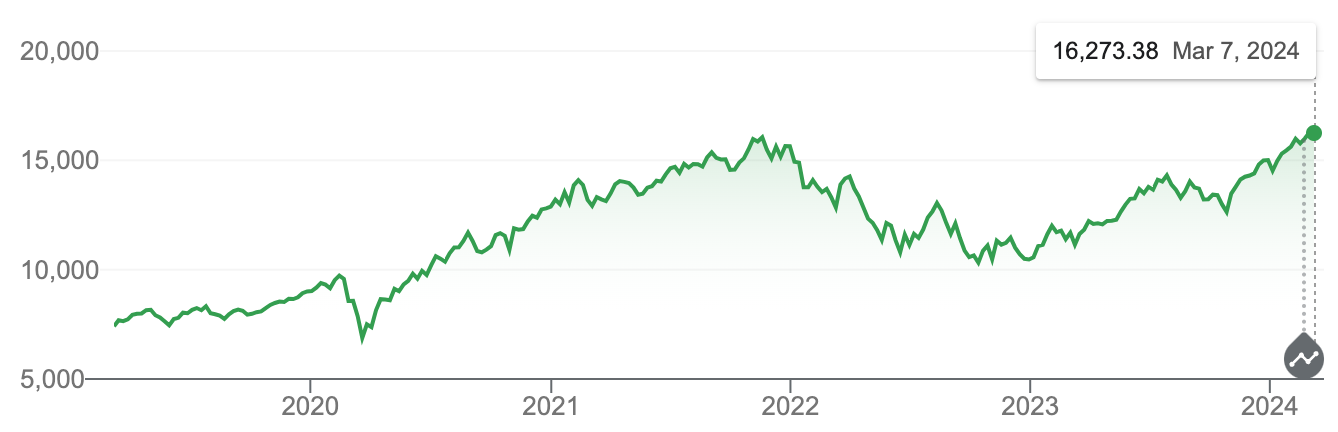
Example line chart of stock performance over time.
Healthcare Data Visualization
Streamlit graph visualization is also valuable in the healthcare sector, where providers and researchers can visualize patient data, track the spread of diseases, and analyze clinical trial results. The ability to visualize large datasets from electronic health records (EHRs) helps in understanding patient demographics, treatment outcomes, and disease trends. Interactive tools make it easier to explore and interpret complex healthcare data. Custom dashboards can be developed to monitor public health data and manage response efforts efficiently, providing a robust tool for healthcare analytics.
Educational Tools
In the field of education, Streamlit graph visualization can be used to create interactive learning modules, visualize educational data, and develop tools for exploring complex concepts in subjects like mathematics, science, and economics. Interactive visualizations make learning more engaging and intuitive for students. Educators can use Streamlit to build tools that explore mathematical functions, scientific simulations, and economic models. Real-time feedback on user inputs enhances the learning experience, making educational content more interactive and effective.
Scientific Research
Researchers can utilize Streamlit graph visualization to visualize experimental data, analyze research findings, and share interactive reports with collaborators and the broader scientific community. The ability to visualize complex datasets from experiments and simulations aids in deeper data analysis. Interactive exploration of data allows researchers to uncover insights that might be missed with static reports. Additionally, Streamlit makes it easy to share interactive reports and dashboards with collaborators, promoting a collaborative approach to scientific research.
Marketing Analytics
Marketing teams can benefit from Streamlit by using it to analyze campaign performance, visualize customer behavior, and track key metrics such as conversion rates, customer acquisition costs, and return on investment (ROI). Real-time tracking of marketing campaigns enables teams to adjust strategies on the fly. Interactive tools allow for the segmentation and analysis of customer data, helping to identify trends and patterns. Custom dashboards tailored to specific marketing goals and KPIs provide a clear view of performance metrics, aiding in strategic decision-making.
Supply Chain Management
Streamlit graph visualization can be used in supply chain management to visualize logistics data, track inventory levels, monitor shipping statuses, and optimize supply chain operations. Real-time visualization of supply chain data helps in identifying bottlenecks and improving operational efficiency. Interactive tools for tracking inventory and shipment statuses ensure that supply chain managers have up-to-date information at their fingertips. Custom dashboards can be developed to provide insights into various aspects of supply chain operations, facilitating better management and optimization.
Geospatial Data Analysis
In geospatial data analysis, Streamlit can be applied to visualize geographic data for applications such as urban planning, environmental monitoring, and disaster response. Interactive maps allow for the visualization of spatial data, making it easier to identify geographic trends and patterns. Tools for exploring geographic data can be customized to meet the specific needs of different applications. Real-time updates and filtering capabilities enable dynamic analysis of geospatial data, providing valuable insights for decision-makers.
Customer Relationship Management (CRM)
Streamlit enhances Customer Relationship Management (CRM) systems by visualizing customer data, tracking interactions, and analyzing customer journeys. Visualization of customer demographics, purchase histories, and interaction logs helps in understanding customer behavior. Interactive tools for segmenting and analyzing customer data provide deeper insights into customer preferences and trends. Custom dashboards for monitoring customer satisfaction and loyalty metrics enable businesses to develop strategies for improving customer relationships and driving growth.
IoT Data Visualization
Streamlit is also useful in the Internet of Things (IoT) domain, where it can be used to visualize sensor data, monitor device statuses, and analyze IoT network performance. Real-time visualization of sensor data and device metrics helps in monitoring the health and performance of IoT devices. Interactive tools for exploring IoT network performance allow for the identification of issues and optimization opportunities. Custom dashboards can be created to manage and visualize IoT deployments, providing comprehensive insights into the operation of IoT systems.
Deploying Your Streamlit App
Once your Streamlit app is ready, deploying it is straightforward, with several options available.
Using Streamlit Community Cloud
Using Streamlit Community Cloud, Streamlit graph visualization apps can be easily deployed and shared. Streamlit Community Cloud is a free platform provided by Streamlit for deploying apps. You can sign up for an account and deploy your app directly from a GitHub repository. This method is convenient and quick, making it ideal for sharing apps with a wide audience.
Streamlit Community Cloud launches apps directly from your GitHub repo, so your app code and dependencies need to be on GitHub before you try to deploy your app. The deploy your app from your workspace at share.streamlit.io. This process automatically builds and deploys your app, providing a shareable link.
Other Deployment Options
Other deployment options include platforms like Heroku, AWS, and Google Cloud. Each platform has its setup and configuration steps, but they all support deploying Streamlit apps. These options are suitable for more complex deployment scenarios, offering greater control and scalability.
For Heroku, you need to create a Procfile and set up the environment variables. For AWS, you can use services like Elastic Beanstalk or Lambda. For Google Cloud, App Engine or Cloud Run are common choices. Each platform provides detailed documentation to guide you through the deployment process.
Best Practices for Streamlit App Development
To ensure your Streamlit graph visualization app performs well and provides a great user experience, consider these best practices:
Optimizing Performance
Efficient data handling is crucial for maintaining app performance, especially with large datasets. Minimizing reruns by caching data and avoiding redundant computations can significantly improve responsiveness. Use Streamlit's caching mechanism with the st.cache decorator to store expensive computations and reuse results. This reduces the need for repeated calculations and speeds up the app, ensuring a smoother experience for users interacting with your Streamlit graph visualization.
Improving User Experience
An intuitive layout and navigation are vital for user satisfaction. Organize widgets and plots logically, provide clear instructions and labels, and ensure the app is responsive and accessible. Consider the placement of interactive elements to make the app easy to use. Group related widgets together, use headers and separators to organize sections, and ensure that labels are descriptive and helpful. These strategies will enhance the overall usability of your Streamlit graph visualization, making it more appealing and efficient for users.
Debugging and Testing
Common issues can include compatibility problems, performance bottlenecks, and user interface glitches. Regular testing and debugging are essential to address these issues. Strategies such as unit testing, integration testing, and user testing can help ensure your app functions correctly and efficiently. Streamlit provides a st.echo function to help with debugging by displaying the code and its output side by side. Additionally, using print statements and logging can help track down issues during development. By implementing these best practices, you can create a robust and reliable Streamlit graph visualization app.
Conclusion
Streamlit makes graph visualization simple and accessible, offering a range of features and integrations that cater to various data visualization needs. From basic charts to complex interactive dashboards, Streamlit provides the tools necessary to create engaging and informative visualizations. With its ease of use, flexibility, and powerful capabilities, Streamlit is an excellent choice for anyone looking to enhance their data presentations. As you continue to explore Streamlit, you'll discover even more ways to leverage its capabilities to create compelling data visualizations.
About the Author
Caroline Scharf, VP of Operations at Tom Sawyer Software, has 15 years experience with Tom Sawyer Software in the graph visualization and analysis space, and more than 25 years leadership experience at large and small software companies. She has a passion for process and policy in streamlining operations, a solution-oriented approach to problem solving, and is a strong advocate of continuous evaluation and improvement.
FAQ
1. What makes Streamlit an ideal choice for data visualization compared to other frameworks?
Streamlit is ideal for data visualization because of its simplicity and ease of use. Unlike traditional web frameworks like Flask or Django, Streamlit requires minimal setup and coding to build fully functional, interactive web apps. It lets you quickly turn Python scripts into web apps without needing front-end development knowledge. Its built-in support for popular data visualization libraries like Matplotlib, Plotly, and Altair makes it a versatile tool for data scientists and analysts. Additionally, the ability to update visuals in real-time and integrate interactive widgets without complex coding sets Streamlit apart from other frameworks.
2. Can Streamlit be integrated with other data processing libraries, and how does that improve app functionality?
Yes, Streamlit integrates well with libraries such as Pandas for data manipulation, Scikit-learn for machine learning, and SQLAlchemy for database connections. These integrations improve functionality by enabling complex data processing, real-time predictions, and direct interaction with databases within the Streamlit app. For example, you can preprocess data with Pandas, visualize the results in real-time, run a machine learning model using Scikit-learn, and immediately display predictions in an interactive dashboard.
3.What are the potential performance bottlenecks in a Streamlit app, and how can you mitigate them?
Common performance bottlenecks in Streamlit apps include:
Heavy computations: If a graph requires processing large datasets or running complex algorithms, it can slow down the app.
Frequent re-runs: Streamlit re-runs the script from top to bottom, which can cause delays if large datasets or expensive computations are not properly managed. Mitigation strategies include:
Caching data using the @st.cache decorator to store the results of time-consuming functions, so they don’t need to be recalculated with each rerun.
Optimizing data handling, such as reducing the size of datasets loaded in memory or filtering data before visualizing it.
4. How can Streamlit be used to visualize real-time data, and what are the challenges of handling live updates?
Streamlit can visualize real-time data by refreshing charts using functions like st.experimental_rerun(). This is useful for applications like stock tracking or IoT monitoring. Challenges include data latency, server load, and handling interruptions in data streams. Optimizing with caching and managing data loads is crucial to maintaining performance.
5. What are the limitations of Streamlit for large-scale or highly complex data visualizations?
Due to its single-threaded design, Streamlit struggles with large datasets and multiple users. It can become slow or crash when handling complex visualizations. For large-scale apps, data aggregation, caching, and breaking tasks into smaller components can improve performance.
6. How can Streamlit be used to visualize geographic data, and what libraries can you integrate for mapping?
Streamlit integrates with Folium, Plotly, and Geopandas to visualize geographic data. Folium provides interactive maps, Plotly supports dynamic geospatial charts, and Geopandas handles complex spatial data. Challenges include optimizing performance and managing consistent map projections.
Submit a Comment