
Max Chagoya, Janet Six, Ph.D.
Associate Product Manager, Senior Product Manager
Discovering insights in unstructured data is becoming increasingly elusive as unstructured data becomes larger and more complex, and as stakeholder expectations for useful data results increase. Graph techniques can assist with data discovery and understanding, and can be applied to discover and communicate findings to decision makers.
But what are the best practices to apply graph technology to the connected data that is inherent in unstructured data sources? How do we get beyond all the noise in unstructured data to discover the knowledge needed to bring business value to that data? Where is the graph?
In this blog, we will discuss several approaches to finding useful graphs in your unstructured data and how to apply visualization and analysis techniques to them.
An example of unstructured data from a graph database.
Why Graphs Are Important
Graph technologies are in high demand due to their ability to model, analyze, and optimize systems in digital transformation, systems engineering, manufacturing, finance, life sciences, and intelligence.
|
Graphs form the foundation of many modern data and analytics capabilities to find relationships between people, places, things, events and locations across diverse data assets. D&A leaders rely on graphs to quickly answer complex business questions which require contextual awareness and an understanding of the nature of connections and strengths across multiple entities. Gartner predicts that by 2025, graph technologies will be used in 80% of data and analytics innovations, up from 10% in 2021, facilitating rapid decision making across the organization. —From “Gartner Identifies Top 10 Data and Analytics Technology Trends” |
|
Unstructured data sources, such as graph databases, document databases, and RDF streams, do not inherently have a schema or data format. To discover pertinent information in unstructured data, it is vital to understand where the relevant data is in the mass of the unstructured data.
Currently, many companies try to visualize or analyze the whole data source. This leads to mixed results and hairball visualizations that may be beautiful artistically, but don’t show the level of detail that is needed for visual analysis and communication of results to stakeholders. There is too much noise in the graph to discover key findings.
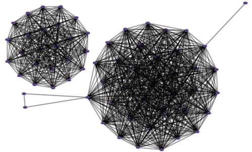
A hairball visualization.
In order to benefit from graph technology, it is critical to use a graph platform that can efficiently support complex data and can create useful, customizable models and results. Graph visualizations must be more than a pretty picture—they must provide useful interaction and actionable results.
Perspectives, our SDK and low-code development platform, employs the power of graphs at its core, providing enterprises with all the tools they need to tame their unstructured data, and build and deploy innovative graph applications.
In the following sections, we outline a three-step approach to finding useful graphs in your unstructured data and how to apply visualization and analysis techniques to find the relevant data and gain those elusive insights.
.webp?width=700&height=386&name=2023.02.17.0.CrimeNetwork.Closeness%20(1).webp)
An example application built with Tom Sawyer Perspectives.
Step 1. Create a Graph Model
The first part of creating useful graph visualization and analysis applications for unstructured data sources is to create an efficient graph model.
With Perspectives, we do this by using a data integrator to connect to the data source, and loading the data into the graph model. Perspectives can automatically extract the schema directly from the data source.
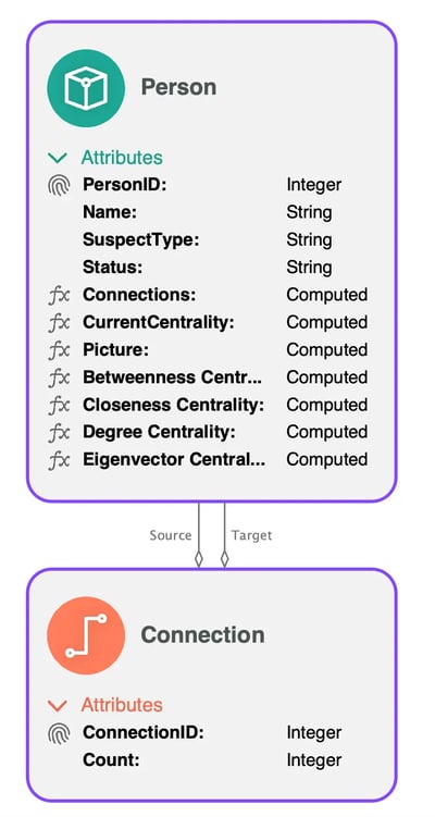
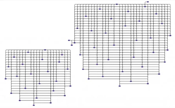
An example data schema in Perspectives.
We can then use the automatic binding capability in Perspectives to ingest data into the graph model with a graph database query.
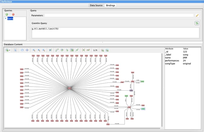
A preview in Perspectives of the data from the database.
Now that we have the data in the graph model, we can process the data and apply visualization and analysis techniques to it.
For more information about Perspectives graph models, see “Create Modern Graph Visualization Applications with New Graph Model Features.”
Step 2. Provide Better Visualizations
Now that we have the graph model, the second technique to understanding your complex, unstructured data is to apply a better visualization and get rid of the hairball. Here is the same hairball graph we saw above but with Bundle layout applied so we see a more effective visualization. Bundle layout is our proprietary graph layout technique that is optimized for dense graphs.
The same graph as the hairball visualization above with Bundle layout applied.
In addition to Bundle layout, Perspectives includes four other graph layout styles and a multitude of graph visualization capabilities, such as labels, connectors, and nesting, that can really make your graph visualizations useful.
Step 3. Find the Most Relevant Part of the Graph
The third step to achieving ultimate understanding of your unstructured data is to reduce the size of the graph to be visualized or analyzed. But what are the best ways to do that? How do we know we are looking at the right parts of the graph?
Here are five ways to hone in on the important parts of the data.
Query
Query the graph to determine the data that is directly relevant to the current analysis.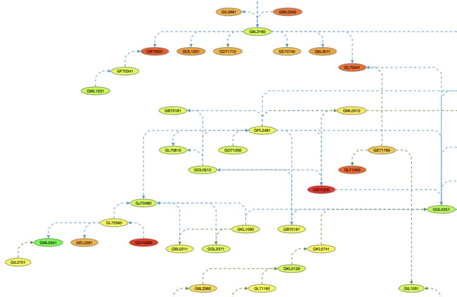
A portion of a graph after a query has been applied.
Filter
Filter the graph to work with only the relevant data. With Perspectives, filtering can be done interactively by the user or automatically through the application of rules.
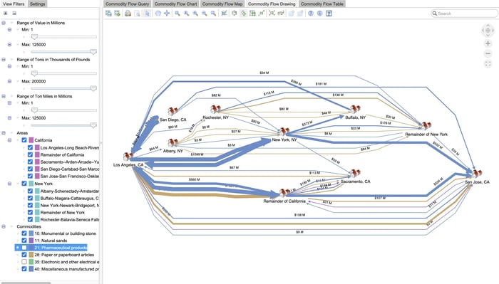
An example commodity flow application with a filter applied to the graph visualization.
Timeline
View the changes to the graph over time to identify key events. Perspectives provides a timeline view, which allows you to see the part of the graph data that is associated with a particular time of event.
A timeline view in Perspectives showing the changes to graph data over time.
Analysis
Apply graph analysis and then work with the part of the graph that has the analysis results you need. With Perspectives, you can apply several graph analysis techniques successively so that the results of the first graph analysis are used in the second graph analysis, and so on. See our Finding Important Data with Centrality and Reachability Analysis video for an example.
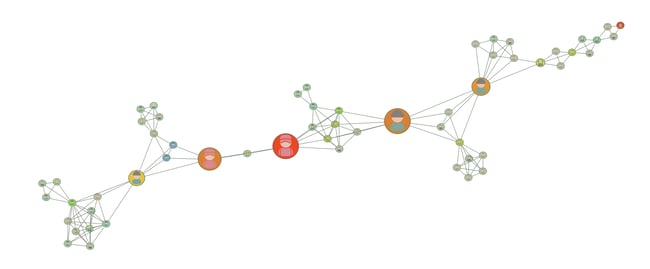
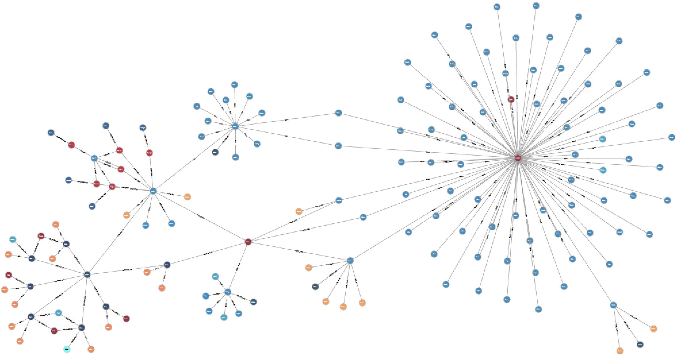
A graph of a criminal network with analysis applied.
ML / AI
Use machine learning and AI tools to determine which parts of the data are most relevant.
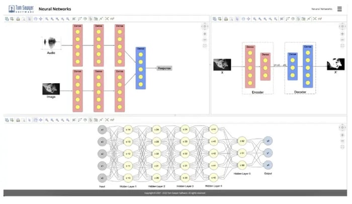
An example neural network application built with Perspectives.
Conclusion: Get More Business Value from Unstructured Data with Perspectives
With the Perspectives graph platform, you can quickly connect to your unstructured data sources, build an effective graph visualization and analysis application, and deploy it to your on-premise, cloud, or air-gapped environment. And given the type of business value or actionable insights that you are looking for, you can customize your data model, interactive visualizations, and integrated analysis to discover the results that you need to meet your business objectives.
Ready to start your graph journey? We can help you get up and running with a guided evaluation and free trial of Perspectives.
You’ll receive our software with complete product documentation and free technical support. We also offer consulting and training during the evaluation to ensure a smooth and successful experience.
Reach out to us with any questions or feedback—we’re always happy to hear from you.
About the Authors
Janet Six, Ph.D. is Senior Product Manager at Tom Sawyer Software, where she works with business, technical, and design teams to help create effective data visualization and analysis solutions within technical, time, and financial constraints. She has been in the graph field for almost 30 years. Her work has appeared in the Journal of Discrete Algorithms, Journal of Graph Algorithms and Applications, and the Kluwer International Series in Engineering and Computer Science. The proceedings of conferences on Graph Drawing, IEEE Information Visualization, and Algorithm Engineering and Experiments have also included the results of her research. Her interests include graph visualization, analysis, and artificial intelligence.
Max Chagoya is Associate Product Manager at Tom Sawyer Software. He works closely with the Senior Product Manager performing competitive research and market analysis. He holds a PMP Certification and is highly experienced in leading teams, driving key organizational projects and tracking deliverables and milestones.
Submit a Comment