
Kristin Petersen
Content Manager
2019 marks the 115th year for World Series baseball in the United States. In a year when home run records were smashed with authority, we thought we’d take a look at America’s pastime through the lens of graph visualization.
Over the next several weeks, we’ll ask two fundamental questions about Major League Baseball (MLB):
- Who’s on the playoff team rosters?
Do most players start on other teams? Which players have been traded and from which teams? - What’s with all the homers?
6,770 home runs were hit during the regular season this year–a new record! Sure, they’re fun to watch, but do they lead teams to the playoffs or the World Series?
Let’s pull some data, make some graphs, and see what we can figure out. Today we’ll:
- walk through the over-arching process, using MLB datasets as our subject
- drop some knowledge about how the graphs were created
- show how we used the customization tools resident in Tom Sawyer Perspectives to easily tailor the graphs to show important statistics we can use in our analysis
Come on…let’s play ball!
The Preseason
Before pitching the first graph visualizations, customizations, and algorithms to analyze players, teams, and homers, let’s warm up the data and create a schema.
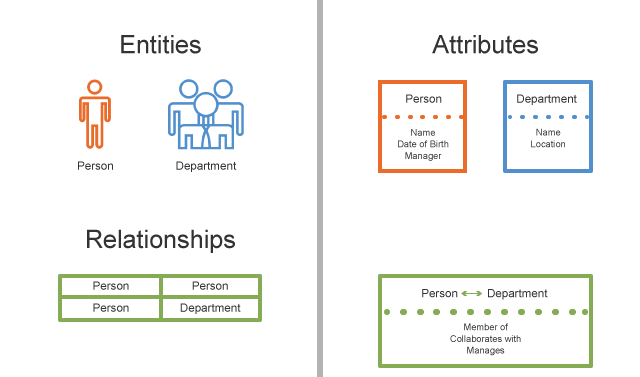
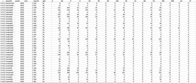
A schema is the blueprint that defines the structure of data. It consists of element types, element attributes, and model attributes. To get the statistics we needed, we gathered multiple sources of MLB data. One set of comma-separated values (CSV) files came from Lahman’s Baseball Database. It included pitching, hitting, and fielding statistics for Major League Baseball from 1871 through 2014. For the more recent statistics, we used the Retrosheet Encyclopedia dataset. Also imported as a CSV file, this included game stats from 1990 through 2018.
Here’s a glimpse of the raw CSV dataset:
Let’s see what insights we can gather about player trades (known as transaction history to baseball insiders) from visualizing this data. We generated the graph below from our dataset. Tom Sawyer Perspectives can also load the data into a Neo4j database, for example, by reading the data from a CSV, or other formats, and doing a data transformation to a graph structure.
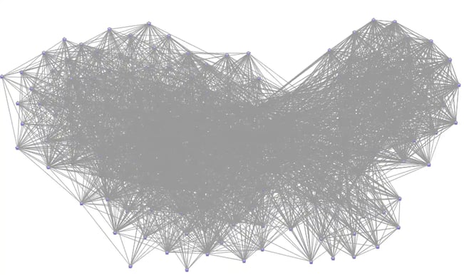
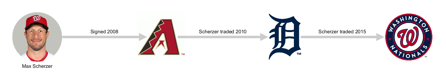
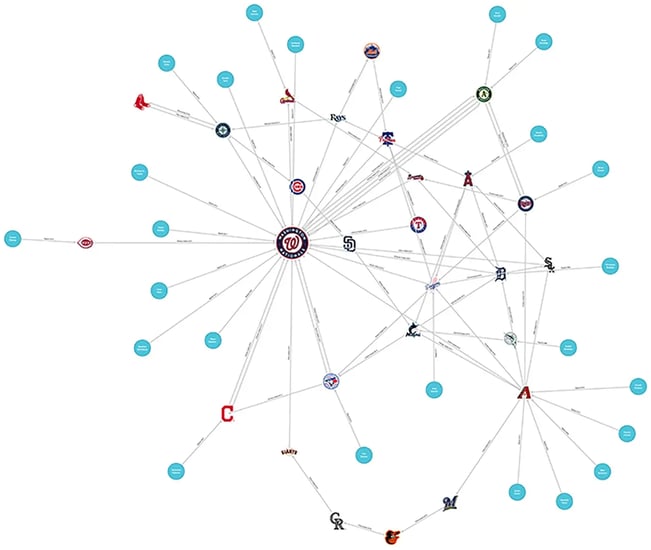
Oof! That’s obviously too much data to throw at fans or managers. This graph shows hundreds of team and player nodes and thousands of relationship edges that reflect countless trades. To gain focus, we’ll filter to a subset of data showing only transaction histories for players on the final four teams in the 2019 playoffs. First, let’s narrow the field to only one year and one team: the 2019 Washington Nationals.
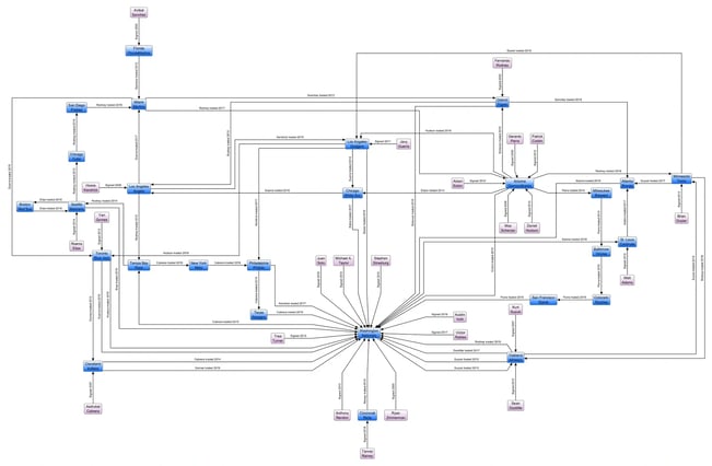
Phew…much better! We can now clearly see the transaction history of all of the players on the team. While a number of players seem to have started with the Nationals (likely from their minor league team), many arrived on the team through a series of trades from other teams.
The Uniform
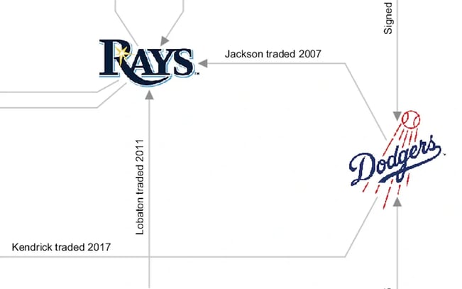
What about the look and feel of the graph drawing? Luckily, Tom Sawyer Perspectives makes it easy for us to dress up the drawing elements on the graph, so we did. Here, we added team logos for all team nodes and changed the formatting of the player nodes.
Small changes—big impact. The Perspectives Designer allows us to easily control hundreds of seemingly tiny attributes in a drawing. From the drawing template, we used the Preserve Aspect option for the Resizability setting to maintain a consistent node size throughout the drawing.
The Shape Clipping setting ensures that edges are clipped tightly and precisely to the edge of nodes, no matter what their shape. And Background Color, Border Color, and Text Color all helped improve the readability of the graph.
Since Tom Sawyer Perspectives provides multiple layouts out of the box, we can easily view the graph multiple ways to figure out which layout is the most useful. Although the circular, spring embedded layout seems to be the most popular, we found orthogonal to be the easiest to read for this graph.
Here’s circular:
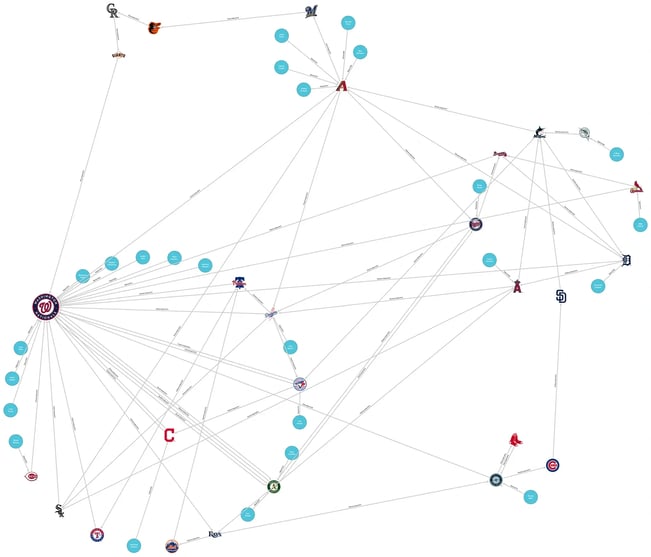
And here’s symmetric:
For transaction history graphs, the orthogonal works best. Orthogonal uses predominantly horizontal and vertical edges, allowing us to make a very compact drawing. With cleaner lines, we can easily see connections and relationships between players and teams—both present and past. In baseball, as with other pro sports, the comings and goings of players cannot only cause fan emotions to run high, but can sometimes make or break a team. The orthogonal layout allows us to clearly see the family history of these teams.
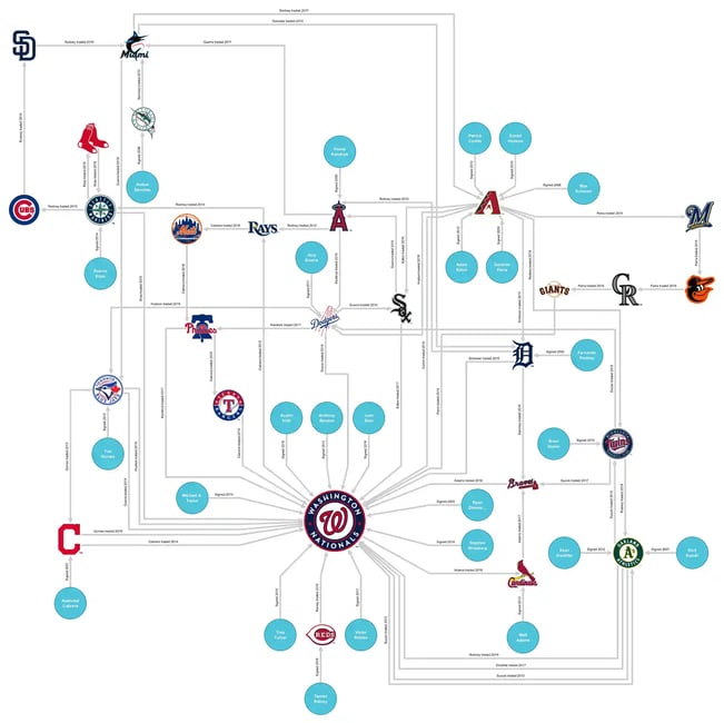
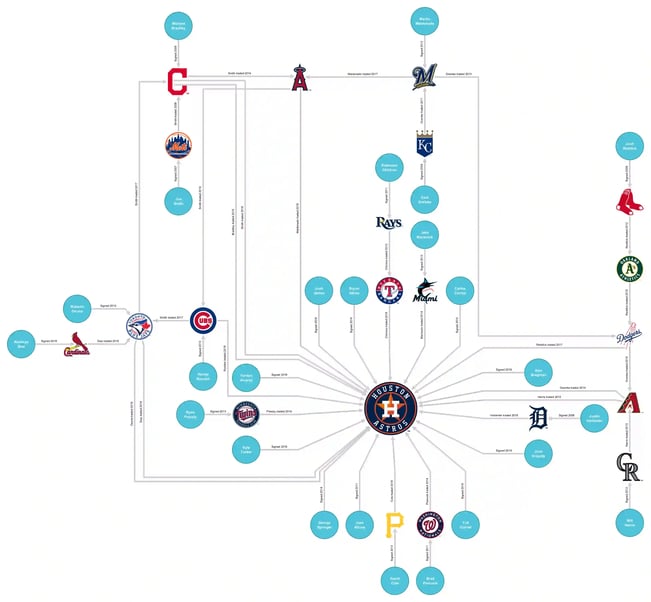
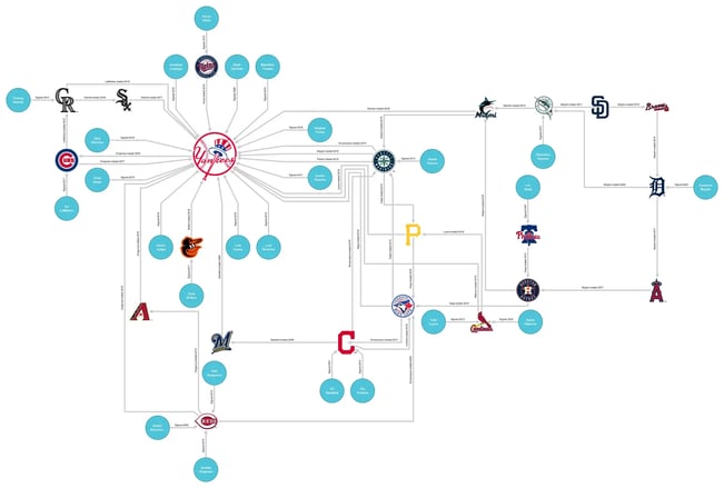
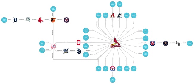
Now that we’ve landed on a graph layout style and format for the elements in the graph, we’ll recreate it for the other three teams in the finals. Check them out! Are you surprised to see where some of your favorite players got their start?
The Final Score
Did we make unseen connections in our data?
Looking at the Washington Nationals team graph, it’s interesting to see so many players coming from just a few teams. The Arizona Diamondbacks look almost like a farm team, showing five of their former players now with the Nationals—including the infamous “Mad Max” Scherzer!
The visualization also makes it easier to see how many players have never played elsewhere. For the Yankees, Astros, and Nationals, less than 25% of their 40-man roster are players without experience in other clubs. The 2019 Cardinals, on the other hand, show more than 42% with no outside MLB experience. Could this be a clue for managers? Do the graphs show that the Cardinals did a poor job adding new talent throughout the year? We aren’t sure what the ultimate conclusion is—but we are sure of this—we didn’t make the connection until we saw the data in a graph.
Next Time: Knocking ‘Em Out of the Park
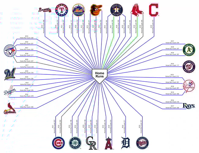
To say that home runs are off the charts this season would be the cliché of all clichés! Players broke records. Teams broke records. Why? Were walls moved? Are the balls the cause? The Internet is rife with theories.
But we wonder, does it matter? Do all of these home runs lead teams to the playoffs or even to World Series wins? The Oakland A’s Billy Beane (famously played by Brad Pitt in Moneyball) asked these questions years ago—but he had nothing but boring spreadsheets to analyze. We’re going to visualize the data! Here’s a sneak peek of the top five home run teams for the past ten years:
About the Author
Kristin Petersen is the Marketing Content Manager at Tom Sawyer Software. She has 17+ years of technical writing and editing experience in both the public and private sector, and transitioned into Marketing where she brings her strong technical background, writing experience, and creativity. She earned her Master of Science in Technical Communication from Drexel.
Submit a Comment