
Ioannis Tollis
Chief Scientist
The huge amount of data being produced makes it difficult to separate what’s important from noise. Once you’ve created a graph visualization of your big data, how do you know what to look for? To focus on what’s important, we use four graph analysis and design techniques to reveal connections in the data and patterns in the structure.
“Successful networks are designed—they don’t just happen.Knowing a network’s essential design issues—and how to make and when to change design choices—is a crucial part of the practice of building effective social-impact networks.”
- Connecting to Change the World: Harnessing the Power of Networks for Social Impact
by Peter Plastrik, Madeleine Taylor, and John Cleveland
1. Graph Analysis Algorithms
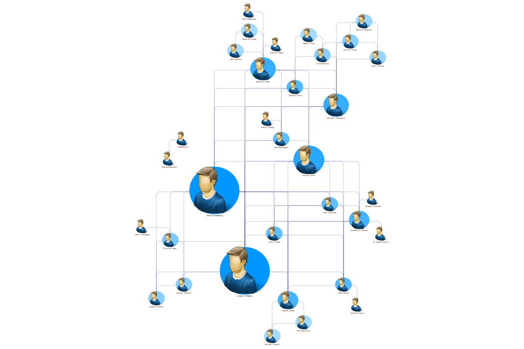
Tom Sawyer Perspectives features over 30 analytic algorithms that can be used to find information that is hidden deep within the data. These algorithms are especially useful when analyzing criminal networks that are designed to hide as much information as possible. Centrality analysis algorithms help users answer specific questions about the players in their social networks.
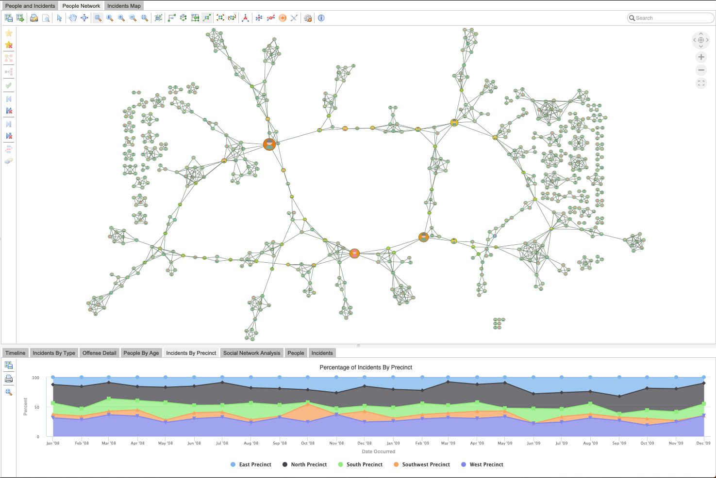
Betweenness Centrality analysis finds key players in a network. This analysis highlights the individuals closest to a high flow of activity. By identifying a person with a high Betweenness Centrality, you can see who controls the flow of information in the network. Think of these people as being on the superhighway of information and activities: if we can arrest the big players, shown as the biggest nodes, we can disrupt the actions of a significant portion of the network.
2. Layout
Layout styles enable the dynamic exploration of prominent relationships in data. Different layout styles lend themselves more readily to different projects depending upon the type of data being analyzed and the end goal of the visualization. Sometimes, simply looking at the same visualization in another layout style will reveal new insights.
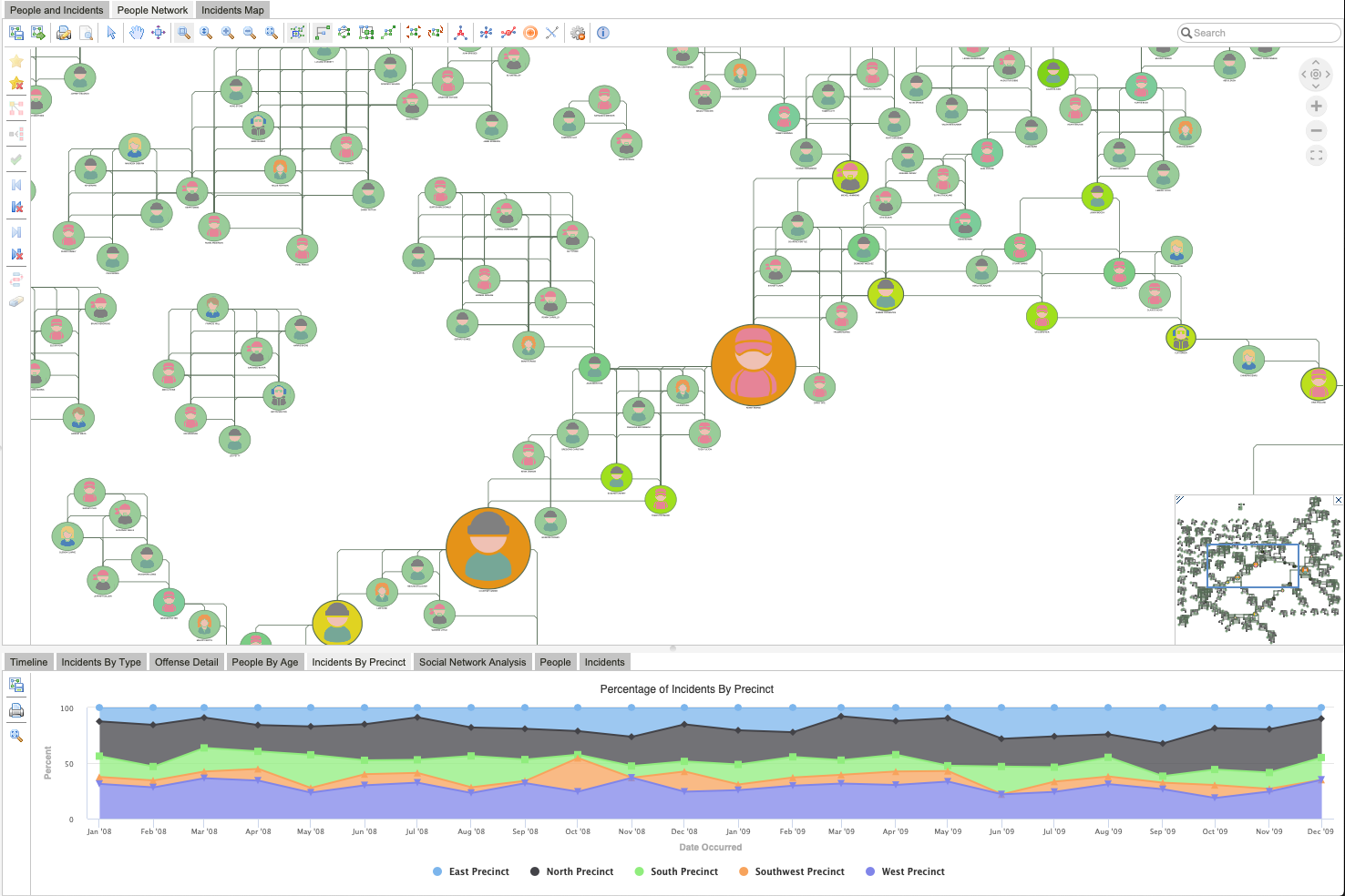
Applying Bundle layout style to the same crime network analysis results quickly shows which criminals are in the subnetwork between two key people. The arrest of a subnetwork player may lead to the location of the leaders in the network.
3. Color and Shape
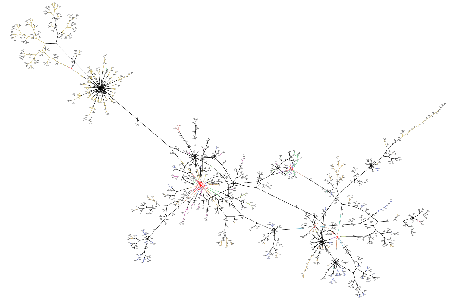
Wise application of color and shape to related nodes can go miles in the readability of a graph visualization. Data is often connected due to the nature of the information it carries. For example, the way proteins or cells interact in the human body forms networks that can be analyzed to find key viruses, infectious or hereditary diseases, or cancer.
We used this technique for our analysis of genomic epidemiology data related to coronavirus. In our graph analysis of the phylogenetic tree data from Nextstrain, a simple change in the node shape of extracted data helped reveal where the same mutation occurred multiple times but at different points in the evolution of the virus.
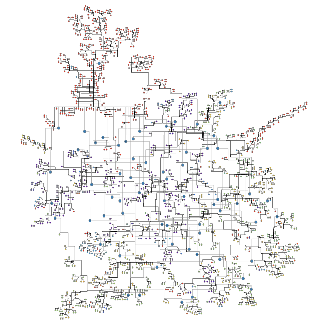
In this visualization, the round nodes represent genomes of positive coronavirus samples. The color of the nodes represents the location in which a sample was processed. Edges between the round nodes show the relationships between these samples. Studying the details of these samples shows the genomic lineage of the samples.
4. Additional Data
You can explore different aspects of data by extracting more information from within the data source. For the previous coronavirus mutation graph, we added a blue hexagon node to repeating mutations and edges to the samples that newly contained the mutation. Now, the blue hexagon nodes show the adoption rate of the mutation. The higher the degree of these nodes—or the more edges that are connected to them—the greater the number of genomes that adopted the same mutation. This could indicate that these mutations are especially important to study.
In the visualization below, we added geospatial data to the phylogenetic tree data. Adding location nodes reveals the different locations to which COVID-19 patients recently traveled. Symmetric layout shows clusters of growing COVID-19 hotspots. These insights can be used to better understand which patients have a higher risk of a certain strain of the coronavirus. You can also identify which hotspots might need assistance with a potential surge.
Putting It All Together
Getting the most out of your data requires an intelligent combination of multiple techniques. To demonstrate this, we worked with our Governance demonstration, which features data from the corporate filing database of the Securities and Exchange Commission. We combined all the techniques in our arsenal—analysis, color, shape, and layout—to arrive at what’s important.
Governance networks are about understanding the people, roles, teams, regulations, norms, and influencers in a company or government and their relationships. Analysis of a governance network shows how these structures fit together and provides an understanding of how a company really works. You can use this analysis to discover:
- Who are the key people?
- How much influence on a company comes from outside influencers?
- Are there weaknesses in the governance network (for example, not enough people in the right part of the network to properly support a regulation)?
- Can the company or government be modeled and set up in a different way?
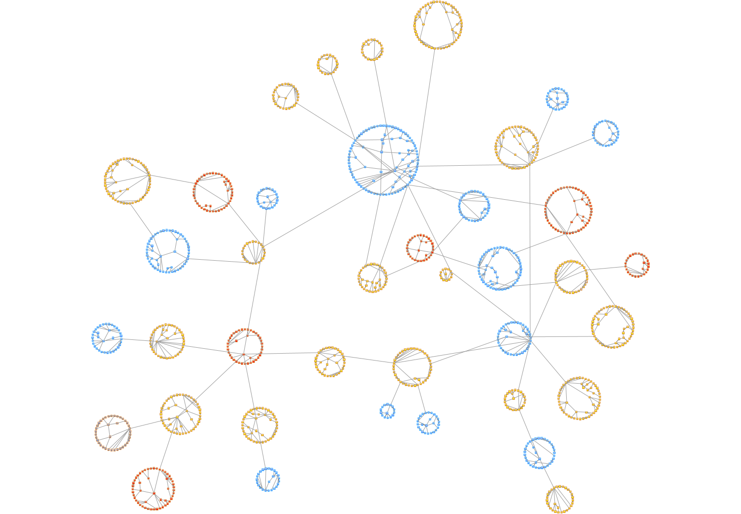
We began by visualizing the data using Symmetric layout. This allows us to quickly identify clusters of people in the network and see the superstructure of the network between those clusters.
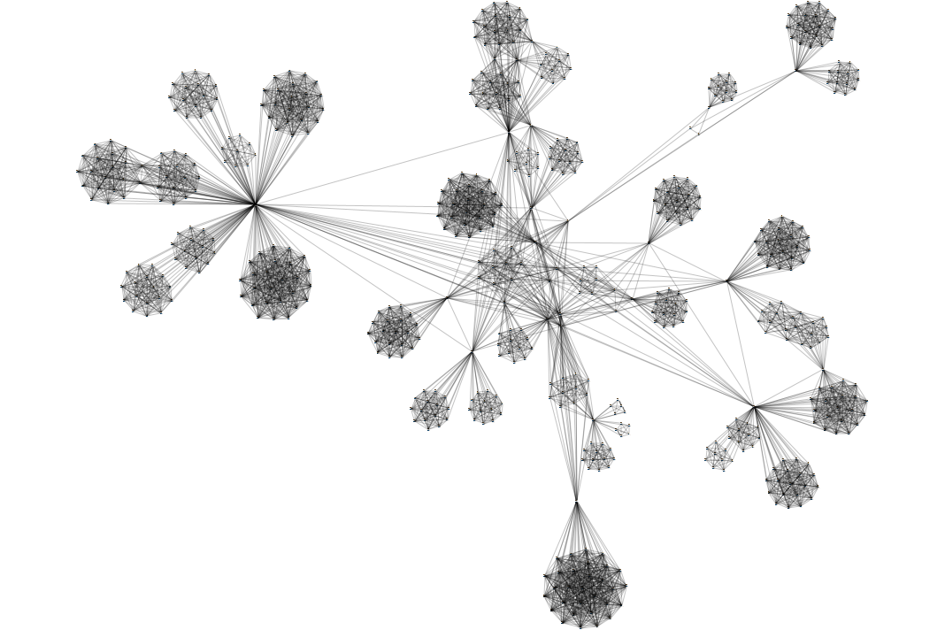
Once we understand the big picture, we can look deeper into the details of the network. To identify key players and see who is really well-connected, we removed all 1-degree nodes (nodes that are only connected to one other person). Then, we focused on a cluster in the superstructure and ran a Degree Centrality analysis to reveal which people are directly connected to the largest number of people. Finally, we viewed the results using Bundle layout to combine any edges with a common destination and reduce the visual complexity of the overall graph. The resultant visualization may surprise stakeholders—key players might not necessarily be who they expect.
Try it for yourself! Our example applications allow you to explore unexpected connections using various centrality algorithms. Or sign up for a free trial. You can harness the power of your own network to discover:
- How constraints interact in an industrial design
- Central parts or people that affect the performance of the whole product or process
- Insights into unstructured data
About the Author
Dr. Ioannis (Yanni) G. Tollis is Chief Scientist at Tom Sawyer Software, and Professor of Computer Science and Head of Network and Information Visualization Lab at the University of Crete (UOC). Dr. Tollis received his Ph.D. degree in Computer Science from the University of Illinois at Urbana-Champaign, his Diploma degree in Mathematics from the National University of Athens, Greece, and his M.Sc. degree in Computer Science from Vanderbilt University, Nashville, Tennessee. Dr. Tollis has published eight books, and over 180 journal and conference papers. He is a Founding Editor and Executive Committee member of the electronic Journal of Graph Algorithms and Applications. His research interests are in Graph Analytics and Network Visualization, Modeling and Visualization of Biomedical Data and Networks, Graph Drawing, Information Visualization and Data Analytics, and Algorithm Engineering.
Submit a Comment