
Janet Six, Ph.D.
Senior Product Manager
In an increasingly complex and interconnected world, the ability to understand and analyze data in a meaningful way becomes crucial. One technique for gaining a deeper understanding of your connected data is to visualize it as it evolves over time. Visualizing data over time benefits a wide range of industries and use cases, including finance, healthcare, supply chain management, and social networks. Enabling organizations to track the evolution of connections over time provides a competitive advantage and opens up new possibilities for strategic planning, risk management, and improved operational efficiency.
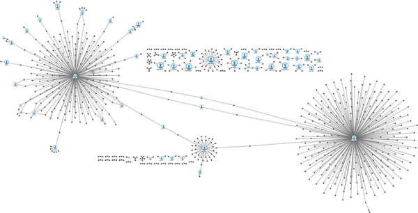
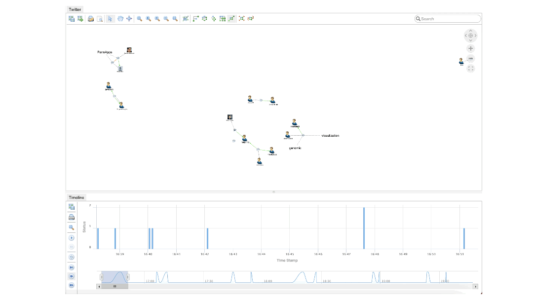
A graph visualization of tweets.
The Importance of Visualizing Connected Data
Connected data refers to information that is linked or related in some way, such as through networks, graphs, or hierarchical structures. Traditional methods of data visualization often fall short when it comes to representing the dynamic nature of connected data. As connections change and evolve, traditional methods can fail to convey the intricacies and patterns that emerge over time, which is where visualizing connected data becomes imperative.
Visualizing connected data offers several key benefits. It improves understanding, enhances decision-making, and provides better communication to identify risks or opportunities early.
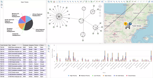
An example computer network management application built with Perspectives.
- Improved understanding: By visualizing connected data, we can gain a deeper understanding of the relationships between different entities and how they develop over time. This allows us to identify emerging trends, patterns, and anomalies that may not be apparent with traditional data analysis methods.
- Enhanced decision-making: Visualizing connected data enables decision-makers to make more informed choices. By observing how different entities interact and evolve, decision-makers can identify areas of improvement, optimize processes, and identify potential risks or opportunities.
- Efficient communication: Visualizations make it easier to communicate complex information to various stakeholders, including non-technical audiences. By representing connected data in a visually appealing way, we can present insights more effectively and facilitate better collaboration across different teams.
The relationships between different entities can change and evolve, making capturing and representing these changes visually and intuitively essential. Fortunately, with the help of visualization techniques, it becomes easier to make sense of dynamic connected data.
Synchronized data visualizations support the discovery of actionable insights.
Techniques for Visualizing Connected Data Over Time
To effectively visualize connected data as it evolves over time, we can rely on several techniques. For example, timelines and animation are effective techniques for visualizing changes over time. Timelines can show how the data has evolved, while animation can highlight the specific change. Other techniques that are used for visualization include temporal graphs, interactive networks, static visualization, and post-situation analysis.
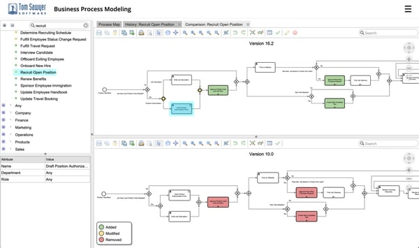
Visually compare the differences between two versions of the process.
- Temporal graphs: Temporal graphs represent the dynamic relationships between entities over time. By animating the connections and nodes, we can visually demonstrate how the network evolves and changes. These graphs are ideal for tracking changes in complex networks like communications networks.
- Interactive network visualizations: Interactive network visualizations allow users to explore and analyze connected data at their own pace. Users can select different time periods, highlight the specific nodes or connections, and observe how the network changes over time. Interactive visualizations provide a more engaging and immersive experience, fostering deeper insights and discoveries.
- Timeline visualizations: Timeline visualizations offer a chronological view of how connections change over time. This method is particularly useful when analyzing historical data or tracking the evolution of a specific network. By representing the changes on a timeline, we can observe trends and patterns in an easily digestible format.
- Static visualization: Another approach is using a static visualization that can be updated as the data changes. This is done by using colors or other visual cues to show the changes over time.
- Post-situation analysis: Post-situation analysis can help understand complex systems and simulate future scenarios, which can provide predictions of what might happen.
Tools and Technologies for Visualizing Connected Data
A variety of tools and technologies are available to help visualize connected data as it evolves over time, such as Tom Sawyer Perspectives, which offers an animated timeline view as well as customizable options for visualizing connected data. In addition to a timeline view to visualize connected data over time, Perspectives includes customizable toolbar options; graph animations to preserve the mental map; graph editing tools for adding, deleting, and moving nodes and edges; and customizable view types to facilitate interactions with graph data.
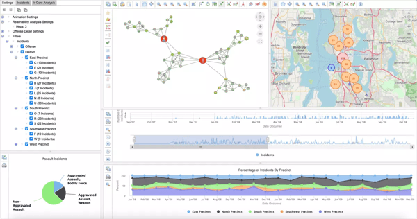
An animated timeline in Perspectives showing data evolving over time.
- Customizable toolbar options: Each application built with Perspectives can have multiple toolbars that are fully configurable and tailored for the context in which they are used.
- Graph animations: Animation can help users preserve their mental map of the graph. When a user runs one of the graph layout styles, the layout can be animated as elements change position on the screen and the layout switches from one style to another.
- Graph editing tools: Editing tools are available for adding, deleting, and moving nodes and edges. The tools can be activated through a toolbar option or selection action.
- Customizable view types: Perspectives includes customizable data visualization view types that enable interactions with your graph data. When designing your custom application using Perspectives, you configure the view types that support your use case. All views are synchronized, enabling end users of your application to stay oriented within the data.
Other key features available that help you gain actionable insights into your data as it evolves include:
- Interactive interface: With a user-friendly interface, users are easily able to explore, manipulate, and interact with the data. Users can zoom in and out, focus on specific entities or time periods, and apply filters to gain a deeper understanding of the underlying data.
- Advanced analytics: With built-in diverse analytics capabilities, users can better understand their data. These features allow users to gain valuable insights and make data-driven decisions.
- Collaborative capabilities: Users have the capability to collaborate and share knowledge by being able to save and share visualizations, as well as annotate specific data points. This promotes teamwork and enhances communication among team members.
Conclusion
As we continue to navigate the complexities of an interconnected world, the ability to visualize connected data as it evolves over time becomes increasingly important as it takes data analysis to a whole new level through its ability to visualize the evolution of connections. By animating the progression of relationships between entities, users can uncover hidden patterns, track the impact of dynamic factors, and identify emerging trends that would otherwise go unnoticed.
By leveraging techniques such as temporal graphs, interactive network visualizations, and timeline visualizations, we can gain valuable insights, make more informed decisions, and communicate complex information more effectively. With the help of tools and technologies like graph animations, customizable view types, and editing tools, we can unlock the potential of connected data and harness its power to drive innovation and understanding in various domains.
Contact us to get started on your graph journey with a free demonstration of Perspectives from one of our graph experts.
About the Author
Janet Six, Ph.D. is Senior Product Manager at Tom Sawyer Software, where she works with business, technical, and design teams to help create effective data visualization and analysis solutions within technical, time, and financial constraints. She has been in the graph field for almost 30 years. Her work has appeared in the Journal of Discrete Algorithms, Journal of Graph Algorithms and Applications, and the Kluwer International Series in Engineering and Computer Science. The proceedings of conferences on Graph Drawing, IEEE Information Visualization, and Algorithm Engineering and Experiments have also included the results of her research. Her interests include graph visualization, analysis, and artificial intelligence.
Submit a Comment