
Kristin Petersen
Content Manager
It’s a tale as old as time: you organize a massive database of facts and figures only to discover that the opening visualization is…a giant hairball! Sure, you can zoom in to 800% and slowly start to see connections, but the time that would take is too exhausting to consider.
Fear not! Our new Bundle Layout, now available in Tom Sawyer Perspectives 9.1.0, makes it possible to untangle, demystify, and succinctly visualize complex datasets.
The Big Data Challenge
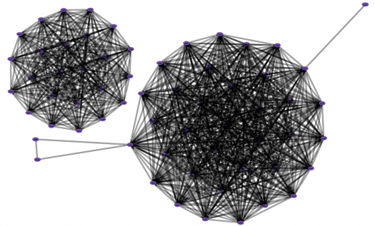
In graph visualization, nodes (shapes) and edges (lines) show the relationships among the individual points in your data. These graphs are used to show connections in computer networks, social networks, crime analysis, and more. For small and sparse graphs, this approach works beautifully. However, as the amount of data increases and the resulting graphs become larger and denser, things tend to get hairy.
Imagine the difference between visualizing relationships in a small business of 20 employees versus a company with over 500 employees. Then, imagine the number of connections (which tend to grow quadratically) drawn between 20 nodes versus over 500, or even in the millions! It’s in this arena of big data visualization, that data ink is of paramount importance.
Reducing Redundant Data Ink
In his 1983 book The Visual Display of Quantitative Information, information visualization guru Edward Tufte provided guidelines for effectively using data ink, “the non-erasable ink used for the presentation of data.” To produce the most effective visualizations, Tufte advises to show data, but to erase redundant data ink.
In essence, this is the core goal of Bundle Layout: to reduce redundant data ink. Where possible, common edges between nodes merge, or bundle, together into one. So instead of seeing five edges leading from five nodes to a common destination, some of those edges bundle together, reducing redundant data ink and making the overall graph a bit easier to read.
Turning the Hairball into a Readable Visualization
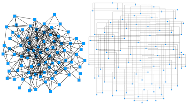
Unfortunately, hairballs are almost inevitable with large graphs. Even layout styles like circular, hierarchical, orthogonal, and symmetric can still produce hairballs. Consider this visualization of Cornell University’s scholarly article database, Arxiv:
While this graph does transform data elements to nodes and edges, the visual complexity of the output is far too difficult to understand. By reducing redundant data ink and bundling edges, we’re able to reduce the visual complexity of the overall graph. So the same graph above transforms into this:
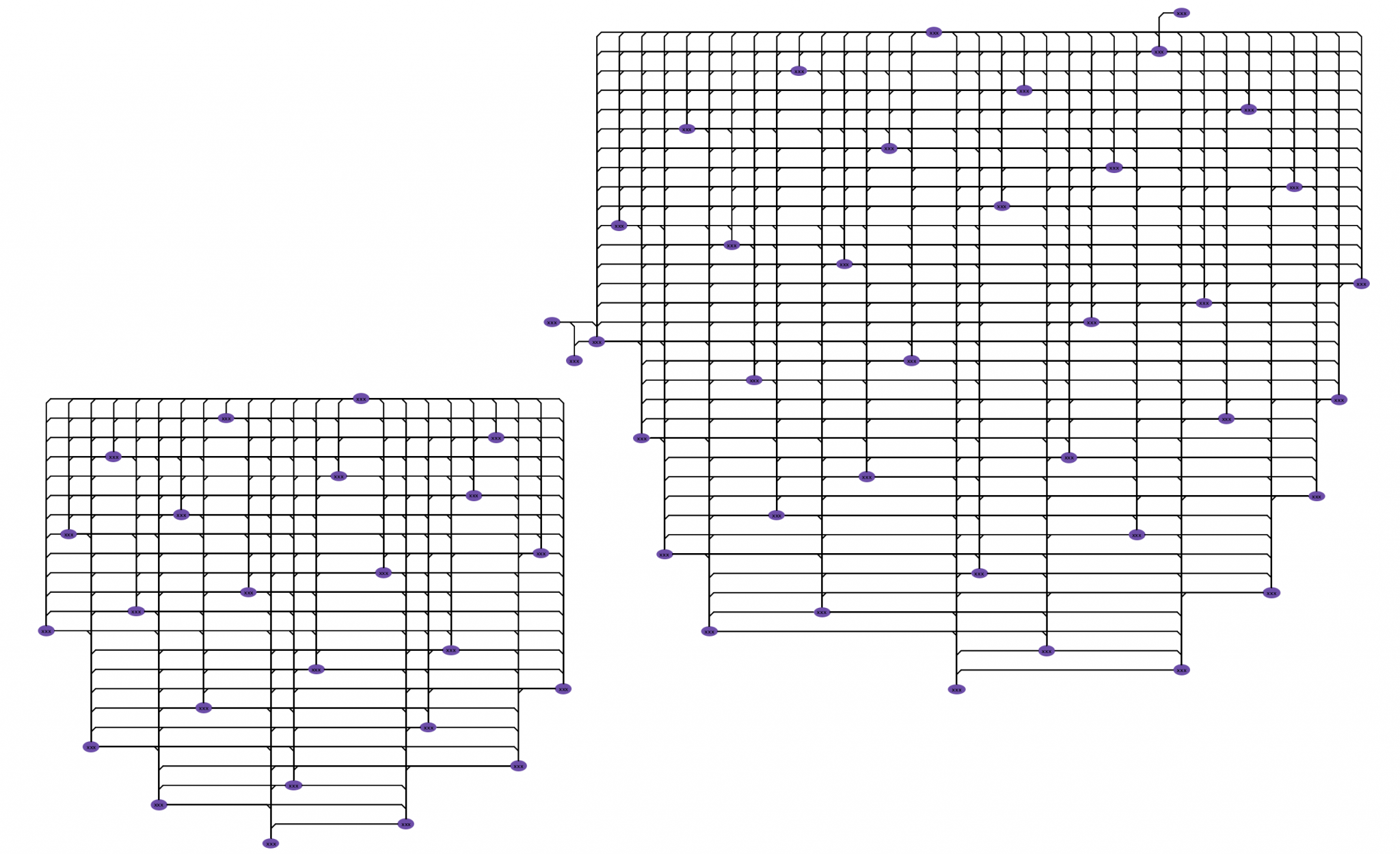
With Bundle layout, you can visualize the entire graph on the drawing canvas. Understanding the overall structure allows you to quickly locate, zoom into, and analyze pertinent parts of the graph. For example, it’s easy to locate papers of interest in the Arxiv graph and explore their relationships.
Try it for yourself! Our free Panama Papers example application uses data from the Offshore Leaks database. Use Bundle Layout to discover connections between people, companies and addresses in the scandal.
About the Author
Kristin Petersen is the Marketing Content Manager at Tom Sawyer Software. She has 17+ years of technical writing and editing experience in both the public and private sector, and transitioned into Marketing where she brings her strong technical background, writing experience, and creativity. She earned her Master of Science in Technical Communication from Drexel.
Submit a Comment