
Max Chagoya
JSON Graph Visualization Techniques
JSON Graph Visualization Techniques transform JSON-encoded data into meaningful and insightful graphical representations. These techniques are essential for visualizing complex networks and data structures where relationships between entities are key. Examples of such networks include social media connections, biological systems, and transaction networks, all of which can be challenging to interpret without effective visual tools.
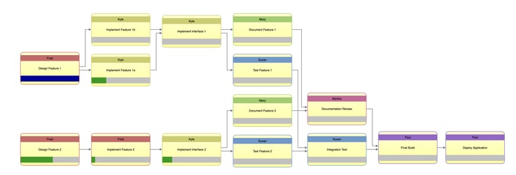
A graphical visualization showing the relationships between tasks in a process.
Understanding JSON Structure for Graphs
At its core, JSON is a lightweight data format based on key-value pairs and arrays, which makes it ideal for representing graph structures. In a graph, the primary components are nodes (representing entities) and edges (representing the relationships between those entities). JSON structures these components to make visualization and data manipulation straightforward.
The key to understanding how JSON structures support JSON Graph Visualization Techniques is recognizing how arrays and objects are nested to represent hierarchical or interconnected data. This flexible data structure allows visualization tools to parse and represent the data dynamically, providing users with an intuitive view of the relationships between entities.
Graph Data Structures in JSON
For advanced users, understanding the nuances of how graphs are modeled in JSON is critical for effectively leveraging JSON Graph Visualization Techniques. The graph data structure in JSON needs to accurately represent nodes (vertices) and edges (links) in a way that supports advanced querying, filtering, and visualization.
- Nodes (Vertices): Each node in a graph represents an entity and is often enriched with attributes that provide additional context about that entity. Beyond just identifiers, nodes can include labels, group membership (e.g., categorizing entities), and other attributes such as geolocation, roles, or values that affect how they are displayed and interpreted in a visualization.
- Edges (Links): Edges represent the relationships or interactions between nodes. These relationships may include multiple attributes, such as the type of relationship (professional, personal, hierarchical), directionality (whether the relationship is unidirectional or bidirectional), and weight (indicating the strength or frequency of interaction). The advanced use of JSON Graph Visualization Techniques often involves working with these attributes to highlight certain relationships, filter irrelevant connections, or showcase significant patterns within the data.
For more complex graph structures, JSON can support multi-attribute nodes and edges. This can include properties like timestamps (for temporal relationships), categories (for clustering nodes by types), and weighted relationships (for indicating stronger or more important connections).
Understanding these structural components allows advanced users to optimize their graphs for performance and readability, ensuring insightful and efficient visualizations. Techniques like edge bundling (grouping multiple edges) and node clustering (grouping similar nodes based on attributes) become critical when working with large datasets.
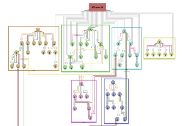
A complex graph structure showing clusters of cellular towers in a network and their relationships to one another.
Common Visualization Tools for JSON Graphs
Several powerful tools are available to implement JSON Graph Visualization Techniques, each with strengths depending on the use case. These tools allow users to transform raw JSON data into interactive, visually rich representations of graphs, enabling a deeper understanding of the data’s structure and relationships.
- Tom Sawyer Perspectives: Perspectives is a robust platform developed by Tom Sawyer Software, designed for advanced JSON graph visualization. This platform handles large-scale, complex graph visualizations, making it an excellent choice for enterprise-level applications where performance, scalability, and interactivity are paramount.
Perspectives offers a suite of advanced features, including:
- Clustering: Grouping related nodes to simplify the analysis of large networks and highlight patterns.
- Pathfinding: Algorithms to trace optimal paths through a network, useful in logistics, communications, and system troubleshooting.
- Real-time interaction: Allowing users to explore, modify, and analyze graphs dynamically, providing real-time feedback and insights.
The platform supports rich interactivity and customization, making it ideal for sectors like network topology management, social network analysis, and enterprise architecture. Its ability to visualize complex datasets with smooth scalability allows users to process and analyze massive graphs without sacrificing performance.
For businesses dealing with intricate data relationships, Tom Sawyer Perspectives offers a versatile, high-performance solution for turning raw graph data into actionable insights.
- D3.js: One of the most popular libraries for dynamic, web-based visualizations. D3.js (Data-Driven Documents) leverages JSON data to create highly customizable and interactive graphs. It is particularly useful for advanced users who need fine control over their visualizations, as D3.js allows for creating both simple and highly complex visual representations. Its ability to handle large datasets and provide interactivity makes it ideal for network graph visualizations.
- Cytoscape.js: A JavaScript library designed for visualizing complex networks in a highly performant way, even with large datasets. Cytoscape.js is often used to visualize biological and social networks and offers built-in functionality for managing the layout and appearance of graph elements. It supports JSON for both the input and output of graph data, making it easy to integrate into various workflows.
- Graphviz: A more specialized tool for graph generation, Graphviz is excellent for creating static visualizations from JSON-encoded graph data. It offers various layout algorithms, such as hierarchical or radial layouts, useful for visualizing organizational charts or layered network structures. While not as interactive as D3.js or Cytoscape.js, Graphviz produces clear, aesthetically pleasing visualizations, especially for smaller datasets or more structured graphs.
By selecting the appropriate tool and leveraging JSON Graph Visualization Techniques, users can customize their graph visualizations to emphasize the most important aspects of their data. Each tool offers different levels of customization and performance, allowing users to optimize for flexibility, performance, or ease of use depending on the specific requirements of their project.
JSON Graph Visualization
JSON Graph Visualization refers to transforming graph data, stored in JSON format, into a visual representation that aids in understanding relationships between nodes. This technique is essential for exploring and analyzing complex networks where relationships and structures can be difficult to interpret through raw data alone.
Parsing JSON for Graph Creation
The first step in visualizing a graph from JSON data is parsing the structure to extract nodes and edges. Parsing refers to the method by which the data is read and transformed into elements suitable for visualization. Each node represents an entity, while edges represent the relationships between those entities. Parsing JSON for graph creation involves extracting these entities and relationships and any additional attributes that may be encoded in the JSON file.
Advanced users often use custom or pre-built parsers from libraries to handle complex nested data structures. Parsing isn’t limited to extracting nodes and edges; it also involves processing metadata (such as weights, types, and properties) to enrich the visual representation. By parsing this additional information, advanced users can customize their graphs to reflect the most important aspects of the data.
Basic and Advanced Visualization Methods
There are several approaches to visualizing graphs based on the complexity and needs of the data:
- Basic visualization methods are useful for simpler graphs where the relationships between several nodes can be easily understood. These methods often involve force-directed layouts or simple radial structures, where nodes are evenly spaced and edges are visible. These methods ensure clarity, even in small datasets, and allow users to grasp the graph’s overall structure immediately.
- Advanced visualization methods are necessary when dealing with large, complex datasets that involve intricate relationships. Techniques like hierarchical layouts, edge bundling, and clustering make large graphs more readable. These methods reduce visual clutter and enable users to focus on specific sub-networks or relationships within the larger graph. Advanced users often leverage algorithms to control node positioning, edge visibility, and interaction techniques such as zooming, filtering, and node expansion to ensure that the visualization remains intuitive even for complex data.
Importance of JSON Graph Visualization Techniques
For advanced users, the primary value of JSON Graph Visualization Techniques lies in their ability to make dense, interconnected data more understandable. These techniques allow users to:
- Identify key relationships and central nodes within a network.
- Detect patterns, such as clustering or hierarchy that would otherwise be obscured in raw data.
- Visualize changes over time in dynamic networks (e.g., social networks or evolving transaction networks).
- Customize visualizations based on user needs, such as applying filters to focus on specific types of relationships or nodes.
Ultimately, the power of JSON-based visualization is its flexibility: users can easily modify or extend JSON data to represent new relationships or insights, making it a dynamic tool for both exploratory and explanatory analysis.
Online JSON Graph Visualization
Online tools have made it easier for users to visualize JSON-based graphs without requiring complex local setups or programming environments. These platforms offer powerful features for parsing JSON data and rendering graphs directly in the browser, providing an accessible way to explore relationships in data without heavy technical investment. Online JSON Graph Visualization has become particularly valuable for users who need quick, interactive graph representations without the need for deep technical expertise.
Overview of Online Tools
Several online tools allow users to upload JSON files and instantly visualize graphs. These tools vary in their feature sets, but all provide quick and efficient methods to interpret graph data without needing to write code or use local software:
- JSON Editor Online: This tool allows users to edit and visualize JSON data directly in a user-friendly environment. While it does not specialize in graph visualization, it offers basic functionality for representing data as nodes and edges.
- OnlineGraphing: Designed specifically for Online JSON Graph Visualization, this tool lets users upload JSON files and instantly create visual representations of networks. It offers a variety of layout algorithms (such as force-directed or circular layouts) and allows for customization of the node and edge properties.
- Other Specialized Platforms: Tools like GraphCommons or Kumu.io provide more advanced graph visualization features, supporting JSON imports along with powerful interaction options, filtering capabilities, and collaborative features. These tools make Online JSON Graph Visualization accessible even for more complex graph structures.
Benefits and Limitations of Online Tools
Benefits:
- Ease of Use: Online tools typically offer simple, drag-and-drop interfaces that allow users to upload JSON files and visualize graphs without any technical setup. This makes them highly accessible for users who need quick insights or are working with smaller datasets.
- No Setup Required: Since these tools run in the browser, there is no need to install additional software or libraries, making them ideal for users who want to avoid local development environments.
- Collaboration: Many online tools include sharing and collaboration features, allowing multiple users to interact with and analyze the same graph in real time. This is especially valuable for teams working on Online JSON Graph Visualization projects.
Limitations:
- Performance: Online tools can suffer from performance bottlenecks for very large graphs or complex data structures, as they often run on shared or limited resources. This can be a challenge when scaling Online JSON Graph Visualization for extensive datasets.
- Customization: While online tools provide convenience, they generally offer less flexibility and customization than local solutions like D3.js or Cytoscape.js. Advanced users may find these tools cannot fully control the visual output or integrate more sophisticated interaction features.
Demonstration of JSON Graph Visualization Techniques Using Online Tools
Online JSON Graph Visualization platforms enable users to explore various techniques with ease. Users can experiment with different layouts, such as force-directed or radial layouts, to observe how node positioning changes the interpretation of the graph. They can also apply filters to focus on specific subsets of the network or use clustering algorithms to group related nodes for easier analysis.
For example, a user might upload a social network graph in JSON format and use an online tool to visualize the most influential individuals within the network by adjusting node size based on centrality metrics. By experimenting with different layouts and visualization settings, they can quickly gain insights into key relationships within the data, showcasing the power of Online JSON Graph Visualization for rapid analysis.
Python JSON to Graph Visualization
Python is a powerful language for transforming JSON data into visual graphs, thanks to its wide array of libraries dedicated to data processing and visualization. For users, Python JSON to Graph Visualization offers unparalleled flexibility in processing JSON data, extracting complex relationships, and applying custom algorithms to visualize intricate networks. Libraries like NetworkX and Plotly are especially useful for this task, as they allow users to create simple and complex graph visualizations from JSON data efficiently.
Advanced Techniques for Python-Based JSON Graph Visualization
Advanced users often apply Python JSON to Graph Visualization techniques to manage large datasets, optimize graph layouts, and enable interaction. Techniques include:
- Custom Parsing: Advanced users may develop custom parsers to handle nested JSON data or highly interconnected graphs. This allows for extracting relevant node and edge attributes and applying specific algorithms to enhance visualization.
- Algorithmic Layouts: Users can leverage Python’s rich algorithmic libraries to apply complex graph layouts, such as force-directed or hierarchical positioning, which make large or complex graphs more interpretable and informative.
- Interactivity and Animation: Using libraries like Plotly, advanced users can add layers of interactivity and animation to their visualizations. This is particularly useful for Python JSON to Graph Visualization when analyzing dynamic or temporal data, allowing for real-time exploration of relationships within large networks.
Python’s versatility makes it ideal for building customized graph visualizations from JSON data. It enables users to apply sophisticated analysis techniques, optimize layouts for performance, and visualize complex networks at scale, offering a robust solution for handling intricate datasets.
JSON Network Graph Visualization
Network graphs are among the most complex types of visualizations, as they are used to represent relationships within interconnected datasets. In these graphs, nodes represent entities, while edges represent relationships between those entities. JSON Network Graph Visualization focuses on how JSON can be used to represent such intricate networks and how advanced visualization techniques can bring clarity to these complex structures.
The Suitability of JSON for Network Graphs
JSON is particularly well-suited for network graphs because it handles nested data and represents hierarchical or interconnected structures. Network graphs can involve hundreds or even millions of entities, each with its attributes and numerous types of relationships. JSON’s flexible, human-readable format allows for the encoding of not just the entities and relationships but also attributes such as:
- Weights: Representing the strength of relationships.
- Types: Differentiating between edges or relationships (e.g., professional vs. personal).
- Hierarchies: Allowing nodes to belong to groups or clusters can be displayed in hierarchical network graphs.
Advanced users can leverage JSON’s structure to store additional metadata for each node and edge, such as timestamps for temporal networks or group affiliations for clustering. This capability is particularly useful in complex datasets where relationships are multi-dimensional and require detailed visual analysis.
Advanced Techniques for JSON Graph Visualization
Standard visualization techniques may fail to perform well, clearly, or be usable when working with large or complex graphs. For advanced users, mastering JSON Graph Visualization Techniques involves applying sophisticated algorithms and methodologies that improve the efficiency and interpretability of graph representations. Below are some advanced techniques used to optimize the visualization of intricate graphs.
Hierarchical Layouts
Hierarchical layouts are particularly useful for visualizing graphs with inherent structure, such as organizational charts or decision trees. In these layouts, nodes are organized based on hierarchy levels, allowing users to see parent-child relationships.
JSON Graph Visualization Techniques for hierarchical layouts require that the JSON structure supports nesting, with nodes and sub-nodes identified. When visualized, higher-level nodes are typically placed at the top (or in a central position), and lower-level nodes are arranged beneath (or around) them.
This technique is effective for visualizing systems with multiple levels, such as:
- Organizational hierarchies: where each node represents an individual or department, and connections represent reporting lines.
- Biological pathways: where nodes represent molecules or reactions, and edges represent interactions.
Hierarchical layouts improve readability by presenting information in a logical, vertical, or radial structure. This naturally organizes relationships based on importance or influence.
Force-Directed Layouts
Force-directed layouts are one of the most widely used techniques for visualizing graphs dynamically. This algorithm treats edges like springs, pulling connected nodes closer together while repelling unconnected nodes, resulting in a natural, intuitive graph arrangement. This layout is especially effective for networks without a strict hierarchy, such as social networks or transaction graphs.
Advanced users can optimize force-directed layouts by fine-tuning parameters such as:
- Node mass and repulsion strength: To prevent overlap or clustering of nodes in dense graphs.
- Edge tension: To control how tightly or loosely nodes are pulled toward each other, affecting how much space the graph uses.
This technique offers several advantages:
- Automatic arrangement: The layout adjusts dynamically as new nodes or edges are added.
- Readable structure: Clusters naturally form around densely connected nodes, making it easier to identify key hubs or groups.
However, force-directed layouts can be computationally expensive for large datasets, so optimizing performance through simplifications, such as reducing the number of edges or selectively visualizing parts of the graph, may be necessary.
Clustering Techniques
Clustering techniques group related nodes based on shared attributes or strong interconnections. These techniques are crucial for simplifying complex graphs and revealing patterns that might not be obvious at first glance.
Clustering algorithms like community detection or modularity maximization help group nodes into tightly connected communities. This is particularly useful for applications like:
- Social networks: Where clusters may represent social groups or interest-based communities.
- Biological networks: Where clusters might indicate functionally similar genes or proteins interacting frequently.
JSON can store metadata about clusters, such as group membership or modularity scores, which can be visualized to highlight communities. Visual cues like color-coding or grouping nodes by proximity in the graph can make clusters more obvious, allowing users to focus on specific sub-networks.
Performance Optimization for Large Datasets
One of the most significant challenges when dealing with large graphs is maintaining performance while ensuring the graph remains readable. Here are some JSON Graph Visualization Techniques that help optimize performance for large datasets:
- LOD (Level of Detail): By adjusting the level of detail shown based on the zoom level, advanced users can reduce the number of visible nodes or edges when zoomed out, showing only the most critical information. As users zoom in, more details, such as additional nodes or metadata, are revealed.
- Edge Simplification: In highly connected graphs, edges can create visual clutter. Techniques like edge bundling group similar or parallel edges together to reduce complexity, making the visualization more digestible.
- Progressive Loading: Instead of rendering the entire graph at once, large datasets can be visualized progressively. For example, only a small portion of the graph is initially loaded, and additional nodes and edges are dynamically added as users interact with the graph.

An example of edge bundling to group edges together to reduce complexity.
Challenges and Best Practices
While JSON Graph Visualization Techniques offer powerful methods for visualizing complex data, they also come with a set of challenges. Advanced users must address these challenges to ensure their visualizations remain effective, performant, and insightful.
Performance Issues with Large-Scale Graph Data
As graphs grow larger and more complex, performance becomes a significant issue. Rendering thousands or even millions of nodes and edges can cause slow load times and poor interactivity. Some of the performance issues include:
- High memory usage: Large datasets require significant memory to be processed and rendered.
- Slow rendering: Visualizing large graphs can result in long wait times for the graph to load and become interactive.
- User interaction lag: With dense graphs, zooming, panning, and filtering can become slow, negatively impacting the user experience.
Best Practices:
- Optimize the JSON structure: Ensure that the JSON data is organized efficiently, with unnecessary metadata removed or placed in secondary layers that can be loaded on demand.
- Asynchronous loading: Load the graph data in chunks or asynchronously, especially for large graphs. This ensures that users can interact with the initial dataset while the rest of the data continues to load in the background.
- Graph partitioning: Partitioning large graphs into smaller subgraphs can make visualization more manageable. Users can then navigate between subgraphs or focus on specific graph sections.
Readability and Clarity in Dense or Complex Graphs
Dense graphs can be visually overwhelming, making it difficult for users to interpret relationships or focus on key areas of interest. Overcrowded visualizations can obscure important details and diminish the overall usability of the graph.
Best Practices:
- Use clustering: Group nodes into clusters to simplify the overall structure of the graph. Color coding or distinct visual markers can help differentiate clusters.
- Edge reduction techniques: As mentioned earlier, edge bundling helps reduce visual clutter by grouping similar edges together. Filtering out weak or less significant edges can also enhance readability.
- Interactive focus: Allow users to interactively focus on specific nodes or edges, hiding non-relevant data and highlighting areas of interest. This can be done through zooming, node expansion, or dynamic filtering based on user actions.
Scalability: Ensuring JSON Graph Visualization Techniques Work Well Across Different Scales
Scalability is a key consideration when applying JSON Graph Visualization Techniques. Graphs must be able to scale up or down, maintaining their functionality and readability, whether representing a few dozen nodes or hundreds of thousands.
Best Practices:
- Layered visualization: Use layers of information that can be progressively revealed as users zoom or interact with the graph. At a high level, shows only the most critical nodes and connections, while more detailed information appears as users explore specific areas.
- Modular JSON design: When working with large-scale graphs, structure the JSON data so that each section can be loaded independently. This modular approach helps ensure that graph sections can be visualized and analyzed without the need to load the entire dataset at once.
By addressing these challenges with targeted best practices, users can ensure that their JSON Graph Visualization Techniques are scalable, performant, and visually clear, even for the most complex data sets.
Real-World Applications of JSON Graph Visualization Techniques
JSON Graph Visualization Techniques have a wide range of real-world applications, particularly in fields where relationships and networks are essential for analysis. Here are some key use cases:
Social Networks
Platforms like Facebook and LinkedIn use JSON graph visualization to represent user connections. Each user is a node, and relationships (friendships, professional connections) are edges. By visualizing these relationships, platforms can offer insights into social structures, recommend connections, and highlight key influencers within a network.
Advanced techniques like clustering are used to group users with similar interests or connections, while centrality metrics help identify the most influential individuals in a network.
Data Flow Analysis
In network security and system monitoring, JSON graph visualization helps track data flow between different entities (e.g., servers, devices, users). Visualizing these interactions can help identify anomalies, security threats, or bottlenecks in data transmission.
JSON is ideal for encoding complex networks with multiple types of entities and relationships, such as communications between devices or the flow of information between servers in a cloud architecture.
Biological Networks
In the life sciences, JSON-based network graphs represent biological pathways, gene interactions, or protein networks. These visualizations help researchers explore how different components in a biological system interact, enabling them to identify key drivers of biological processes or potential targets for pharmaceutical intervention.
By applying clustering and edge bundling techniques, large biological networks can be simplified, making it easier to detect relevant patterns and interactions for research.
Blockchain and Cryptocurrency Networks
Blockchain networks can be visualized using JSON graphs, where each node represents a wallet or user, and edges represent transactions. These visualizations analyze transaction flows, detect fraud, or understand market dynamics. By visualizing complex cryptocurrency networks, analysts can identify major players, detect patterns in transaction history, or uncover suspicious activity.
Conclusion
JSON Graph Visualization Techniques play a crucial role in representing and understanding complex data structures, making them indispensable across various fields, from social networks and biology to financial systems and cybersecurity. JSON’s data format flexibility, widespread adoption, and compatibility with numerous visualization tools make it an excellent choice for encoding graph data.
Key advantages of using JSON for graph visualization include:
- Scalability: JSON allows for easy structuring and expansion of graph data, enabling visualizations that range from small datasets to massive, interconnected networks.
- Clarity: When combined with the right visualization techniques, JSON-based graphs offer clear insights into relationships, helping users detect patterns, clusters, and critical connections.
- Customizability: JSON enables advanced users to tailor their visualizations by including metadata like weights, types, and categories, enriching the analysis and offering deeper insights.
Throughout this discussion, we’ve explored how users can leverage hierarchical layouts, force-directed algorithms, clustering, and performance optimization techniques to make JSON graphs more efficient and informative. Whether visualizing social connections, biological systems, or financial transactions, applying the right JSON Graph Visualization Techniques helps uncover valuable insights that are otherwise hidden in the complexity of raw data.
About The Author
Max Chagoya is Associate Product Manager at Tom Sawyer Software. He works closely with the Senior Product Manager performing competitive research and market analysis. He holds a PMP Certification and is highly experienced in leading teams, driving key organizational projects and tracking deliverables and milestones.
FAQ
1. What is the best way to handle missing data in JSON graphs for visualization?
When dealing with missing data in JSON graphs, you can use NetworkX to apply default values or preprocess the data to remove or estimate missing nodes or edges. Ensuring data integrity before visualization helps avoid incomplete graphs and ensures better insights.
2. How do I create an interactive dashboard from JSON graph data?
To build an interactive dashboard from JSON graph data, you can use frameworks like Dash or Panel. Start by converting the JSON data into a graph object using libraries such as NetworkX or Pandas. Once your graph is ready, you can visualize it using Plotly for dynamic and responsive plots or Bokeh for more advanced visualizations. These frameworks allow you to integrate interactive elements like sliders, dropdowns, and filters, which enable users to zoom into specific nodes, filter data, or toggle between different layouts. The result is a fully interactive dashboard where users can explore the graph and extract meaningful insights in real-time.
3. What are common problems with JSON graph visualization in Python?
Issues include handling nested JSON, performance with large datasets, and visual clutter. To flatten data, use custom parsers or json_normalize, use the Graph-tool for performance, and use clustering or edge bundling to simplify dense graphs.
4. What are some common issues when visualizing JSON graphs in Python and how can they be resolved?
Common issues include handling nested JSON structures, performance with large datasets, and visual clutter. Use custom parsers or json_normalize to flatten data, optimize libraries like Graph-tool for large graphs, and apply techniques like clustering or edge bundling to reduce clutter and improve readability.
Submit a Comment