
Caroline Scharf
Vice President of Operations
Understanding complex relationships is more important than ever. Directed graph visualization provides a way to unravel and represent intricate networks where relationships have a defined direction. Whether it’s mapping the flow of information, analyzing workflows, or studying social interactions, this approach brings clarity to otherwise overwhelming datasets.
This guide covers everything from the basics of directed graph visualization to advanced techniques and real-world applications. Along the way, you’ll explore tools, methods, and challenges to effectively work with directed graphs.
.png?width=2180&height=1154&name=2023.05.18.0.VerticalContstaints.Hierachical_optimized_100%20(1).png)
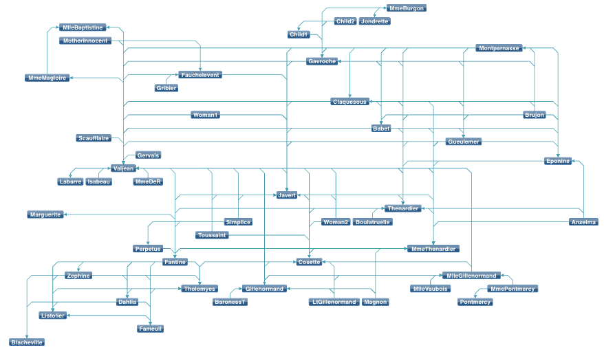
A hierarchical directed graph showing different nodes and their relationships.
Fundamentals of Directed Graphs
Directed graphs, or digraphs, are mathematical structures that model systems with directional relationships. They consist of nodes (representing entities) and edges (defining connections between them). Unlike undirected graphs representing mutual relationships, directed graphs emphasize one-way connections, making them ideal for analyzing systems where flow or sequence is critical.
The Importance of Directionality
The defining feature of directed graphs is their directionality. Each edge has a clear start and endpoint, often represented by an arrow. This characteristic allows directed graphs to capture dynamics such as causality or influence, providing a framework for understanding how systems operate.
Challenges of Raw Graph Data
While directed graphs effectively model complex systems, raw data can be difficult to interpret. Adjacency matrices and similar formats become cumbersome as datasets grow, making identifying patterns, relationships, or bottlenecks challenging. Visualization transforms abstract data into interpretable visuals, highlighting critical nodes and relationships.
.png?width=2223&height=478&name=2022.11.03.0.SubProcessExpanded_optimized%20(1).png)
A directed graph of an expanded sub-process showing different components.
Tools for Directed Graph Visualization
The ability to visualize directed graphs effectively depends heavily on the tools you choose. Various software platforms and libraries are available, each designed to cater to different levels of expertise, data complexity, and visualization requirements. Whether you’re a beginner creating simple workflows or an advanced user working with large-scale networks, the right tool can make all the difference.
One of the most well-known tools for graph visualization is Graphviz, an open-source platform that uses a descriptive language called DOT. With Graphviz, users can define nodes and edges in plain text, which the tool transforms into a clean, organized visualization. Its straightforward syntax and reliable layouts make it a favorite for generating static diagrams.
For users seeking a more interactive experience, Gephi is a powerful option. Often referred to as the "Photoshop of graph visualization," Gephi allows users to manipulate and analyze graphs in real time. Its advanced features include filtering, clustering, and modularity analysis, making it ideal for uncovering insights in complex networks.
Sigma.js is another standout, particularly for developers. As a lightweight JavaScript library, it’s designed to create interactive, web-based visualizations. Sigma.js efficiently renders large graphs, using WebGL to handle datasets with thousands of nodes and edges while maintaining smooth interactivity.
For enterprise-grade solutions, Tom Sawyer Software offers a comprehensive platform called Tom Sawyer Perspectives. This tool provides advanced layout algorithms, rich customization options, and seamless integration with various data sources. It’s particularly suitable for organizations that require high-performance visualizations for large and dynamic datasets.
Building a Directed Graph: Step-by-Step
Creating a directed graph visualization involves a structured process:
- Define Nodes and Edges: Identify entities (nodes) and the relationships between them (edges). This framework forms the backbone of the graph.
- Choose a Tool: Select software based on your dataset size and visualization requirements.
- Input Data: Format your data for the chosen tool, whether through a descriptive language or importing datasets like CSV files.
- Apply a Layout: Choose a layout that aligns with your goals, such as hierarchical for workflows or force-directed for relational dynamics.
- Customize the Visualization: Adjust node sizes, edge thickness, colors, and labels to clarify relationships and emphasize key insights.
- Export and Share: Finalize your visualization by exporting it in a suitable format, whether as a static image or an interactive graph.
Directed Graph Visualization in Action
Creating a Force-Directed Graph Visualization
Force-directed graph visualization arranges nodes dynamically by simulating physical forces. Nodes repel each other, while edges act as springs, pulling connected nodes closer. This balance creates layouts that highlight relationships and clusters naturally.
This method is especially useful for visualizing social networks, where community detection and key individuals are of interest. Similarly, it is effective for workflow analysis, as it reveals process bottlenecks and dependencies.
To create a force-directed graph visualization, tools like D3.js, Gephi, and Cytoscape provide robust solutions. D3.js allows for fine-grained control of web-based visualizations, while Gephi and Cytoscape offer user-friendly interfaces for analyzing and visualizing large datasets.
React Directed Graph Visualization
React, with its component-based structure, is a powerful framework for integrating directed graph visualizations into web applications. React's flexibility allows developers to create dynamic and interactive graphs tailored to user needs.
Libraries like react-d3-graph and Vis Network simplify the integration process by providing React-compatible components for graph creation. For example, react-d3-graph allows customization of node colors, edge thickness, and interactivity, ensuring the visualization aligns with application goals.
React Directed Graph visualizations are particularly useful in real-time dashboards, where data updates dynamically, or in applications requiring user interaction, such as clickable nodes that reveal more information.
JavaScript Directed Graph Visualization
JavaScript excels in creating directed graph visualizations, offering the flexibility to render graphs directly in web browsers. Libraries such as D3.js and Sigma.js empower developers to build interactive and visually appealing graphs for diverse use cases.
D3.js provides unparalleled control, enabling the creation of force-directed layouts, hierarchical views, or custom designs. Sigma.js, on the other hand, is optimized for handling large-scale graphs, ensuring smooth rendering and interaction even with thousands of nodes.
JavaScript directed graph visualization is particularly effective for building graphs in real-time data applications or embedding visualizations into interactive dashboards, where user engagement and scalability are critical.
Python Directed Graph Visualization
Python offers a rich ecosystem for directed graph visualization, making it a go-to choice for data scientists and researchers. Libraries like NetworkX, Matplotlib, and Plotly enable both analysis and visualization of complex datasets.
NetworkX is widely used for its comprehensive graph analysis capabilities. It integrates seamlessly with Matplotlib to generate static visualizations. For interactive graphs, Plotly provides dynamic features like zooming and filtering, allowing users to explore data intuitively.
Python-directed graph visualization is particularly effective in fields such as social network analysis, machine learning model visualization, and dependency tracking in workflows.
Directed Graph Visualization Online
Online tools for directed graph visualization cater to users who prioritize accessibility and ease of use. Platforms like Graphviz Online and Cytoscape Web provide straightforward interfaces for creating and sharing graphs.
Graphviz Online allows users to define graphs using the DOT language and generates clean visualizations instantly. Cytoscape Web offers more interactive capabilities, enabling users to explore network graphs dynamically without needing to install software.
Directed graph visualization online is especially useful for collaborative projects or quick prototyping, where users can generate and share visualizations without requiring advanced technical skills. These platforms combine convenience with functionality, making them a go-to choice for users who need accessible visualization solutions.
Directed Graph Visualization Python
Python's directed graph visualization capabilities are enhanced by libraries like NetworkX and Plotly, which offer extensive features for creating and customizing graphs. These tools cater to static and interactive visualizations, making Python a versatile choice for diverse applications.
For example, NetworkX supports customizable layouts such as circular and hierarchical, while Plotly adds interactivity for users to explore relationships and clusters. Directed graph visualization python enables users to effectively analyze and present complex data structures, offering a powerful combination of flexibility and functionality.
These features make Python-directed graph visualization a powerful tool for uncovering insights in datasets and presenting them in a visually engaging manner.
NetworkX Directed Graph Visualization
Python's directed graph visualization capabilities are enhanced by libraries like NetworkX and Plotly, which offer extensive features for creating and customizing graphs. These tools cater to static and interactive visualizations, making Python a versatile choice for diverse applications.
For example, NetworkX supports customizable layouts such as circular and hierarchical, while Plotly adds interactivity for users to explore relationships and clusters. Directed graph visualization python enables users to effectively analyze and present complex data structures, offering a powerful combination of flexibility and functionality.
These features make Python-directed graph visualization a powerful tool for uncovering insights in datasets and presenting them in a visually engaging manner.
Advanced Visualization Techniques
Mastering advanced techniques in directed graph visualization enables users to handle complex datasets, improve usability, and extract richer analytical insights. These methods enhance clarity and ensure the creation of effective visualizations tailored to specific needs.
Optimizing Layouts for Clarity
The layout of a graph plays a crucial role in how well it communicates information. Advanced layout techniques such as edge bundling, multi-level designs, and hierarchical arrangements are particularly effective in simplifying complex datasets. Edge bundling minimizes clutter by grouping edges with similar paths, making dense graphs easier to interpret. Multi-level layouts further simplify large datasets by clustering related nodes into meta-nodes, allowing analysis at various levels of detail. On the other hand, hierarchical layouts are ideal for emphasizing workflows or dependencies, as they visually arrange nodes to represent sequential relationships. Together, these methods enhance the visual appeal and analytical utility of directed graphs.
Enhancing Visual Context
Customization of graph elements provides an additional layer of meaning, making visualizations more engaging and easier to interpret. Adjusting edge thickness or node size can reflect the strength of relationships or the importance of entities within the dataset. For instance, larger nodes might signify influential entities, while thicker edges could represent stronger connections. Colors also play a vital role in categorizing nodes and edges, while animations can dynamically depict changes over time. These thoughtful adjustments balance aesthetic appeal and analytical depth, ensuring the visualization effectively communicates insights.
Incorporating Interactivity
Interactivity transforms static graphs into dynamic tools, empowering users to explore complex data at their own pace. Features such as zooming and panning enable users to navigate dense graphs without losing context. At the same time, dynamic filtering allows for targeted exploration by adjusting the visibility of nodes and edges based on their attributes. Pathfinding tools add further value by highlighting critical connections within the graph, such as the shortest routes between nodes or particularly influential pathways. These interactive features make visualizations adaptable, engaging, and versatile for diverse analytical needs.
Handling Large Datasets
Effectively managing large-scale graphs requires strategies that maintain both clarity and performance. Approaches like data sampling can simplify the visualization process by focusing on representative subsets, offering an overview without overwhelming users. Progressive rendering ensures smoother performance by displaying the graph incrementally, which is particularly useful in interactive settings. Additionally, clustering and aggregation help condense complex graphs by grouping related nodes into meta-nodes, enabling users to explore broader trends before delving into finer details. These techniques ensure that even massive datasets remain accessible and insightful.
Combining Static and Interactive Visualizations
Blending static and interactive visualization approaches leverages the strengths of both. Static snapshots are ideal for reports and presentations, offering concise, high-quality visuals that communicate key points clearly. Meanwhile, interactive dashboards provide users with the tools to delve deeper into details and uncover trends that might not be immediately visible. By combining these methods, visualizations cater to both decision-makers seeking high-level insights and analysts needing detailed exploration.
Overcoming Challenges in Directed Graph Visualization
Directed graph visualization is a powerful technique, but it comes with challenges that must be addressed to ensure clarity, usability, and effectiveness. By adopting thoughtful strategies, these obstacles can be mitigated, allowing for insightful and impactful visualizations.
1. Managing Visual Clutter
Dense graphs often suffer from visual clutter, where overlapping edges and nodes obscure relationships and patterns. This can make interpretation difficult and reduce the overall utility of the visualization. Strategies to address clutter include:
- Edge Bundling: Group edges with similar paths to reduce overlap and highlight structural relationships. This technique is particularly effective for hierarchical datasets.
- Filtering and Simplification: Remove or hide less significant nodes and edges to focus on key elements, ensuring the visualization emphasizes the most relevant insights.
- Optimized Layouts: Use layouts like hierarchical or force-directed, which arrange nodes logically and minimize overlap for improved readability.
A graph visualization produced with Tom Sawyer Perspectives illustrating bundled edges.
2. Scaling for Large Datasets
Visualizing large datasets with thousands or even millions of nodes and edges can overwhelm users and computational resources. Effective strategies include:
- Clustering and Aggregation: These methods group related nodes into meta-nodes, reducing complexity while preserving overall structure. They allow for analysis at multiple granularity levels.
- Progressive Rendering: Load and display the graph incrementally, improving performance and user experience, especially in interactive applications.
- Sampling: Focus on a representative subset of the data to provide an overview without overwhelming the viewer.
3. Maintaining Clarity and Simplicity
Balancing detail and simplicity is crucial for creating effective visualizations. Too much detail can overwhelm viewers, while oversimplification may obscure critical insights. Best practices include:
- Layered Visualizations: Start with a high-level overview and provide options to drill down into specific areas of interest.
- Interactive Features: Enable users to zoom, pan, and filter the graph dynamically, allowing them to explore complex datasets without cluttering the primary view.
- Annotations: Use labels, tooltips, and legends to provide additional context while avoiding overcrowding the visualization.
4. Adapting for Diverse Audiences
Graphs often need to cater to a variety of stakeholders, from technical experts to decision-makers. Customizing visualizations for different audiences ensures accessibility and relevance:
- For Technical Audiences: Include detailed metrics, overlays, and customizable options for in-depth analysis.
- For Non-Technical Audiences: Focus on high-level insights, intuitive layouts, and simple annotations for straightforward interpretation.
- Hybrid Approaches: Combine static snapshots for quick overviews with interactive dashboards for deeper exploration.
5. Handling Dynamic Data
Dynamic or temporal datasets, such as evolving social networks or real-time traffic flows, pose unique challenges. Effective approaches include:
- Animation: Show changes over time through animated transitions, helping users track how nodes and edges evolve.
- Time-Sliced Views: Break data into sequential snapshots, allowing users to compare states across specific time periods.
- Highlighting Key Changes: Use visual cues, such as color changes or motion, to draw attention to emerging patterns or significant shifts.
Designing Effective Graph Visualizations
An effective directed graph visualization does more than present data—it tells a story, reveals insights, and simplifies complexity. Achieving this requires a careful balance of aesthetics, functionality, and user experience. By following these principles, you can create visualizations that are both impactful and intuitive.
1. Prioritize Clarity and Simplicity
The primary goal of any graph is to communicate information quickly and intuitively. Overly complex designs can overwhelm users and obscure key insights. Simplifying the visualization ensures that viewers focus on the most critical aspects of the data.
- Select an Appropriate Layout: Choose a layout that aligns with your data and its purpose. Hierarchical layouts are ideal for workflows or dependency mapping, while force-directed layouts emphasize clustering and relational dynamics.
- Reduce Visual Clutter: Minimize overlapping edges, excessive labels, and redundant nodes. Removing unnecessary elements keeps the graph clean and focused on its message.
Simplicity enhances readability, making it easier for viewers to quickly grasp the graph’s purpose and insights.
2. Incorporate Meaningful Customizations
Customization adds depth to a graph, making it more engaging and informative. Every design choice should serve a purpose and align with the story your data tells.
- Node Size and Shape: Reflect attributes like importance or activity by adjusting node size or shape. For instance, larger nodes can signify higher influence or connectivity.
- Edge Weight and Color: Use edge thickness or color to represent the strength or type of relationships, making distinctions more intuitive.
- Color Coding: Apply consistent, intuitive colors to categorize nodes or edges. This is especially important for non-technical audiences who benefit from clear visual distinctions.
Thoughtful customizations not only enhance the graph’s aesthetic appeal but also ensure it conveys meaningful insights.
3. Focus on Readability
Even the most sophisticated visualization loses its impact if it’s difficult to read. Readability depends on clean and intentional design choices.
- Strategic Label Placement: Position labels to avoid overlap with nodes or edges. Use tooltips or interactive pop-ups for additional details where needed.
- High-Contrast Colors: Ensure strong contrast between graph elements and the background. For example, light-colored nodes on a dark background often stand out more clearly.
- Professional Fonts: Choose clean, sans-serif fonts for annotations and labels to maintain a polished and accessible presentation.
A readable graph allows viewers to interpret data effortlessly, regardless of its complexity.
4. Make It Interactive
Interactivity transforms static graphs into dynamic tools for exploration, especially for large datasets or detailed analyses. Interactive features enable users to engage directly with the graph and uncover deeper insights.
- Zooming and Panning: Help users navigate dense graphs without losing context.
- Dynamic Filtering: Allow viewers to isolate specific nodes, edges, or subgraphs based on attributes of interest.
- Pathfinding Tools: Highlight key routes or connections, such as the shortest paths between nodes or influential relationships within a network.
Interactivity is particularly valuable for exploratory analysis, empowering users to dive into the data at their own pace.
5. Design for Your Audience
Tailoring your visualization to your audience ensures that it communicates effectively, regardless of their expertise.
- For Technical Audiences: Include detailed metrics, overlays, and advanced interactive features to enable in-depth analysis.
- For Non-Technical Audiences: Focus on high-level insights, using clear annotations, intuitive layouts, and static visuals for ease of interpretation.
- For Mixed Audiences: Combine approaches by offering overview graphs with optional layers of detail for more advanced users.
A well-designed graph meets the specific needs of its audience, maximizing its overall impact.
6. Test and Iterate
Even the best-designed graphs benefit from iteration and feedback. Testing ensures that your visualization is intuitive, functional, and aligned with its goals.
- Usability Testing: Observe how users interact with the graph to identify areas of confusion or difficulty.
- Refine Based on Feedback: Adjust layouts, labels, or customizations to address user concerns and improve clarity.
- A/B Testing: Experiment with different design variations to determine which resonates best with your audience.
Testing and refinement transform good visualizations into great ones, ensuring they are polished, user-friendly, and effective.
Conclusion
Directed graph visualization is a powerful tool for simplifying complex systems and uncovering hidden insights. By representing relationships and flows visually, it allows users to analyze everything from workflows to social media networks with greater clarity and efficiency.
Throughout this guide, we’ve explored the fundamentals of directed graphs, from defining nodes and edges to understanding directionality. We’ve also examined tools like Graphviz, Gephi, Sigma.js, and Tom Sawyer Software, which cater to a variety of needs and expertise levels. By mastering these tools and techniques, users can create effective visualizations that enhance decision-making and communication.
For beginners, the journey starts with understanding the basics and experimenting with small datasets. As your skills grow, you can explore advanced techniques like edge bundling, real-time data integration, and predictive modeling. For advanced users, leveraging dynamic and multi-dimensional visualizations opens doors to new possibilities in fields like AI, cybersecurity, and logistics.
Directed graph visualization is not just a way to interpret data—it’s a method for solving real-world problems, driving innovation, and making informed decisions. With its wide-ranging applications and ever-evolving tools, this technique is indispensable in today’s data-driven world.
Now it’s your turn to dive in. Choose a dataset, pick a tool, and start visualizing. Whether you’re mapping a workflow, analyzing a social network, or exploring citation trends, directed graph visualization will help you transform complexity into clarity.
About the Author
Caroline Scharf, VP of Operations at Tom Sawyer Software, has 15 years experience with Tom Sawyer Software in the graph visualization and analysis space, and more than 25 years leadership experience at large and small software companies. She has a passion for process and policy in streamlining operations, a solution-oriented approach to problem solving, and is a strong advocate of continuous evaluation and improvement.
FAQ: Directed Graph Visualization
What Is The Difference Between Directed And Undirected Graphs In Visualization?
Directed graphs feature edges with a specific direction (e.g., A → B), making them ideal for analyzing one-way relationships such as causality, hierarchy, or workflows. Conversely, undirected graphs use bidirectional edges (e.g., A ↔ B) to depict mutual relationships like friendships or collaborations. The decision to use a directed or undirected graph ultimately depends on whether the relationships in your data are directional or mutual.
How Do I Decide The Size Of My Dataset Before Visualizing It?
The dataset size should align with the goals and clarity of your visualization. For large datasets, consider clustering or sampling to reduce visual clutter while retaining key datasets without compromising performance or interactivity.
Can I Use Directed Graph Visualization For Predictive Analytics?
Yes, directed graph visualization is widely used in predictive analytics. Applications include recommendation systems, fraud detection, and supply chain analysis. By visualizing relationships and flows and combining them with machine learning, you can predict outcomes, uncover trends, and optimize processes.
How Do I Visualize Weighted Graphs Effectively?
Weighted graphs can be visualized by incorporating edge thickness or color intensity to represent varying strengths of relationships. Thicker lines can denote stronger connections, while gradient colors convey intensity or frequency. Scaling node sizes based on centrality or importance further enhances the visualization.
Are There Plugins Or Extensions For Enhancing Directed Graph Visualizations?
Yes, many platforms offer plugins to expand their capabilities. Gephi provides extensions for modularity analysis, advanced layouts, and filtering options. Sigma.js supports plugins for real-time updates, animations, and performance optimization. These enhancements improve both functionality and usability.
What Industries Commonly Use Directed Graph Visualization?
Directed graph visualization is prevalent across various industries, including:
- Supply Chain Management: Tracking and optimizing product flows.
- Finance: Detecting fraud and analyzing transaction patterns.
- Telecommunications: Visualizing and managing network infrastructures.
- Social Media: Mapping user interactions and influence networks.
- Healthcare: Tracking disease spread or analyzing patient data.
What Challenges Might Arise With Multilingual Datasets In Graph Visualization?
Working with multilingual datasets can present challenges like encoding inconsistencies, varied naming conventions, and unclear labels. To address these, use standard Unicode encoding, normalize data names, and incorporate legends or translation tools within the visualization for clarity.
How Do I Maintain Consistency In Style Across Multiple Graph Visualizations?
Maintain consistency by leveraging predefined themes for colors, fonts, and layouts. Many tools allow saving templates or styles for reuse. Establishing guidelines for node sizes, edge styles, and labeling conventions ensures a cohesive appearance, especially in large-scale or collaborative projects.
Submit a Comment