
Kristin Petersen
Content Manager
In the past month, the internet has exploded with information about coronavirus and the disease it causes, COVID-19. The vast amount of data feels like too much to keep up with. But that’s where graph and data visualization thrives! So, we used the power of Tom Sawyer Perspectives to visualize the continually updated genomic epidemiology data provided by Nextstrain to reveal previously unseen coronavirus mutations.
Understanding Coronavirus Mutations
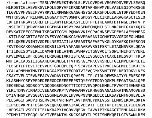
To find a cure or develop a vaccine, researchers examine the RNA of the virus to figure out how it works, grows, develops, and changes. To do this, they break down the RNA to its smallest parts, identify each part, and then look for changes or relationships—like cracking a complicated code. Because genome sequencing uses a series of letters representing the chemical alphabet, viewing a genome sequence can be an eye-crossing affair. For example, this image is just a portion of an isolated genome of coronavirus (click here to view the full sequence):
When comparing one strain to another, researchers look for changes in the sequence. Mutations are identified any time a letter in the sequence changes, the exact way the coronavirus mutations are identified. Typically, virologists display this kind of data in a phylogenetic tree.
What Is a Phylogenetic Tree?
Nextstrain has been integral in understanding the coronavirus mutations, spread, and geographical impact. It visualizes the data in a standard phylogenetic tree.
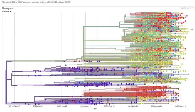
Much like a genealogical or family tree, a phylogenetic tree shows how genetic matter evolves. It uses branches to show how individuals (or individual pieces of matter) relate to each other from one generation or mutation to the next. Node color indicates where that mutation was found.
It seems simple, but the sheer volume of genomes and mutations can make for a very crowded phylogenetic tree. We’re seeing similar overcrowding in graph visualizations of coronavirus mutations. There are so many nodes in the tree, it can be hard to see the individual elements of the visualization or where potential similarities or relationships exist.
Taking Nextstrain Data to the Next Level
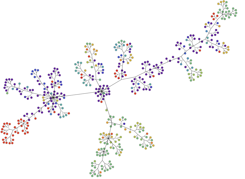
As coronavirus mutations continue to evolve and spread across the world, they also mutate along the phylogenetic lineage. In other words, the phylogenetic trees are getting very big, very fast. To create more effective visualizations of these structures, our research team approached the problem from two sides. First, use graph layouts that naturally distribute the data in a better way. Second, combine any phylogenetic tree nodes that share a mutation.
Step One: Change the Graph Layout
Here, each node represents a genome sampled around the world. The color of the node represents the lab where that genome was found. Similar to the phylogenetic tree, the edge shows the lineage of each mutation. To better organize this data visually, we redrew the graph using symmetric layout.
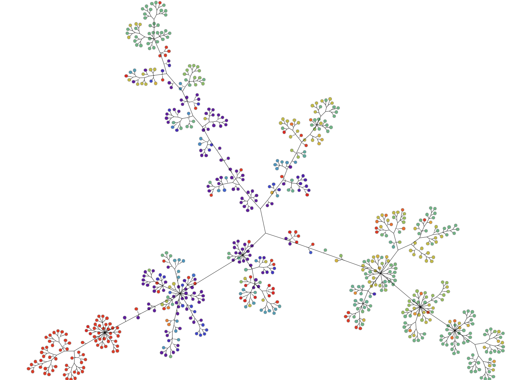
Step Two: Combine Nodes That Share a Coronavirus Mutation
Next, our team developed a method of combining nodes if they shared a mutation. By running a preprocessing step before importing the Nextstrain data into Tom Sawyer Perspectives, we were able to easily update the way nodes with the same mutation display. Here, the blue hexagon nodes show the adoption rate of the virus. The higher the degree of these nodes—or the more edges that are connected to them—the greater the number of genomes that share the same mutation. It seems simple, but by updating the visualization to give these special types of nodes a distinctive shape and color, we can identify them more easily.
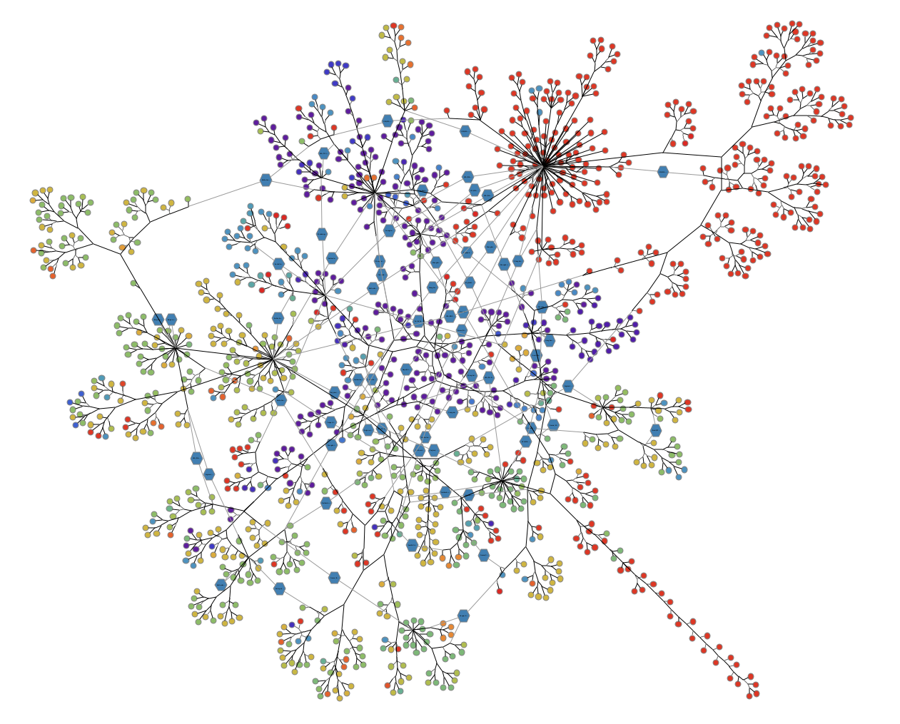
With the phylogenetic tree, we don’t see that the same mutation has occurred multiple times, but in our new visualization, we can clearly see when a mutation has occurred more than once. And the duplications of the mutations in different genomes could be indicative that those particular mutations are important to understand. Perhaps these mutations cause an increase or decrease in the severity of symptoms. If so, should they be considered when creating a vaccine? This new insight into the same data could help scientists identify things that are functionally impacting the virus.
Visualizing the Importance of Social Distancing
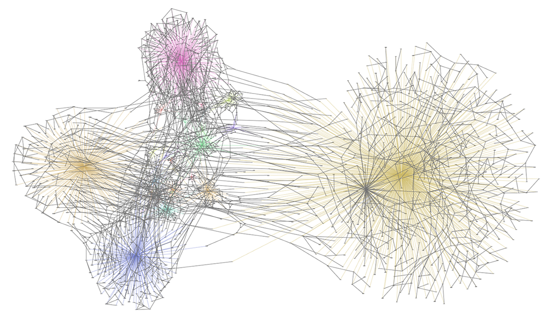
Recently, phrases like safe at home, shelter in place, and social distancing have dominated conversation. So how does the addition of travel change our graphs?
Below, we added nodes indicating the country in which the genome was sampled to the Nextstrain data. Colored edges link the genomes to the country in which they were sampled. Clustering indicates how many genomes were sampled in each country. The overlaying grey edges are from the phylogenetic tree. Multiple grey edges between the colored clusters indicate that the genome line moved to another country. In other words, an infected person traveled to another country.
What’s Next?
The farther we dive into this data, the more questions we have–and the more answers we want to try to visualize! Questions like:
- What are the effects of different public health policy decisions?
- Can visualizing the phylogenetic data show us when the outbreak actually began?
- Can overlaying additional, complex data lead to insights on how the virus spreads?
We’re already working hard to visualize and analyze the data in order to provide answers! To create visualizations of your own data, get started today.
Sources
Our graph visualizations are made possible by the sharing of genetic data by research groups from all over the world. We acknowledge and thank:
- Hadfield et al, Nextstrain: real-time tracking of pathogen evolution, Bioinformatics (2018)
- Sagulenko et al, TreeTime: Maximum-likelihood phylodynamic analysis, Virus Evolution (2017)
- The Nextstrain research team, including: Trevor Bedford, Richard Neher, James Hadfield, Emma Hodcroft, Thomas Sibley, John Huddleston, Jover Lee, Kairsten Fay, Sidney Bell, Colin Megil, Barney Potter, Pavel Sagulenko, Charlton Callender, Misja Ilcisin, Louise Moncla, Allison Black, Anderson Brito, and Nate Grubaugh
- Kristian Andersen, David Blazes, Peter Bogner, Matt Cotten, Ana Crisan, Gytis Dudas, Vivien Dugan, Karl Erlandson, Nuno Faria, Jennifer Gardy, Becky Kondor, Dylan George, Ian Goodfellow, Betz Halloran, Christian Happi, Jeff Joy, Paul Kellam, Philippe Lemey, Nick Loman, Sebastian Maurer-Stroh, Oliver Pybus, Andrew Rambaut, Colin Russell, Pardis Sabeti, Katherine Siddle, Kristof Theys, Dave Wentworth, Shirlee Wohl, and Nathan Yozwiak
About the Author
Kristin Petersen is the Marketing Content Manager at Tom Sawyer Software. She has 17+ years of technical writing and editing experience in both the public and private sector, and transitioned into Marketing where she brings her strong technical background, writing experience, and creativity. She earned her Master of Science in Technical Communication from Drexel.
Submit a Comment