
Kristin Petersen
Content Manager
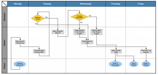
Swimlanes organize graph visualizations in a simple, user-friendly manner. Typically, process flows use swimlane diagrams to group components into individual categories, or lanes. Each node represents a task or activity and the lanes organize them by role, function, or department. However, because swimlanes are usually defined along a single axis, they tend to be used as alternatives to other graphical cues like text, coloring, or icons. In this scenario, swimlanes only add one additional dimension of data. What if you could show more?
With the latest release of Tom Sawyer Perspectives, we’re taking our swimlane diagram capability to the next dimension.
Creating the Ultimate Combination
Sometimes in data visualization, you get a chocolate and peanut butter moment. Graph enthusiasts know that graphs and matrices are isomorphic. In other words, you can represent any matrix dataset with a graph containing the same information, and vice versa.
For example, imagine a roster of students and classes. A matrix of the roster shows students along the top with classes down the side; values in the corresponding cells indicate the enrollment status of each student in each class. Meanwhile, a graph representation of the roster shows nodes for each student and class; an edge connecting a student to a class indicates enrollment.
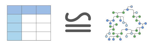
Mathematically, these are equivalent representations; they are isomorphic. However, humans often understand matrices and graphs differently. Usually, small dense datasets lend themselves to matrix representations, while larger and sparser datasets are easier to understand as graphs. But what if you could do both?
What if you could build a detailed graph visualization on top of a matrix? You could use both techniques where they are most beneficial. Workflows, supply chains, and network graphs could have added clarity. And perhaps best of all, you could quickly recognize important patterns in high-dimension data that might otherwise have been missed.
You could have chocolate in your peanut butter.
Upgrading Supply Chains with Two-Dimensional Swimlanes
Supply chain diagrams can benefit from two-dimensional swimlanes by adding supply levels and geospatial information. The example below shows a supply chain visualization of dependencies between widgets needed for a product. You need Widget1 to build Widget2, Widget2 to build Widget 3, and so on. Both Widget5 and Widget6 need Widget3. Widgets 1 through 11 are needed to build Widget 12. Because we’ve added a two-dimensional swimlane matrix showing both location and supply level, a glance reveals that Widget 6 and 9 are low in supply.
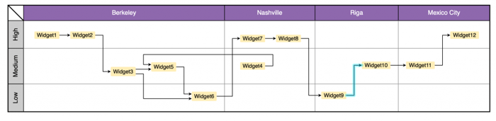
As the product owner, you can assess whether supply levels are a natural consequence of the current phase of production or if this requires intervention. Additionally, you can identify a backflow between facilities. Nashville produces Widget4 but Berkeley needs it. Once you identify this seemingly undesirable pattern, you can decide if other factors justify this extra shipping cost or if an optimization can be found.
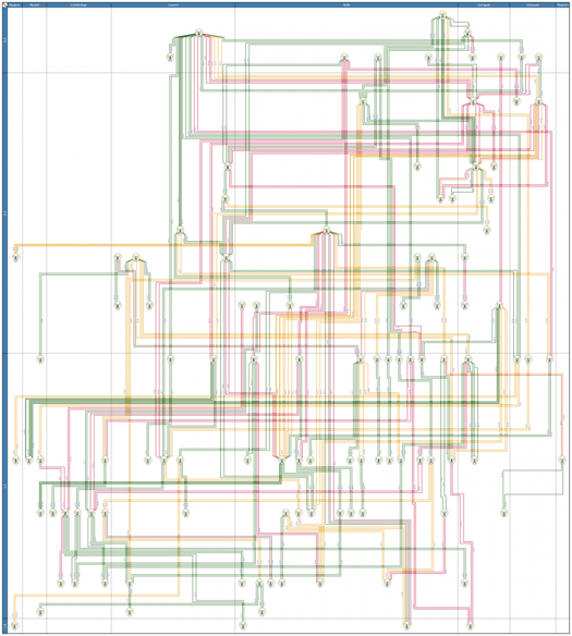
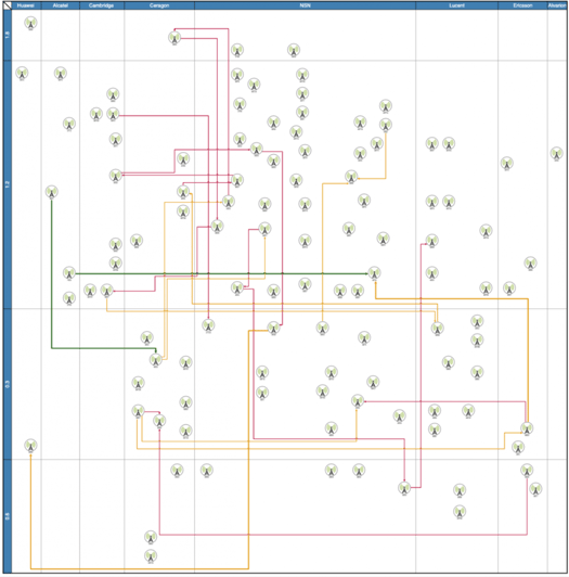
Using Swimlanes to Add Hardware Profile to Networks
Adding categorical lanes to a microwave network allows you to display both vendor type and physical size and then draw your graph visualization within the appropriate lanes. At a glance, you can see the:
- Topology of the network
- Suppliers and scale of equipment
- Relative isolation of equipment scales
- Scale of the most heavily loaded equipment
Filtering Swimlane Matrices
Finally, adding other complexity management techniques like interactive filtering adds even more value. The drawing above shows all connections in the network. In the drawing below, we used the filtering capabilities in Tom Sawyer Perspectives to remove any low bandwidth connections between antennas. The connections that remain are actively carrying a high data volume.
Layering this drawing with our two-dimensional matrix helps to quickly identify areas for hardware upgrades or reallocation to prevent service disruptions in the areas with the highest network traffic. The red connections are close to total capacity and potentially need repair or improvement.
Try it for yourself! Users of our new Tom Sawyer Perspectives 9.1.0 release can find a two-dimensional swimlane tutorial under …/examples/tutorials/views/drawing/swimlanes/two-dimensional. Or, sign up for a free trial today!
About the Author
Kristin Petersen is the Marketing Content Manager at Tom Sawyer Software. She has 17+ years of technical writing and editing experience in both the public and private sector, and transitioned into Marketing where she brings her strong technical background, writing experience, and creativity. She earned her Master of Science in Technical Communication from Drexel.
Submit a Comment